Friday, 25 October 2013

Photography


Here are my 6 images from our photography lessons. I had already done photography at college but this helped me remember it all. I liked playing with the settings and seeing what happened. I also liked learning about the lighting because we weren't allowed to do much of that at college. I think the curved table is very clever cause you can take photos of things without there being a line on where the floor meets the wall.


I liked using different depths of field for example this one above, the background is quite blurred which brings more attention to the foreground. I did this using the aperture settings.


This was quite fun, we set our cameras to a really slow shutter-speeds and put them on tripods to avoid camera shake, then had someone walk across the canvas and our cameras captured the person at different stages giving a ghost like effect.


Wednesday, 23 October 2013

TARZAN 2

Aw just been watching Tarzan 2! such a good movie I've not seen it before. I love the character design of Tarzan, he looks so cute like he's got the baby features because he's a kid, but they've also thought of the ape in him not just by the way he walks but they've even changed the muscles to how they would be if he really walked like that. I like the way they drew his nose, I have difficulty drawing noses. The facial expressions are often exaggerated but still look realistic and when he jumps and things they use the squash and stretch technique. I also like the way his hair moves in the wind so you get a sense of atmosphere. Speaking of atmosphere, the scenery is beautifully designed with such lovely colours and textures. I like the way the lighting alters to a sort of blue colour when they're under canopies in the shadow. I believe this is aimed at children because it uses such bright colours and simple lines and the storyline is quite simple. This definitely does its job in that it draws kids in.  Its just beautiful! Disney, you've got this. Teach me!!!

Tuesday, 22 October 2013

OUAN403-Animation Skills-Telling stories


My finished storyboard


So I finally finished my storyboard on the computer using Photoshop. I think it was definitely a good idea to do it on the computer because it has made it look far bolder and more professional. It's also more consistent because you can copy certain aspects or trace them. It took quite a while to do but I actually enjoyed just sitting there for hours working on it, experimenting with my bamboo tablet. I hope to draw with this more often now I have seen what I can do with it. The only problem is -and I think it might just be my printer- when it gets printed out its a lot darker and not as much detail. When I print it on A3 at uni I hope it turns out a bit better.

This is the finished product!!

Overall I am very happy with my work and I look forward to making more things like this and then hopefully making them come to life!!


Monday, 21 October 2013

OUAN403-Animation skills-Identify

Gertie the dinosaur


I was reading 'The animators survival kit' and came across this animation. I think its adorable. It's like Gertie is a pet. They have slightly personified her because obviously dinosaurs don't stand there leaning from one foot to the other like a kid, but that gives it personality! I think its cleaver the way they introduce a human to the image too and made him interact with Gertie because in those times that would be pretty big! I like how a big destructive dinosaur is portrayed as a cute little pet through animation. I think this is using the same technique as we used in the lesson below.

OUAN 403- Animation skills- Pose to pose

Today we had a go at pose to pose animation, which is where you draw out the poses you are definitely going to have, then draw out the in betweens after. To get it even we were told to draw the first pose, last pose and middle pose, then do in between each, then do in betweens again but not to the middle one. (to get the slow in slow out effect of the pendulum). We used light boxes and special animation paper then scanned the drawings onto the computer. We opened it in Quick time player 7 and clicked open image sequence and set it to 12 frames per second, so our 24 frames would make a 2 second animation. This is what i ended up with.
Looking back at it i think i should have gone over the drawings in a darker pencil so it shows up better. Also i think it would have looked better if it was slower. I quite like this form of animation however it does take quite a while to get it right in the drawing then scan it all in. If it was a long animation this would take FOREVER. I like how all the paper is separate though so if you go wrong on one, you can either rub it out or just get a new sheet of paper. Also you can change the order easier or trace different things.

Friday, 11 October 2013

OUAN403-Animation Skills-Telling Stories

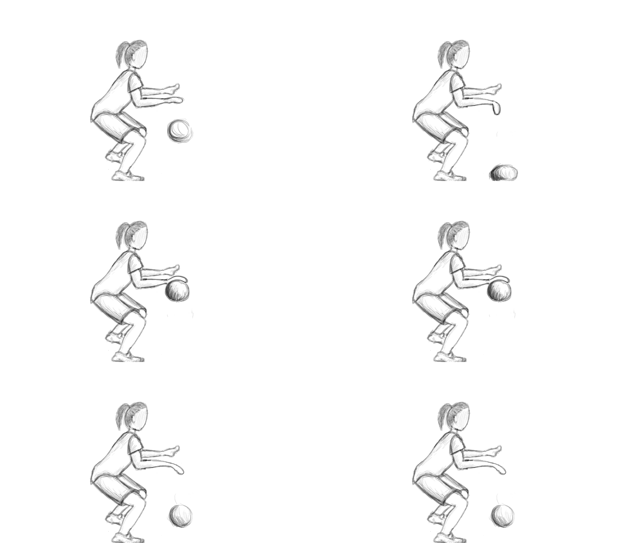
I'm a baller...Holla!

I couldn't think what to so Steve said do a walk but I have never done anything like that before so I didn't feel comfortable yet. So he said I could mix the ball bouncing with a person putting action on the ball like a basket baller! Ta-daaaa!


I think if I did this again I would possibly make the persons whole body move slightly so it looks more realistic. As it is, she looks very static.

OUAN403-Animation Skills- Telling stories

Jumping toddler

I decided to get a little more adventurous...I animated a kid! I tried to use the squash and stretch technique with him jumping but when I played it back it wasn't very emphasised. I think it looks alright though!

If I did it again I would perhaps change his facial expression and emphasise the movement more.

Pendulum


Pendulum

Our next task was to create a pendulum. I'm actually quite impressed with how this turned out. In this animation, the aim was to use the slow in and slow out technique. To do this you basically add more frames in which created the effect of it slowing down! If I did this again I would make the background more detailed and also there is one part where the animation doesn't quite add up, it jitters a little so I would correct this. 
Creating the background is actually not that simple, you have to do all the animation layers first, click layers to frames and THEN add in a new layer which then applies to all layers.

OUAN403-Animation Skills- Telling stories

My second animation


Our next task for the day was to make a bouncier, squishier ball applying the squash and stretch technique. I think it turned out pretty well considering this is the first day I have ever done any animation in my life! I added a little block for the ball to bounce of to create a bit of interest.

OUAN403-Animation Skills-Telling stories

My first animation

So today in our Photoshop class I created my very first animation. I thought this was pretty cool! we used a technique that I think was called frame by frame animation. So we basically drew out each phase of the animation in different layers.


Next, we clicked on a button in the timeline box 'convert layers to frames' or something. This put all the layers we had created into individual frames that we were able to play back... like this gif. image! This first one was just a bouncing ball.


OUAN403-Animation skills-Telling stories

Photoshop Induction

Last week was our first Photoshop induction. We learnt lots of things like how to use the paintbrush tool, how to add in images, making masks and things like that. We used Wall-E as an example in our work which I think it made it a lot more interesting. A lot of the things I already knew but I learnt new things such as how RGB and CMYK are different for printing which may come in very useful! 


Wednesday, 9 October 2013

Music

This is the music from the post below called 'Caged bird-D.N.Angel' I would love to learn this on piano! I think it would make a good background for a lot of animations. What do you think?!

OUAN403-Animation skills-Explore

I thought this flip book animation was quite nice. I like how its the background that moves for the most part and not the guy, its about the constantly changing world around us. I really like the choice of music too. It's very soothing although I can imagine with all that change going on it wasn't very calm at all.

OUAN403-Animation Skills-Explore

Flip Books

I had never made a flip book before Mondays lesson. It. Was. AWESOME :D woooh go flip books! I really enjoyed it and could have sat there for ages doing them! I really want to improve my flippin' skills and do really good drawings that work with it! Can't wait to explore. When Mike first looked at my first attempt at the bouncing ball, he told me it need to be faster- so less frames- this worked really well and gave it more energy! I think it was cool how it looked so life like with the squashing and stretching effect we learnt. It's really clever how you wouldn't think to make the ball the wrong shape but actually this gives it movement and it does actually change while its bouncing your eyes just cant catch it cause its so fast.
This was included in the 12 principles of animation that Frank Thompson and Ollie Johnston from Disney created in the 1930's. You can see this Here.
Or for something a little more visual I found this which is pretty fun.


I found these principles very interesting and useful and I can definitely see how using these in my work will help to give it life.

OUAN403-Animation Skills- Identify

Bradford Media Museum

So on Thursday we went to the media museum in Bradford. I've been a few times before and thought it was alright. This time I went I actually got to see the animation stuff (my course last year weren't bothered about it) and everyone joined in and was really fun and I think there were some new things there! So yeah I really enjoyed it this time round and found it a very worthwhile trip! I liked seeing where gaming started and how far it has come, I liked seeing the story boards and how they put the cell with colour on it over the top, I had no idea that's how it was done and I really like it! There was lots of models from the actual animations which was pretty cool to see! I also saw this one part called 'The astronomers sun'. I'd never heard of it before but I fell in love with the model, it was so intriguing, I cant quite put my finger on what it was about it. Possibly the expression on the little mans face, mixed with the moody lighting. Anyway, it inspired me and I watched it when I got home. It's such a  nice stop frame animation, and very emotional. I think this animation was supposed to make you feel for the guy left at the end which it does!!  If you haven't watched it, here it is.

OUAN403-Animation Skills-Telling Stories

Progress

I have begun to draw and colour my frames in neat. I like the style but I feel they are a bit messy and not very bright in colour. I may try them out on the computer although I have never done that before. It would get me some nice colours though so perhaps its worth a shot!
Here is an example of what I have at the moment:


Do you see what I mean about it being a bit... wishy washy? Watch this space for my first attempt at doing it on the computer :S

OUAN403-Animation Skills- Telling Stories

Character Design

So this is Little Miss Muffet after her cosmetic surgery. I redesigned her so that she looks more modern and appealing like her hair, it looks neater, but still with the old style clothes so its a sort of contemporary look. I don't know if you'll be able to read the notes so i'll write them down here too.
I've given her a maids style dress because this is how I think of Miss Muffet, I think of her as a maid who is on her lunch break eating her curds and whey. Ive given her a purple dress, it was going to be blue but I thought that won't stand out against the blue and green background. It's sort of Victorian because I like this style. The boots are also Victorian because I love them and they match the dress. I gave her a bonnet to match her dress. The apron shows she is of working class. I think she is possibly quite young, maybe a teenager. She is a friend to most but likes to be alone.
I used watercolour pencils to colour this image and I think it gave a nice effect.

OUAN403-Animation Skills- Identify

Storyboarding tips 


We watched this video in class and I really enjoyed it and I think learned a lot from it. It's basically what we were doing in class. This guy is a bit crazy but that just makes the video more interesting. He teaches us that these sticky notes need to be quick and rough. The good thing about sticky notes is that you can just mix up the order if you don't like it, or just screw it up and start again without having to redraw your whole storyboard. He also says that the frames shouldn't look the same or it become less interesting. There's some great tips on there so if there's anyone who hasn't watched it...watch it!!

OUAN403-Animation skills- Telling stories-Story boarding

My first story board

So last Monday we started our first project. We had to think of a nursery rhyme and break it down into roughly 12 images. We did this on post it notes. I chose 'Little Miss Muffet'. I really enjoyed doing this, it got me excited for what's to come on the course. Here is my first draft of my story board.

In this lesson we learnt about different camera shots like extreme long shot, close ups, etc and that we needed a variety to make our animation visually interesting. We also learnt about how to tell the reader what's happening in the shot like if you wanted it to zoom in on that shot then you put a box around the bit you want in the frame at the end, then lines to the corners.