Wednesday, 4 May 2016

WOOHOOO

It's done! I did it!!! after 2 months of hard work its finally finished! Im so relieved and so proud of myself for getting it done with time to spare before deadline which is what i had planned!Told myself when i started the long hours that i need to work as hard as possible so i can have 2 days to polish and have 4 days off to go camping 2 weeks before deadline and time incase something went wrong and i did it! I actually just looked at my statement of intent which said i wanted the animation done by 2/05/16 which i actually did bang on! 3/05/16 was spend editing it all together with titles etc and today I am making sure i have everything and doing my evaluation.

I am so happy right now! I even managed to do it fully frame by frame! granted i re used bits for time saving otherwise id be here for another few weeks but i think it has worked out fine and isn't too obvious. 

So heres what you missed while I've been squirrelled away in my room animating:

I started off by finishing the parallax and i am so glad its done it was extremely frustrating as layers kept shifting and going on top of each other and was nowhere near as simple as it was supposed to be. 

Then i did the lip syncing of the bat and Quetzalcoatls conversations. I decided to do all of these at the same time because i was getting used to what I was doing and it was going faster and if i stopped to do something else then i would have to start over again. After i had done the first half i realised i would get it done in plenty of time so i went back and added ear movement and more expression to the bat which really made a big difference. it was a bit confusing to start with but definitely neccesarry as it really adds to the animation. i didn't do it to start with though because i wasn't sure id have time.

After I had completed these scenes and replaced them all in my animatic  in photoshop to help me know where i was at and what i had left, i decided to carry on along the timeline and get to the end...partly cause it felt like those scenes were easier...I thought it would help my motivation if i got more done quicker. At this point i was getting 20-30 seconds a day done. 

It was at this point that i had good motivation and I got up early and worked for 3 hours on the final scene only for photoshop to crash and lose all my work and have to do it again.... needless to say after that point i saved literally overtime i did anything new. 

So after that i went back to the bit i was dreading, and rightly so. The part where the bat gained his feathers. I regularly thought 'why the hell did i choose to do a story that involved so many feathers?!'. It really did take it out of me as it took so long and made me get a lot less done everyday. Then there was the falling scene which was seriously confusing and took a lot of brain power. I am actually pleasantly surprised with it! 

Then I had to edit everything together in premiere. I chose fades for most scene transitions. I decided the quick talking scenes between the bat and quetzal coatl should just cut straight to each other. The scenes with the coloured feathers were really fast and difficult to decide which transition to use. i tried shapes and then fades and then i decided that the fades really distracted from what was happening so went back to the shapes. 

I then had to figure out a title sequence . I decided to use the daytime sky colours at the beginning and the nighttime sky colours at the end credits. To start with the end credits rolled and they were pretty fast. I snap chatted fiona what i had and she said she really didn't like the font and the roll was too fast. After some conversation we decided on a new font and that the credits should fade into each other. I am really glad of her opinion cause it looks SO much better now. Here are before and after pics:
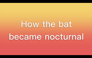


I then found a couple of jungle sound effects on the youtube sound library. I looked through my animation and realised i didn't really need anymore sound effects it was great with the voice over because it was very narrative.
I also found some intro and outro music from the youtube audio library. It was children friendly, sound spanishy/mexicany enough for what i need and its upbeat but not too overpowering so i think it was about right.

And thats it! all finished! there was a slight issue with the sound making a weird buzz noise but i fixed that i just deleted it and re added it. 

I am honestly so impressed with myself  i have never done anything like this before and i was so nervous that i couldn't do it. I have just proved to myself that if i put the effort in i can give anything a go!


Here is the finished result! hope you like it!

Friday, 29 April 2016

Final crit

The final crit wasn't actually that useful to me. At this point I had 1 min 40 left to animate. Some suggestions i got was that the clouds could move slightly to make it feel like their really up in the clouds. I really liked this idea unfortunately to do this on every scene i feel would take far too long at this stage. I also needed to think about title sequence and sound design which i already knew and had planned into my schedule. I also got told and realised myself that there was some clean up neccesarry. I did some of this however it was actually a mammoth task as some of the line work isn't very good. I was talking to rebecca wong and she says its pretty hard to get good line work unless you use a tablet with a screen. Unfortunately i hadn't noticed until i saw it on a larger screen. 

The notes i got in the silent crit where you write a comment on each others paper are as follows:

- Looking really great now audio was a little loud at parts but coming along well
- Voice acting is fab, works we'll with characters expressions.
- Great lip syncing! tells story really well
- This is looking really promising, the animation for the bat especially looks really good, the way he speaks, flies and flaps his feather. I was really sucked in to the story too. Excellent work sam.
- The animation for the bat ears and lip sync works really well together. Backgrounds were really nice too! I think the timing and speed for the beginning parallax need to be faster and the feather for the condor needs to be smaller, just to emphasise how tiny the feather is :) AWESOME (i hadn't actually done the condor scene at that point)
- Your animation and shots work really well with the narration- i really like the story telling aspect of it and can see it being used in schools etc to entertain children. :)


So all in all id say thats a pretty good review and not too many things to fix. 

Thursday, 14 April 2016

Progress

The animating is going well so far, I have made good progress on it over easter and I am being increasingly impressed by myself and my abilities. Because I have managed to keep on time so far I think I may be able to complete this to the standard I wanted after all. Although there is still an awful lot to go. I think with about 1 month to go before deadline I need to start working longer hours. Make myself treat it as a job not something I squeeze into my schedule. 

Tuesday, 29 March 2016

This is a really useful website showing how different birds and bats fly so you can see in detail the way that their wings move. However hummingbirds wings move so fast that i don't believe getting the exact movement is necessary as you won't even be able to see it.
http://www.dailymail.co.uk/sciencetech/article-2776970/Watch-fruit-bat-fly-hummingbird-hover-The-hypnotic-animations-reveal-exactly-different-animals-skies.html

The start of this video shows multiple humming birds playing together which shows how they move. Their wings are fast and the hover then move quickly then back to a hover. This movement is very specific to humming birds so i think it is important to get it right.


Monday, 14 March 2016

Condor lip sync

I have now tested the condors lip sync using the phonemes i created. I did this from the side because in the storyboard we mainly see his talking from side view. I think it actually turned out okay! I was a little bit worried as its completely different to a human mouth. To make this testing process quick i litterally placed the phoneme images on top of each other rather than just the mouth thats why it is a little jittery but i obviously will just replace the mouth in the real thing. This was just for speed to see if the phonemes worked and i think they do!

Condor phonemes

Today i have been working on the condors phonemes. Because the condor has a beak it has been a lot more difficult as birds don't actually talk and their beaks just go up and down. So i had to anthropomorphise it. I decided to just make the lower jaw move and that is what moves in human mouths but i made the upper beak hard so it doesn't move like lips its more like a nose. I think this will stop it looking to cartoony and silly. 

Sunday, 13 March 2016

Quetzal lip sync

Here is my test lip sync for Quetzalcoatl. Think it went alright, not as good as the bat but still pretty good i think!! I think from figuring out phonemes to this 2 second animation it took me about less than 4 hours. I think the actual animation itself was 2 hours but there was no other movement just the lips.

Quetzal phonemes

Today i have figured out the phonemes for Quetzalcoatl so i can do a lip sync test. It was more difficult than the bat but i think it turned out okay. There is a lot less jaw movement in this one as i think he doesn't talk as expressively. He is more refined and quiet.


Friday, 11 March 2016

Paralax

Well that could have gone better… Something that i thought would take a short day to do actually took me 2 days. I was getting a bit confused with what i was doing yesterday so i asked mat and he told me that i was animating the layers instead of animating the camera. This sounded great but unfortunately the way i had created my scene meant that i couldn't do it this way. I had designed it so that things would be revealed from behind trees as you went round and things but this could not be done the way mat had explained so i had to do it my confusing way. Unfortunately as soon as i felt like i had got it right, something else went wrong….many times….I just wanted to punch the screen after a while but i didn't i just carried on correcting things. I rendered it and it looked fine right up until the end!! just a little flash. And also i need to rub out some silly green bits in the foreground. But that won't take long or much effort so i am much happier. However…I am not doing it today i have had enough. And I would love to show you it but its too large for blogger and I'm fed up. I will put it up eventually.

Tuesday, 8 March 2016

Progress

Now I have started making things like backgrounds and some test I am gradually putting these into my animatics. This shows me what I still have left to do and shows it all coming together and eventually It'll turn into the full animation swapping finished parts in as and when they are done. Im not sure if this is best to do on after effects or photoshop but i am currently doing it in photoshop as that is what my original animatic is in and that is what i have on my laptop so i can do this at home.

Bat flight test

So looks like a bat flying is almost like our backstroke except not upside down or in water....

I think it is not nessessarry to look exactly like this especially how the bones move and stuff as my bats hands fit differently but i will try get this kind of movement. I have also noticed that the feet move with the wings, this seems kind of crucial to staying in the air so i will try and incorporate this but we will see how it looks.

From this I have made a test of my bat flying. I have just done keyframes so far as it is just a test and i think it works well enough for that like this but for the real one i will add more frames in. This took me about 2 and a half hours which isn't bad but adding in betweens would probably make it about 6 hours at a guess. 
I think I will actually animate this in one place and use after effects to make it move across screen that might be best. Although it works fine as it is and you just have to duplicate the frames so I'm not really sure what would be easier? I think it will depend on context.


Tuesday, 1 March 2016

fixing

So I have now hopefully fixed my problem as i have made each layer fuller and all the trees taller and/or wider so that i have more room to manover. We now have this as the full image but obviously you won't be able to see all of that as the aspect ratio is different and we will be panning through. Hopefully i have done enough to see a big difference when i try it tomorrow.

Paralax test

So I needed to do a test on this to figure out if my method of painting is working okay for what i want and also to figure out how to do a parallax again before i need to do the real thing. Im really glad i did this because i completely forgot how to do it. I think i need to have another conversation with someone about getting better angles but for now at least i have the basics down. From this i have realised that i need to alter my photoshop documents so that each piece is on its own layer and  also that each layer/tree has more height and width than it needs to that there won't be blank bits. I also need to make sure that each layer of floor is filled because as you can see in this test it creates blank bits. Overall i think this is going to work really well. I may add a few more trees in there on the left though as its a bit bare. I may need another test/ tutorial on how to do this before the real deal. I think i will try look on youtube a bit to see if there are any good tutorials or just ask a tutor tomorrow. Tonight i need to fix the backgrounds so i can properly use them.


Saturday, 27 February 2016

Lip sync test

Tadaaaa! here is my lip sync test! It actually turned out okay! i mean its not perfect but for a first time effort id say its pretty good! I found a couple things needed changing slightly to sound right with the emotion and the word but that wasn't too difficult. I am really pleased with the beginning but it gradually gets a little worse as I think i was getting tired. Might be a good idea to do lip syncing in shorter bursts. This took me 7 hours from figuring out the phonemes to this and i didn't take much of a break.
After playing it back I think the O sound with the lines on the cheeks make it look a bit confusing so i removed the lines and i think it actually works better now. Doesn't look like its gone wrong.
                                       

Phonemes

Today I have been creating the phonemes for the bat so I can do a test of 2d lip syncing which I have not done before. This is how they turned out. I think i got most of the sounds. I think it turned out okay but we will see when it comes to using them.


Friday, 26 February 2016

Test animation

Here is a test animation of my bat. I am really pleased how i am getting his emotion across. I also intend to do a test of flight and possibly lip sync. So far though I think this is going well. All together this took me 5 hours to animate including colour so that means it is taking me 1 hour per second of animation. That means i need 420 hours to animate all of this frame by frame but luckily it doesn't all need to be like that. But that is only 17.5 days which is time i definitely have but realistically 42 days of 10 hour shifts. Again i still have this. This means I am much less worries about getting this done on time as it won't all be animated frame by frame.


The animation

After a few talks with tutors we have discussed the amount of time left compared to the amount of work. I am creating an animation that is just short of 7 minutes long and I have just 10 weeks left 3 of which are the easter holidays and I also have PPP to think about. For this reason the tutors suggested I create more of a motion comic as my voice over is at a standard that can cope with this. It will end up being a little bit more like Jackanory. This means I will still get a finished animation ready for the deadline it just won't be as animated as I first thought. After this is done I will see how much time I have left and start adding more animation in. I think I will have time to do this on a lot of scenes but it won't even be needed on all of them. I will just chip away at what I can and start with the scenes that need the most movement in them. For the motion comic more looking animation I will be using a lot of after effects so I can do parallax and pan through backgrounds and use puppet tool and the transformation tools.
I am feeling a bit better about it now as I was getting a bit worried that I didn't have enough time left but now I actually think if I really apply myself I may even get it done to the standard I had originally planned.

Thursday, 25 February 2016

Cave 2


So I added some extra bits and took away some outlines and i think it definitely brings something to the image. There is much more to look at which means it will be harder to focus on the bat but I can zoom in a bit on the image to cut all that out. This just gives us a sense of where we are in relation to everything. I think the greens really emphasise the beauty of the colour palette which is very warm as my research tells me that children are more drawn to warm colours. I think this is so much better than the previous. It gives a sense of place too, it is obvious we are up high but not as high as quetzalcoatl and it also looks a lot less flat now we have some foreground and background imagery.

Tutorial

Today in my tutorial we discussed some ideas to make my backgrounds a bit better for example with the cave one i need to show the ledge where the opening of the cave stops so we get a sense of space and also possibly a bit of extra cave or background to show a sense of place. Another thing we saw was the difference between aesthetics in my three backgrounds and that is that the forest has no black lines whereas the other two images do. Annabeth suggested getting rid of some of the black lines on the cave and adding more texture rather than it looking like a blob of poo. 
They both liked the look of my new pyramid so thats good I've obviously made some improvement and i am really pleased with it myself. They also like the forest image and we figured out that i had done right by layering the trees and each one having its own ground with it.

Cave

This is my background for the cave scene. I have added some cave paintings inside as i thought this would make it seem like it was a long time ago in an ancient mexican cave. I really like the background on this i think really captured the sunset look.

Tuesday, 23 February 2016

Forest

This is the background for my opening scene where we pan through the forest. I did this on all different layers so that when i put it into after effects it looks like 3d but isn't and can do a parallax. I also might put some butterflies flying through. I think the bat will be playing with the birds on the right behind the big foreground tree.
I used may research of mexican forests to put this together. I like all of the green colours there were many different shades. The trees also seems to be quite intricate and not as flat as the trees we have here so I used a more textured brush and a few different colours to give it a bit more of a bark look. I liked the parrot image so much I had to put it in the foreground. If i have time id love to animate something flying across but Im not sure. I think the parrot also gives some visual interest to the shot and a pop of colour. The leaves down the bottom came up in a lot of images so i think they are pretty native and again add colour and foreground which will help when panning through. Then in the background I added the river and mountains which helps us know where we are in other scenes.


Tuesday, 16 February 2016

Pyramid

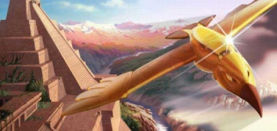
I have finally drawn out a pyramid that looks right!! I was having trouble remembering how to use maya then realised i didn't have a mouse so i searched for ages on google until i found an image that was the right angle and perspective to copy! I was very lucky to find one! 
In this image i have also tried to copy the style of gold that is in cities of gold and i think it makes a huge difference to the quality. I also took some advice from people who said that the characters need to reflect the light and shadow so they look like they fit in the scene. Here is my modified version compared to the original and as you can see there really is a big difference and it makes it look so much more professional.

Original:

Modified: 


Friday, 12 February 2016

The pyramid

So I am having trouble drawing my pyramid/temple. I decided it looked really flat and that i needed to have it at a bit of an angle but when i tried i got totally confused!! I knew it wasn't looking right but my friend said it looked more like a tower.
After talking with mike i realised i am missing a vanishing point and all my lines are flat when they should be at an angle.


Anna suggested trying to use maya to create a pyramid shape and copy it but i was still really struggling to figure out things like the steps so i had another conversation with mike and he suggested going into maya and creating each step and putting them all on top of each other into a pyramid and them move the camera to where it needs to be and then it should be exactly what i want and i can just copy it. I think that is going to work.

The mysterious cities of gold

In the tv series the mysterious cities of gold, the gold statues and figures definitely look like they are made from gold whereas mine look yellow and flat. I think i am going to try and use this kind of colourings and highlights to make my drawings look better.


I like the way they use light in this and it is something i need to learn. Like the directional light. This is like the clouds i want to be using so i think it might be nice to have like a sunburst in them and stuff.


Aswell as these stylistic things  that i like, the whole show is actually based in Mexico so I will get an idea of another person who has done this kind of animation and the aesthetics. It is pretty much what I had in my head visually like the really pretty backgrounds with the slightly more cartoon like characters.


Mexican forest


Here are some images of forests in Mexico that will be used as reference for the opening scene where the camera pans through the forest to find the bat. 


There are often hidden cities within the forests so they will look like old ruins with lovely aztec patterns on them like this, i think that would be nice to incorporate to help set the scene.


I like the use of the red leaves in this to give it a more tropical feel.


I think having birds or something flying across the screen or sitting on trees would be really nice and add a bit of visual interest while the voice over is going. It also really brings us into their world.


This is a really nice clear image using depth of field, i like having things on different layers like foreground mid ground background and i think that will look really nice with the 2.5d after effects technique i intend to use.

This waterfall is lovely and if i can figure out how to make a waterfall look like its moving then i would like to have this in my forest even to just pan past as i think it will show how beautiful the forest is. I could even have a bird or something flying and slashing through it. Maybe I'm getting ahead of myself...


Theres also the river with trees and mountains which i would like to have as what you can see from the mountain but i need more of i horizon kind of shot.


This is just a really cool picture i love the layering of like foreground background and everything in between with the bear as the focus.


I like that this draws you into the centre and you can see through like you are going through it.

This is a nice image of the mountains, river and trees. I quite like this composition but I don't think it would work from above.


This would be good for like when the bat flies up really excited about his feathers.


I think this kind of thing would work better for a view from a mountain but less city, more trees and water.

This is just adorable. I may think about having a monkey on a branch somewhere.


So theres a think in mexico called the butterfly forest! thats pretty cool! We were talking yesterday saying how it might be nice to have butterflies flying across the screen and as they are a big thing in the forest i think i might actually do that!


Thursday, 11 February 2016

After effects

Each shot in after effects is a new after effects composition then edit hem together in premier.
do one long shot of each character while going through all the dialogue and cut it in premier.
Use anchor points on feathers
When easy easing turn on the xyz button on graph to edit the ease
Don't forget about 3d layers
Camera is in layer
lights in  layers
merge and name layers when creating backgrounds to take into after effects
bring in background as composition
turn all layers 3d

Wednesday, 10 February 2016

Concept art

I decided to do this scene as concept art as i was inspired by the photo with clouds and also this is something i wondered how was going to work. Originally I did this set up as i did it in my storyboard. I like the clouds and the temple and i think the colours are nice but it just looked so flat and strange. I like that you can see how high up Quetzalcoatl is but it doesn't have much wow factor.

I then tried it more looking over the bats shoulder so we can see what he sees and moved things around a bit so its not all so centred and uses more the rule of threes. I actually think this works much better and it also means we can see a bit more of the background. I can also see this working better with a parallax than the first which will give some movement.

Aztec temples

In aztec history, these temples were considered 'god houses' and people used to go and pray and sometimes bring offerings to keep the gods happy and still today, people visit them and pray to the gods or ask forgiveness.


"Often a whole area of a city would be dedicated to religious activities. Some monuments would be made to specific gods. Some were built for specific celebrations. The buildings you probably associate with the Aztec religion are the great pyramids. These were four sided, stable structures that can withstand the earthquakes that are common in the area. These would have stairs up one side, and a flat top, often with a shrine on the top."


For my animation I think it would be nice for Quetzalcoatl to sit a top his own temple only it could possibly be made of gold to show just how important he is. The stairs show that the bat could go up to see him but he doesn't because of the respect for him because he is a god. This shows status and power. It does however mean that there won't be any shots of the bat and quetzalcoatl together. 

This is how the temples look. they often have little statue faces up the side.


I really like how this sky looks, looks like the temple is in the clouds which i want it to be like in my animation. As you can see the colours are vivd and beautiful.


http://www.aztec-history.com/aztec-temples.html

Tuesday, 9 February 2016

New animatic


This is my updated animatic using the new shots in the storyboard. I think it does make quite a bit of difference in visual appeal. This re doing things has set me back a little in my schedule but I believe I can make it up.

Modified storyboard

Here is the modified storyboard that i have adjusted after talking to peers and tutors so there are a few different shots to create more interest and also better idea of importance of characters and size difference.

Friday, 5 February 2016

Storyboard/ notes

Yesterday I received feedback from a tutor on my storyboards. The notes are as follows:
- When the bird flies up, make it go out of shot then come up spiralling toward the camera in a birdseye view
- When the condor is introduces on page 5 have a bat in the foreground with the condor large and towering over him maybe panning up to his face. This shows how big and menacing he is.
- Then when the condor is looking at the bat, the bat looks really small and looking at him from above with a shadow of the condor cast over him. 
- Have background features all on separate layers for parallax if needed. make sure you do backgrounds at 6000x4000 so you can pan around and zoom in and out
- In night scene, add a moon possibly quetzalcoatl constellation of stars.
- Like the colour scheme
- Do some shots in full colour/ proper line work to see how they are going to look.
- Make cave structure more elaborate 
- Look at tv shows and see how they frame conversations


Today I showed my animatic to this tutor and some of my classmates. When talking to them afterward I thought of the idea for the intro to be panning through the trees of the forest while the narrator talks until we find the bat playing with the birds. 
These were other peoples thoughts:
- Make Quetzalcoatls home more godly like give him a temple or a throne and use all the classic mexican symbols to make it look ancient and special. Maybe put this up some stairs so he is much higher than the bat.
- Show a shot of the mountains when talking about the condor living there.
- Think about music at the start and end and possibly as motifs for Quetzalcoatl and the condor.
- Make the bats feathers larger to contrast with the tiny feather the condor gives him.
- Make bat silhouette when flying at night and saying you can't see
- Make Quetzalcoatl have a bigger entrance shot.
- Think about use of close up shots and reaction shots.


Tuesday, 2 February 2016

Animatic

This is the animatic for this module subject to change when I get feedback. I quite like how it is turning out however there are a few bits that feel a bit strange like too long and boring. I am getting a feel for how I can make animating a little easier for myself though. As it is such a long animation with not that much time to do it in I am going to have to cut a few corners like using after effects for simple movements and things like that. Doing an animatic has helped me figure out which parts I will able to do that with. I personally think it flows nicely and doesn't feel too long even though it is quite long. I have managed to get to the stage i intended by the right date although I still need some alterations based on comments.

Friday, 29 January 2016

Storyboard


This is my first idea of a storyboard. I did it in colour and using really characters not stick men because I think these are very important aspects of this animation and gives a better idea of what it will look like.
I really want is to be colourful as i have found out that this is engaging to children. They also seem to react better to warm colours so I plan to use a warm palette. Found here: http://jrscience.wcp.miamioh.edu/nsfall01/FinalArticles/ColorPsychology.Childrenv.html . And also it Mexico is a very vibrant colourful place/ culture and I want to show that in my animation. I also think it will be useful to track the time of day using colour as it goes from mid afternoon to night time.
 I think some of the shots are a bit flat but I like it overall. Update: Comments from Annabeth have really helped with making the shots more interesting. Here is what she said:
 - When the bird goes out of shot on page 4, make the next shot a birds eye view where the bat starts off small, flies round the screen and comes towards the camera looking really happy.      
- When the condor is introduced, show his size by having the bat in the foreground and the condor large in the background and pan up to his face. Then when the condor is looking down on the bat, make the bat really small and from above with a shadow of the condor around it. 
-She also said to look at tv shows to see how the frame characters in conversation.

Sunday, 17 January 2016

Condor

I realise i need to find out what a condor looks like and double check it is native! Thankfully it is. 
They are pretty ugly and scary looking. Having just finished my dissertation about character design, looking at the condor makes me think he is evil. The colours are very dark, mostly black, with a big sharp beak and  the plumage around his neck is like malificents collar!Lots of dangerous looking spikes and n evil looking red around the eyes. This works really well for my story as he is the big bad bird that everyone is afraid of and he is the reason the bat loses his feathers because the condor throws him off the mountain.


Friday, 13 November 2015

Extended practice

So for my extended practice module i intend to animate the story of the bat who wants to be a bird. I have got permission off the person who i heard the story told by and we have arranged for him to come to leeds and perform it form me so i can record it for the audio. I will pay his travel expenses as his fee. This will be done after christmas as it is a good time for us both.Also this will get it done well in advance so i have something to work off when I start planning the animation. I am quite looking forward to this project. Then if i get my storyboards and animatic done by 3rd February then that leaves 3 months to just animate the whole thing. Fingers crossed that will be enough. I think ill aim to get it done a few days in advance like the 2nd May just so i have some leeway and time to correct and stuff incase things go wrong.

Wednesday, 11 November 2015

GOOD NEWS

Good news, the journey man did respond but it went into my junk mail so i didn't know!! he said yes to using the story but said there is also someone who has already done it before. It is on this website:
http://www.mexicolore.co.uk/aztecs/stories/legend-of-the-bat-1-the-video
I understand that she used aztec kind of style drawings as its a mexican story but i actually think the characters could have been designed better so i think i would still like to try. I also think the animation could be more fluid so i could attempt that. I would also like to see more use of backgrounds.

Tinga tinga tales

Unfortunately the man i asked to use his story about the bat didn't respond so i have had to resort to plan B. This is to find a folk tale such as "how the leopard got his spots" and then animate that for children.
Now the first already animated version i see is this. It is very old fashioned, long winded and a little racist with poor almost animation.

This is more the tone of voice and pace i am looking at

As discussed in my tutorial, doing a story from a difference place in the world would make me have to do a lot of research which would inform my designs more. Like Tinga tales which is very african based.

I really like this i love how the culture is all in there and i would like to do that too. However i don't think i would like mine to be quite as long as that. There are lots and lots of tinga tinga tales and i don't want to copy them but i do really like how they are done. 
These all come from the Just so stories by Rudyard Kipling.
I found this website that has all of the stories on 

Tuesday, 27 October 2015

Extended practice

For my extended practice module I intend to animate an existing story that i heard on a lantern walk around skipton woods. This will be aimed at children mostly. The story is about a bat who wanted to be a bird and basically tells the story of why the bat is now a nocturnal animal. I will hopefully design the characters as part of my context of practice module.
I have contacted 'the journeyman' who was the story teller asking permission to use his script and also asked if he would be interested in doing the voiceover for me. I hope he responds soon as I will have to come up with a different story to design my characters for COP on too.

Friday, 15 May 2015

Collaboration

As i had some spare time I decided to help Becky Gilby out and do her animatic. This was an after thought as i have already submitted my work but I still did it so I thought i should blog it. I used the characters that Rosy had already drawn and just adjusted to make it look like it was moving. I also created the background for the alley way and the trash bag.

Your BLT sandwich

Here is my animation in its pretty much finished form. I think this will be how i submit it but i would like to try and get it completely finished.


Thursday, 14 May 2015

Evaluation

This project has certainly been a challenge. I decided to work on my own as I wanted to try a hybrid of animation and a lot of people were doing stop motion and i didn't want to. This gave me a lot of work to do all by myself. The good thing about this was I didn't have to arrange with everyone when and how to do things. The bad thing was that I didn't have anyone to bounce ideas off of and delegate tasks to if someone was better at it. I could work when i like on what I like and not feel bad. I do think having a partner or group would've improved my animation in hindsight. 
This project was also difficult in that I was learning new techniques and it was all a bit confusing for a while. I learnt how to make 2D images move through 3D space using maya. I had not thought of this technique before, I thought maya was just for 3D things. It was tough to get my head around what needed doing as i didn't do things in chronological order. I think i should have done that to make it easier but i couldn't because there were things i didn't know how to do.
I think the part i enjoyed the most on this project was actually creating the assets. I really enjoy animating the pig too. 
The way i tackled the audience was by making things very clear both visually and verbally so it is easy to understand for both children and adults. This way it can be used as a teaching method or just something to explain for personal use at any age. I believe the tone of voice is clear yet not patronising. 
I think if i were to do this module again I actually would've chosen something a bit more fun to work on like Cara, Rebecca and Annas one as i think it would have kept my attention more and made me want to work on it whereas i got quite bored with this one. I am happy with how it turned out in the end but i feel it is not my best work and I think its the idea that is holding it back. 
I also would've worked in a team so i could concentrate on a specific skill and we could have made everything to a better standard.


Almost there

Today i fixed my most of my maya issues (last nights renders turned out to be useless as there were lots of black boxes everywhere) So i sorted that out and tonight i have added extra sound effects from freesfx.com and then i decided to see what a music track would sound like on it and i decided it made it more interesting. I chose one from  http://www.purple-planet.com . It's nice background music that isn't too over powering. It's also not sad and a bit jolly which lightens the mood much the way the tone of voice is in the animation. 
There is still a couple of bits in maya that need editing (the flash of a box and the tomato plant needs lifting) but i will do that if i have time tomorrow. If not-this will do fine for submission, at least it is finished. 

Title sequence research

The incredibles is i brilliant title sequence, I like how it starts of with the normal family then the dad rips open his shirt to reveal the logo and then its all action from there.

Unfortunately our title sequences aren't going to be long like this as that would be like the same length as the actual animation.
Like this which is much shorter and cuter.It is still too long though
I think i might just have to have the title move across the page or something reeaaally simple.
A little more like this:

This one is really cool! Its an impressive use of motion and also the text is twisted and has a cool shine on it but i think what makes it is actually the music they use! its very powerful and dramatic.


This is really cool too but i think thats something to learn as a whole project not just for my title sequence as i dont have time!

Wednesday, 13 May 2015

Maya

I have made a lot of progress in maya today. I now have all my assets moving around the kitchen. It's not perfect yet but heres a tester. For some reason the tractor decides to go black half way round so ill have to check that out and also it only decided to render these frames, but that might have been me not checking the render settings properly. but it is enough to show you where i am at.

Tuesday, 12 May 2015

product design

Today i redesigned my dvd cover and poster. I was not happy with my original designs as they just looked cheep and tacky and boring. Rosy gave me a great idea to make the type look like a sandwich in 2 slices of bread. I thought this looked better with a blue background. I think it looks much more professional now especially the poster. 

PROBLEM SOVLED!!!

For the last couple of days I have been stuck with maya. although i exported my files as png's and clicked rgb and alpha so i had a transparency setting, it still wasnt working properly! It made me have ghost objects! but today with annabeths help, the problem is solved! for started i shouldnt have been creating mp4s then exporting them as png's afterward, i should have exported png's from photoshop, and clicked straight matted. This part was very important as that is what took away the background properly and also made the image the right transparency!!! definitely a successful day! 

Here is a test of my pig in 3d space. its not quite right yet but at least he isn't a ghost anymore. I will edit everything tomorrow  and hopefully put it all together. 

Monday, 11 May 2015


A correlation i see between these posters is that they are all a bit dark, they feature a main character, 3 of which by a close up headshot. they all have the title on.some have more details like release date, some have actors names or "from the makers of" as this might sell the film. 
Now i don't have a main character, or famous actor or anything like that so I actually don't know what to do to make my poster look awesome>?