I think this video is good because it's slow paced and is aimed at beginners telling you where everything is etc and how to use the video layers so the layer is only visible on one frame etc. Very clever stuff that I am looking forward to playing with.
Thursday, 27 February 2014
Rotoscoping
I think this video is good because it's slow paced and is aimed at beginners telling you where everything is etc and how to use the video layers so the layer is only visible on one frame etc. Very clever stuff that I am looking forward to playing with.
storyboard
Rotoscope
Monday, 24 February 2014
Rotoscope
Experiments
I decided to experiment with colour to see if this looked any better and I actually think that the black and white/ shading tonal drawings work better. This is nice but it almost makes it seem more childlike.
Rotoscope
Playing with a new technique
I decided after the crit that rotoscoping might help me get the technique I wanted into my animation. So I had a go at drawing over a still image of a child. I think this gives a really neat and accurate representation which is what I wanted.
At first I did just a line around it and it looks good like this but I decided to give shading a go and decided that I really liked this.
Talking to Mat I have decided that even though this will be time consuming, I would like to try rotoscoping because it gives me the effect I want and also it's a technique I've not tried before so it will broaden my animation experience as my last 2 projects have just been drawn on photoshop.
We have decided that I would do al the frames in lines and then depending on time I could shade them all afterward.
Wednesday, 19 February 2014
Drawing style
This is the sort of style I want to use on my animation. It still has realism in it but it's simplified which make it look like more cartoony. I think the first image will also help me on creating my character because he looks the same kind of age as I want.

Animatic
I created my animatic with an example of sound. I may use this at the end I, may not. I added the scenes with the writing on this gives me more of an idea of timing.I decided to fade them in and out because this is what they do on other adverts like this. I noticed playing this back that it shakes slightly on the fades so on my final piece I will have to try and find out why that is happening. I am quite pleased with this though and I'm looking forward to animating. I can also see that when I import my images into premiere they are the wrong size. I will also have to figure this out.
Programme code
I researched about the watershed and what can be shown on TV and what can't and this is what I found http://www.ofcom.org.uk/static/archive/itc/itc_publications/codes_guidance/programme_code/section_1.asp.html
Basically any violence or portrayal of violence should be shown after the watershed. Part of this is because it can really disturb kids. Therefore for my ideas I would need to be aiming at the adult audience. Having spoken to Mat as well I have decided to go for my first idea as this targets the older audience.
Basically any violence or portrayal of violence should be shown after the watershed. Part of this is because it can really disturb kids. Therefore for my ideas I would need to be aiming at the adult audience. Having spoken to Mat as well I have decided to go for my first idea as this targets the older audience.
Story boards
This was my first idea. The boy under the blanket reading a book, the father comes and switches the light on and the boy looks frightened and the man walks towards him. The screen switches to a blank page with words saying something along the lines of "everyday 10 kids are abused in their own homes" (but obviously I will research this). Then we see a boy at a desk in school with a black eye. The teacher just carries on with the lesson. Then back to some words like "people know but they do nothing".
Then we see the boy doing homework in his room, the dad storms in and throws his book across the room and storms towards him. Then we see him grabbing the boy and shouting at him. There's another screen with words on it then we see the boy sat in a corner looking scared and the camera zooms in on him. There is one last screen with words saying something about if only he had help, then the childline logo. There will be sad music in this, no dialogue. I think this will help evoke emotion.
My next idea was of a young girl drawing a picture of her and her dad. We zoom into the picture and it comes to life. The girl drops her glass and runs away. The dad is angry and runs after her and grabs her. We switch to a long shot and the dad is now depicted as the devil standing over her. The dad walks away now drawn normally, leaving the girl in the corner. Then the childline logo is shown. I was thinking maybe before that it could zoom back out to the girl drawing and maybe she could screw it up and throw it away. I'm not sure if I could make this last 40 seconds thought but it might. I wouldn't have any words in this at all and just let the imagery speak for itself.
Monday, 17 February 2014
Idea
An idea I had for the story in the childs perspective was that the kid would be drawing and theres a voice over the top saying "my daddy hits me" and the drawing/ animation shows that. "sometimes he says its all my fault". "I'm scared." "I need help". During this the childs drawings progress into her curled up in the corner maybe the dad turned into a monster casting a shadow onto her.
Charley says
The Shining
Abuse in media
The shining is another example of the different ways abuse can be portrayed in media. In this instance the violence is a result of alcohol, and fish bowl syndrome. This is done in a horror movie, this means there will be lots of visual violence and an emotional response from the audience including them being scared, worried for the character and angry at the man doing it.This again is a man who is murdering his wife an child. This seems to be the go to way round in media. It's not as often you hear about the woman killing her husband and child though it does happen. I happened to glance at the newspaper the sun the other day that someone had left on a table in McDonalds and there was lots of pictures and most of them said underneath 'Black widow'. It happens, it's just not used often in films.
This is a good way of showing the detail of the abuse however again I don't think this is something I could use in my campaign as it would be too graphic. It may also scare children, that's if it's even allowed to be aired in the day time. If it's not then children can't see it anyway so don't even know childline exists so even if the adults give money to this cause, the children won't call up to use it.
Punch and Judy
Abuse in media
In Punch and Judy, Mr Punch kills his child, wife, policeman and more including the devil himself. This makes Mr Punch a cereal killer. That isn't funny at all but in this instance the puppeteer makes it funny with a lot of silliness and slapstick. When this show first came about it was aimed at a more adult audience and has been adapted somewhat for children. In this story we feel no sympathy for the dead. We see what Mr Punch sees- annoying nagging wife, irritating baby etc.This is a completely different way of seeing abuse in the media. It's almost positive whereas you usually see it as negative and that these people need help. That is society today for you. When this was shown in the Victorian times people may have felt sorry for punch but no one would really bat an eyelid at his actions.
I think this shows a different way in which abuse is portrayed but I won't be using comedy in my campaign as I want to evoke an emotional response.
Friday, 14 February 2014
Sketch book
In my sketch book that we were asked to keep, I have been drawing things like this. This particular one is Elena Gilbert from Vampire diaries. I thought it had been a long time since I had drawn anything like this as there is not much call for it in animation. Imagine animating something detailed like this! Not fun. I am really pleased with how the hair turned out and I am pleased I can still draw like this as this is my first attempt in ages. I definitely need to figure out how to draw lips though. Took me many attempts and its still not right!
I have also been drawing from photographs that I have from my holidays and such:
I am quite pleased with how my figurative drawing has improved recently as before they would just look out of proportion like with giant heads and skinny legs etc.
I want to turn my sketch book into something filled with memories and things I like and inspiration.
Seeing sound
You spin my right round
For this project I tried to find an interesting object. Everything that looked interesting was either round
or square. That would be boring, unchallenging and wouldn't help me get better at foreshortening.
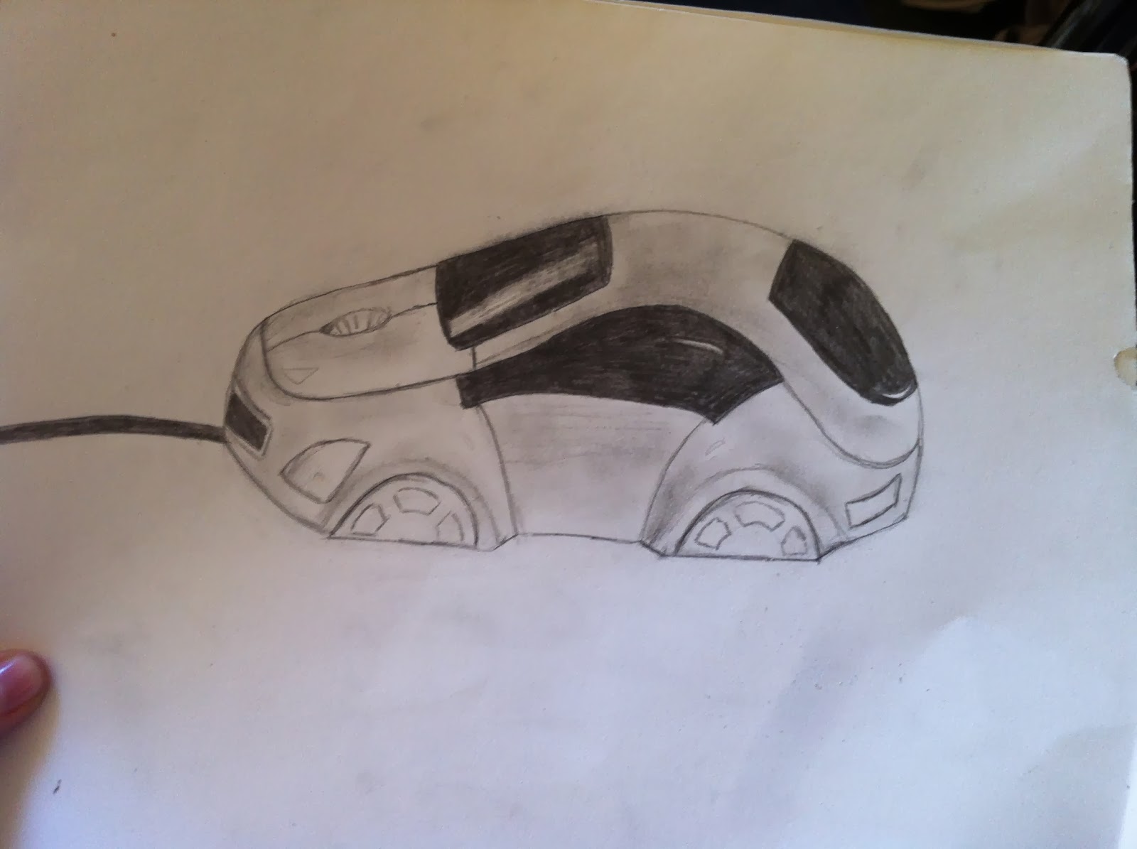
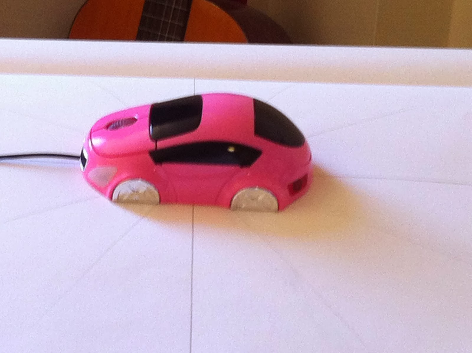
So I thought it would be fun to draw my mouse that looks like a car...wrong. I can't draw cars. And this one isn't even the right shape so it just went wrong.
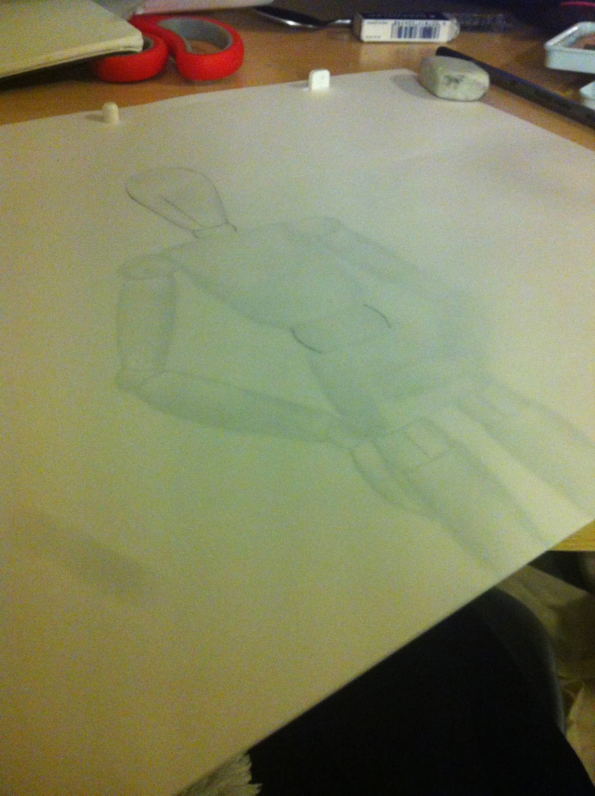
My next most interesting object was my quivering bloke. I thought this would help me get better at the human proportions, drawing from different angles and foreshortening which will definitely help me in later animations.
To start off with I drew out some lines on the correct angles of what I needed to draw, drew a little line on the base of the figure to line it up with then placed the figure in the centre.
Next, I started drawing my figure onto animation paper. This would help make sure that the bits that stay central actually stay in the same position so that when I scanned it in it wouldn't move about across the page and it was the correct size. I could also get a sense of how this would move and if it looks like it's spinning by flipping the pages.
This is my finished animation. What I have learnt from this is that the first thing I do before I start drawing, is to draw a 16:9 box so that when I put it into an animation it will be the correct size. Over all I am pleased with my work. I am happy with the quality of drawing and I think I did pretty well at foreshortening. I quite enjoyed this task and love my end result.
or square. That would be boring, unchallenging and wouldn't help me get better at foreshortening.


So I thought it would be fun to draw my mouse that looks like a car...wrong. I can't draw cars. And this one isn't even the right shape so it just went wrong.

My next most interesting object was my quivering bloke. I thought this would help me get better at the human proportions, drawing from different angles and foreshortening which will definitely help me in later animations.
To start off with I drew out some lines on the correct angles of what I needed to draw, drew a little line on the base of the figure to line it up with then placed the figure in the centre.
Next, I started drawing my figure onto animation paper. This would help make sure that the bits that stay central actually stay in the same position so that when I scanned it in it wouldn't move about across the page and it was the correct size. I could also get a sense of how this would move and if it looks like it's spinning by flipping the pages.
Thursday, 13 February 2014
WALL E
Tom and Jerry
They also use the musical score to say what is going on. If there is a chase then the music would be fast and interesting and high pitched. If someone is sneaking up the music would start low and move up in pitch slowly. Things like that help tell a story. This is what the majority of the sound consists of because it is predominantly non dialogue so they have to tell the story another way.
Rango
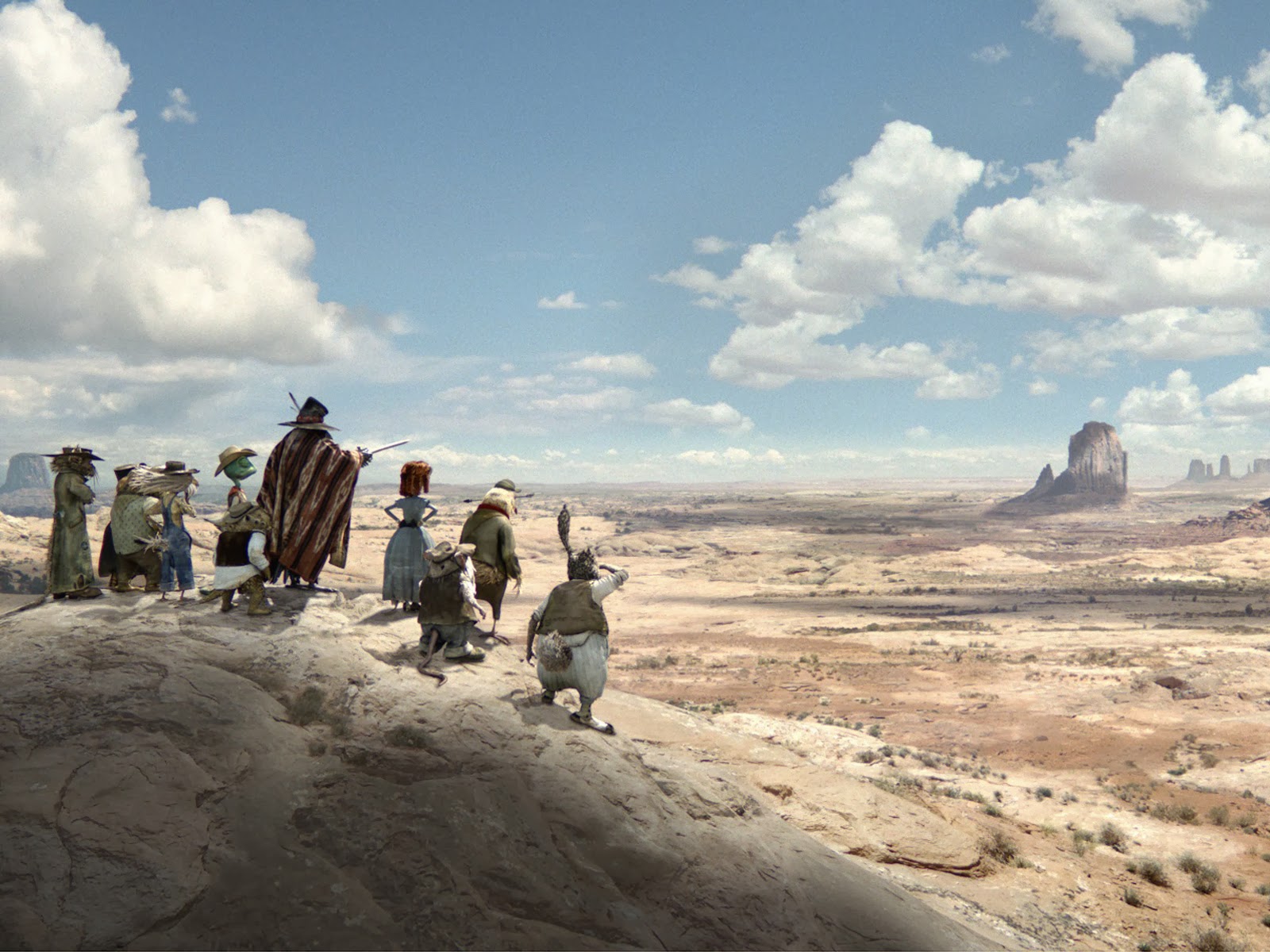 Rango uses imagery to set the scene well. From this image along we can see that they are in the desert far away from anything with a giant expanse of land that feels even bigger for these small animals. They use shadow and colour to show time and heat and the land just seems to go on forever.
They show through their backgrounds what kind of town this is. It's all old and rusty and breaking. Everything looks like its about to fall apart. It's dry and hot and people are busying about getting on with their lives while you can tell the two characters are above all this on a balcony. This kind of shows the turtles status because he is their leader so he is higher than the rest.
Avatar
I think Avatar really uses backgrounds and scenes to help tell a story. Take this image for example.
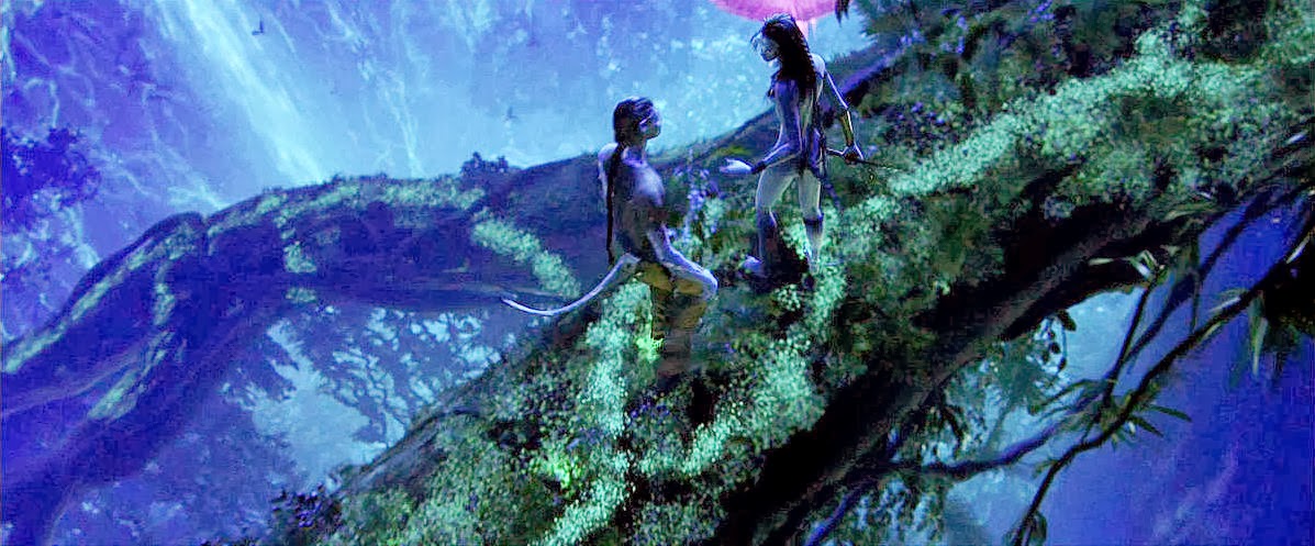 From this we can see that it is in the evening because it's dark with a moonlight kind of blue hue and there is a lot of contrast and shadow. Also from the angle they chose to shoot this scene we can see exactly where they are. They are high up in a tree on a single branch above and huge drop into a waterfall. This gives a sense of danger and also how Nala is used to this where as the guy isn't.
I like how they use lighting in this to show the light coming through the tree tops. This gives you a sense of where you are (under trees) and what kind of time of day it is. It's around the middle of the day because the sun is shining through the top and its bright. They use the foreground, middle and background in this with the rule of thirds. I like the colours too they're nice and bright.
I definitely think that they do a good job in setting the scene. Like when they first fly in and see like this...
It shows just how big this place is and that it's magical...theres just rocks hovering everywhere. It is a giant expanse that it absolutely beautiful and fills the audience with a sense of awe. This makes them feel bad that they want to knock this place down.
Monday, 10 February 2014
Childline
Childline was founded in 1986 by Esther Rantzen from 'Thats life' the tv show. She suggested to the BBC that they make a new programme called 'childwatch' which would be about child abuse. This would hopefully detect children that were at risk before they were in any danger. After the programme, a helpline would be open so that current sufferers could call up. After this Estehr Rantzen, BBC supporters, Sarah Caplin and Ritchie Cogan decided that there should be a 24/7 helpline. This was possible thanks to Ian Skipper.
Childline then merged with NSPCC in February 2006 when extra recourses were pledged 'to make sure no child's call goes un answered'
Child line has 12 counselling centres in the UK, staffed mainly by volunteers. These are in Glasgow, Aberdeen, Manchester, Liverpool, Prestatyn, Birmingham, Nottingham, London, Belfast and Foyle with additional online only centres in Leeds and Cardiff.
Calls to Childline are free and will not show up on phone bills. Calls can be made at any time day or night and children can call about ANYTHING even if they are just worried about a friends well being.
Other places around the world have also jumped on this and have their own childline like componies or have the same branding as our UK ones. These include: Childline India Foundation, Childline Ireland,チャイルドライン (Japan), Vaiku Iinija (Lithuania), Childline South Africa, National Child protection Authority of Sri Lanka, Childline Helpline Tanzania, Childline Trinidad and Tabago, and other organisations in Nambia, Trinidad and Tabago, Gibraltar, Kenya, Zambia and Zimbabwe.
Examples of things that childline work with are: Abuse and safety, Home and families, School and college, Feelings and emotions, Bullying, Self harm, Sexual identity, Mental health, Sex and relationships, Life issues (autism, money, death etc.) Friends, Online and mobile safety, My body, Damaging yourself (drugs, alcohol, smoking) Crime and the law, Deaf zone and Racism. There is also a link to support after childline, when your no longer a child.
You can email, post on message boards, call, online chat or 'ask sam'. There are many options as some people might be afraid to phone, especially in our generation people much prefer to go online.
The website interface is very friendly, interactive and easy to navigate. Theres even a little 'hide page' button that i just find that you can very quickly click on and it takes you to your home page. They have thought a lot about what the child might need. It is packed full of information and it's all done in a child friendly manner.
Research
Mood boards
I put together some mood boards for my campaign that I thought of. Even if I end up changing my idea, these would still come in useful. I have put together images of scared children, angry men, ideas for drawing styles, expressions etc. I think this will help when it comes to story boarding as this will help with reference.
I think the facial expressions on the top left will help me get the anger in the abuser especially the mouth shape. I like the simple drawing style of the shutterstock drawing but I also like the next one down which is a bit more detailed but really nice. I have the logo on this page too because this will have to be included somewhere in my campaign. Two of the images in this set have the child in a corner, this shows they're scared and they're trying to hide. A corner feels like a safe place because nothing can get you from behind. Although if something gets you from the front, you cant run. One image is a child in despair and the other is a child getting help. The way the cord on the top image goes towards the screen is almost like your helping the child. The image in the middle is an existing campaign. This shows a shocking image with a message at the side.
I chose the first image on this page because if a child is asking for help and is nervous and sad they would probably be looking down. Down=negative. The next picture is an idea for drawing style and colouring. This is like a watercolour style. The black and white photo is another idea for a drawing style. This is a semi realistic style which I quite like. Next we have an angry man, I thought this angle would be good because it makes you feel like the one that he's being angry at. This created a sense of empathy an make make the audience want to help because they didn't like feeling that way. On the bottom left we have more facial expressions which look like they would be very helpful. They have the expressions from a different angle and also in a cartoony but real style so might be easy to recreate in any style I wish. The bottom right image is a girl on the stairs crying into her knees. This is an image of a girl who's given up or hiding.
The first image here was mainly about the expression and being a real child to have reference from, the same with the girl at the bottom right. The top right is a style idea. This is like you have traced a real image which is something I actually might try. We also have a man shouting on the phone, I just liked the angle of the shot I wouldn't have him on the phone. There is an image of a child on the phone because this was an idea i had and the same with the homework images, these were for reference for my first idea. There are a couple of different angles but they are both nice images.
These mood boards give me an overall sense of the charity and what they work with. I would now like to research further and find out exactly what other circumstances they work with.
Saturday, 8 February 2014
videos
Here are my finished animations. I really like this first one, I think it expresses the sound really well and I am proud of how it flows and looks like it fades which is what the sound does.
I am not as pleased with how this one turned out. I now know that I shouldn't have used the leaf brush as that has nothing to do with frying eggs. I just liked the way it scattered colour. I guess I could have done that myself though. I do like the tapping part at the beginning.
I quite like this one how it looks gloopy and splashy however Mike said it was a bit too literal. I agree now but I still like it. It's not exactly an object and it does work.
I really like how this turned out. The electric blue on the black looks ace and I timed the sharp spark perfectly! I can see from this that I need to start working at a higher frame rate soon because it is a little bit jittery.
I didn't like this one at first but actually I think it really does represent the sound. If i had time i would try and make the red spikes a bit sharper.
Friday, 7 February 2014
Drawing sound 2
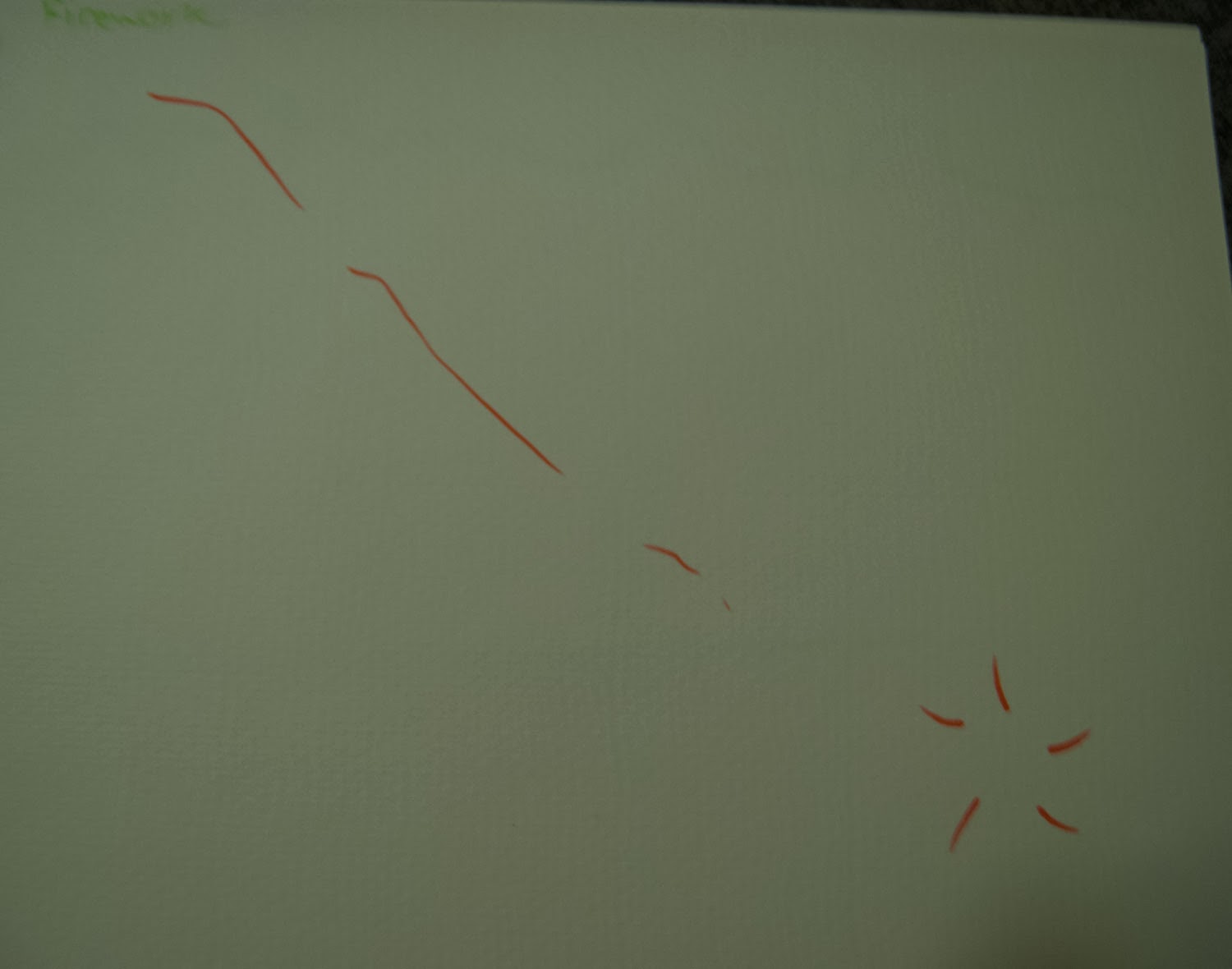
This is the electrical sound again using a few different types of pens and colours. The red one i put a little star on the peek to show like a spark but I don't think that works. And the blue still is the best representation.
This one is the sound of a firework like a screamer. The pitch goes down so I made the line go down. Then there is a pop at the end. I think this definitely needs a black background to show it's a firework...although the point isn't really to show what it is! Just the sound! I like the single lines as apposed to the blue one i tried with scribbles. It describes the clean weeee sound better.
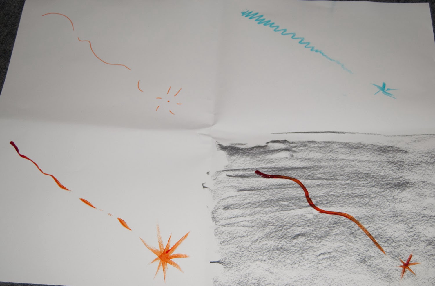
This one had two sounds on one track. There was an annoying sound and also a constant sound like someone flat lining. Though my first attempt shows them far away from each other but they aren't when you hear them.
I also thought about pitch and how the constant was higher pitched to i tried that at the top instead of bottom. Then I tried the sounds over the top of each other. I think that works best. I also tried lots of different media such as pen, Pro-marker pastels, charcoal and acrylic paint.
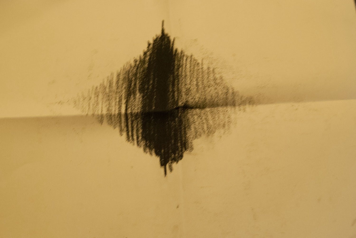
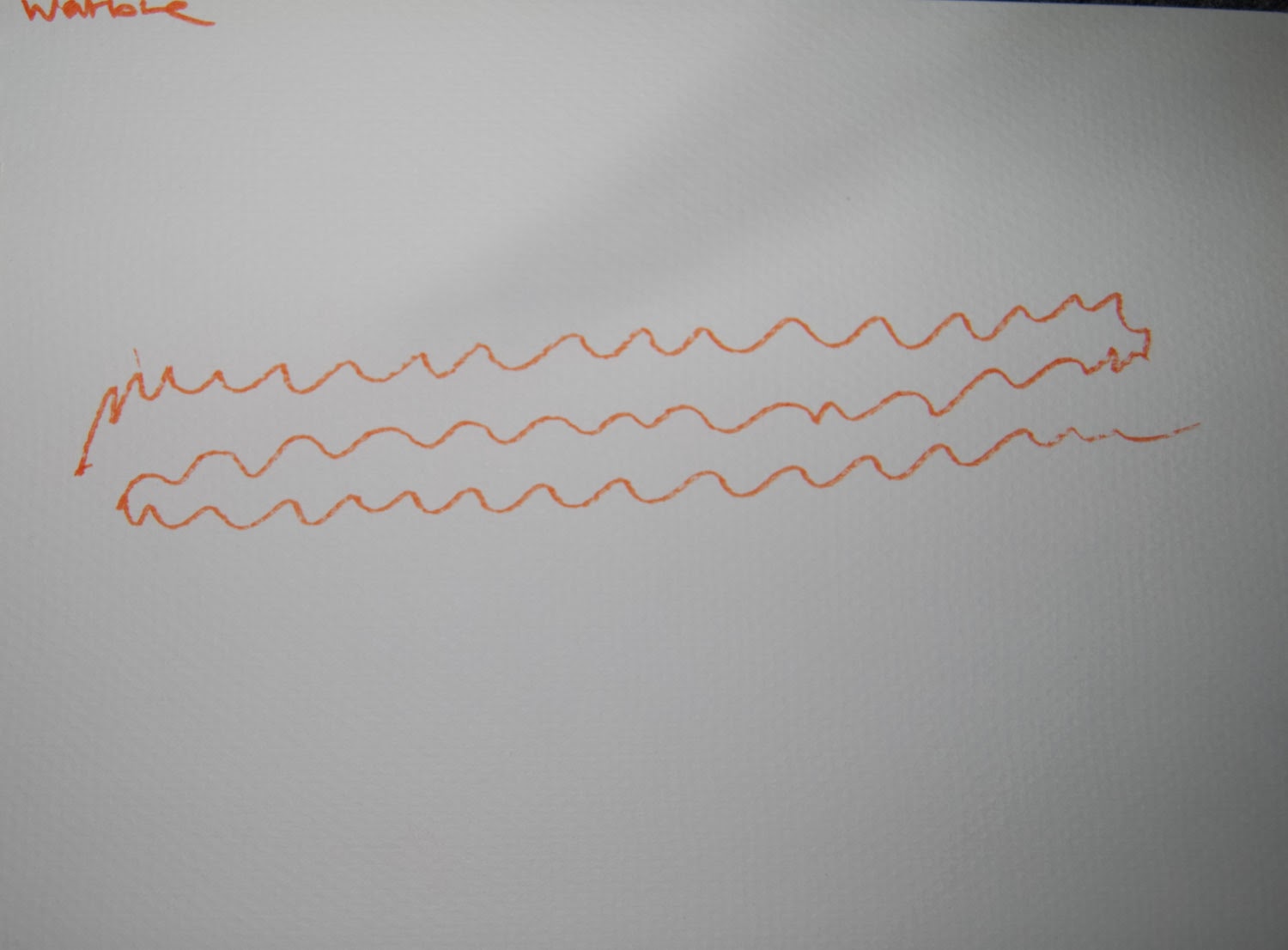
This sound went on for ages and was just wiggly and warbly so that's exactly what I drew. A wiggly sound. I played around with colour and size and decided smaller was better for this sound because it wasn't really loud. I'm not sure about colour but I don't think it needs to be red, for the same reason. It's not loud.
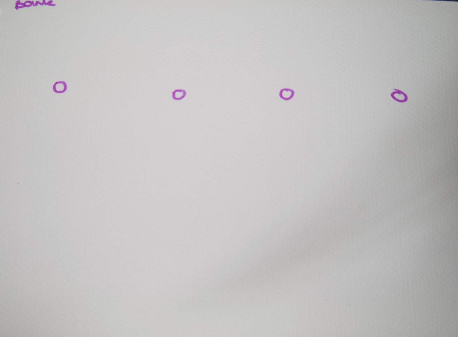
This sound was like short sharp plonks almost like drips. They had pauses in between so I put gaps in between each dot. I tried different kinds of dots in different shapes to see if they expressed the sound anymore. I think They all work so its difficult to choose!
This one was a dentist and when I was listening I could hear one sound coming from the left that was soft and one sound coming from the right that was loud, sharp and annoying. So I used soft colours and shapes on the left and spiky blacks and reds on the right that have different peaks because the pitch is different each time.
Thursday, 6 February 2014
Drawing sound
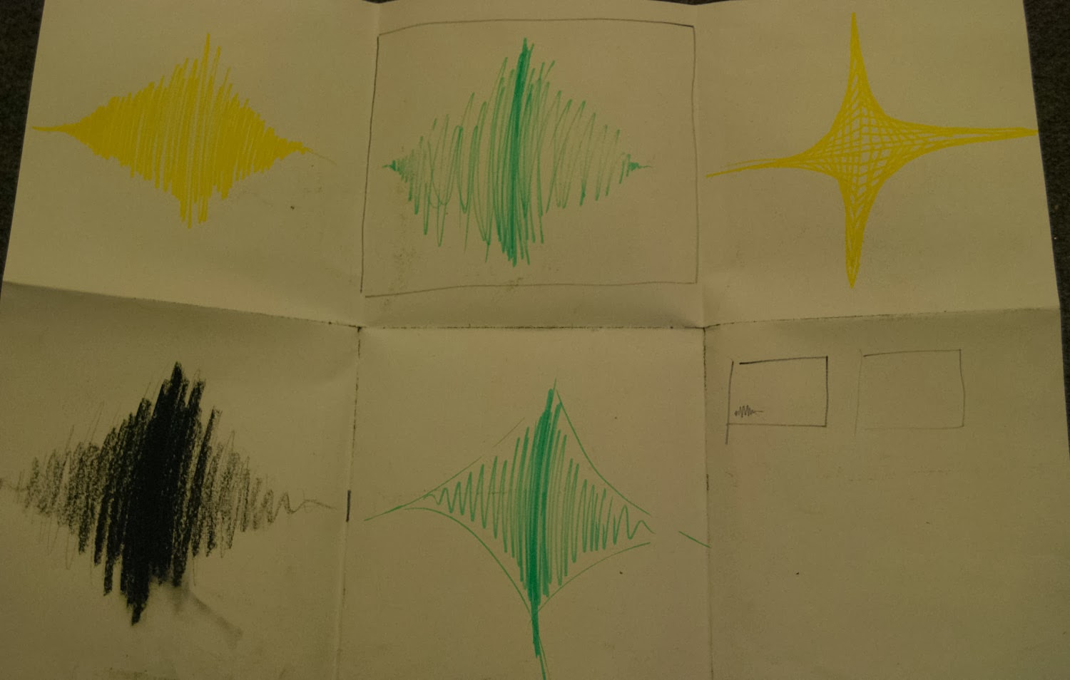
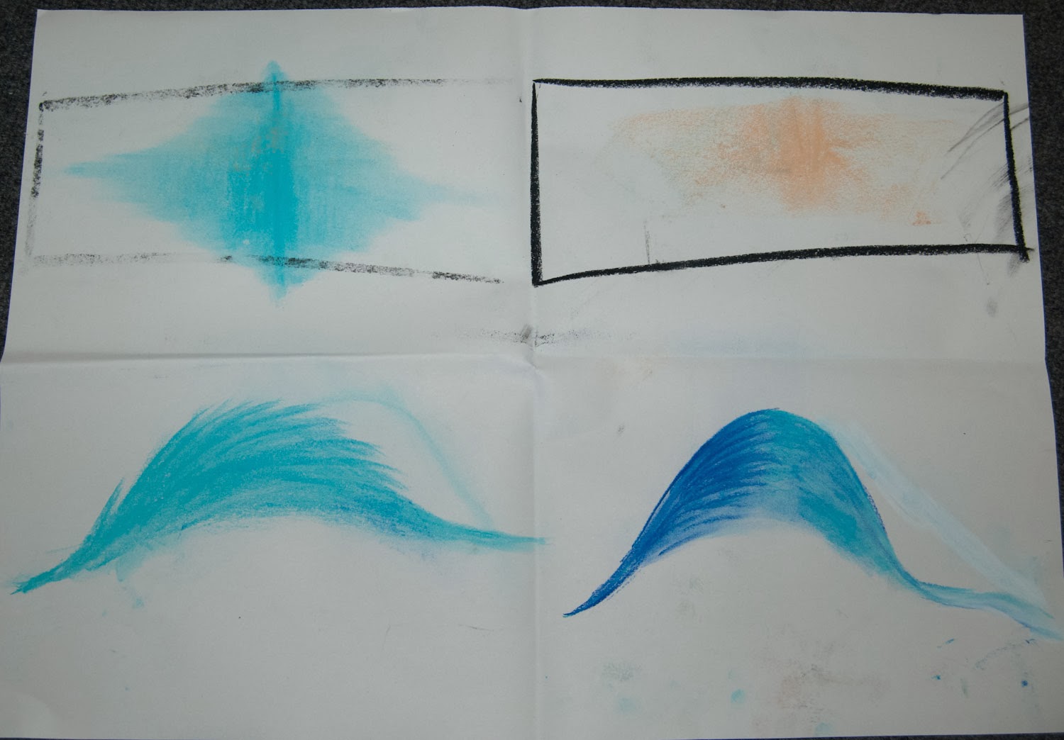
In this project we had to draw sound...sounds crazy. It's so difficult to draw something you can't see! We were given a list of sounds to choose from. This is the first one I did. It sort of came in quiet and built up then faded out again so i drew it getting bigger filling the page but also the colour gets more intense. Mike said that it shouldn't touch the top of the page because that means it's scratching where it makes a horrible noise and you don't hear that in this sound so he said to just be careful about my placement.
I tried a few variations on this using different colour and different media. This included felt tip, charcoal, pastels. I liked the pastels best because it faded much better.
I think I still prefer the shape I originally used.
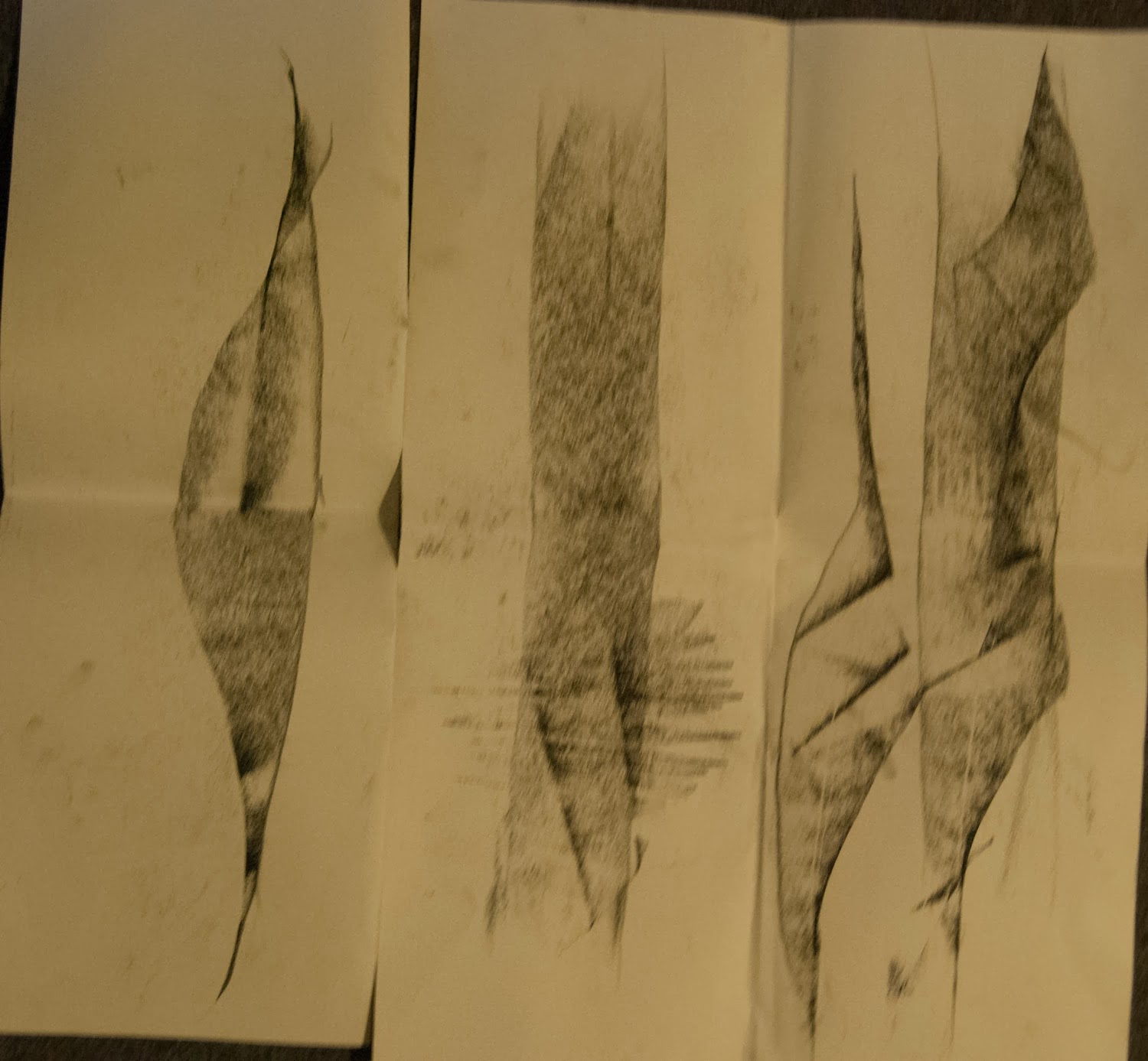
This next one was a gloopy squishy grosse sound so I used greeny boggy colours to represent this. I used felt tip but also a type of ink. When it dried it still looked wet which looks really cool. I placed the blobs like the pitch when it went up and down.
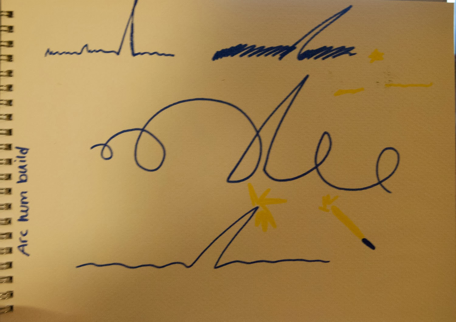
This sound was electrical and buzzy then there was a snap and it went back to normal. I used blue because to me that is electricity. I came up with a few different lines to start with.
This was the sound of someone frying an egg. I did it like it started in the middle and then came out and as the sound got quieter the little shapes got further apart.
Another idea I had for this is below. I put in the tapping on the side of the pan like 2 solid dots because it was a solid sound. Then there is a swoosh where the egg pours into the pan.Then lots of crackling. I think this works quite well.
Monday, 3 February 2014
Planning
I decided to make a better plan of my time on this project. Although I made on last time I didn't use it much because it wasn't clear and not accessible. I have hung this on my noticeboard so I can always look at it and I have also taken photos on my phone so it's easily accessible. Hopefully I'll be able to stick to it better this time. I have also stuck sticky notes around my room with deadline on.
Subscribe to:
Comments (Atom)


