

The next image i believe is by the same person as it uses the same style. I also like how where the grass is it comes from nowhere but it just gives that effect of ground so the frog isn't hovering in mid air.
 I really like the colour palate used in this image, I think it is really nice and soft and I think could look a bit more realistic on a photographic background than bright colours would. The drawing style is also very cute!! Im not really sure cute is what I am going for I don't really have any characters in my animation. I just like the softness.
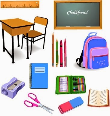
 I am finding it really difficult to actually find images of objects that are in a nice style that I am looking for. These seem a bit more 3D than I had thought of but I do like the simplicity. I like the shadows and highlights as it would maybe bring it into the right world but I think everything is just a bit too perfect and rounded.
I quite like this style, I like the hand drawn aspect and it still had shadows and highlights in it but in a more natural way. I think this kind of style possibly mixed with the colours and softness in the characters above could look really nice.

No comments:
Post a Comment