Friday 13 November 2015
Extended practice
So for my extended practice module i intend to animate the story of the bat who wants to be a bird. I have got permission off the person who i heard the story told by and we have arranged for him to come to leeds and perform it form me so i can record it for the audio. I will pay his travel expenses as his fee. This will be done after christmas as it is a good time for us both.Also this will get it done well in advance so i have something to work off when I start planning the animation. I am quite looking forward to this project. Then if i get my storyboards and animatic done by 3rd February then that leaves 3 months to just animate the whole thing. Fingers crossed that will be enough. I think ill aim to get it done a few days in advance like the 2nd May just so i have some leeway and time to correct and stuff incase things go wrong.
Wednesday 11 November 2015
GOOD NEWS
Good news, the journey man did respond but it went into my junk mail so i didn't know!! he said yes to using the story but said there is also someone who has already done it before. It is on this website:
http://www.mexicolore.co.uk/aztecs/stories/legend-of-the-bat-1-the-video
I understand that she used aztec kind of style drawings as its a mexican story but i actually think the characters could have been designed better so i think i would still like to try. I also think the animation could be more fluid so i could attempt that. I would also like to see more use of backgrounds.
Tinga tinga tales
Unfortunately the man i asked to use his story about the bat didn't respond so i have had to resort to plan B. This is to find a folk tale such as "how the leopard got his spots" and then animate that for children.
Now the first already animated version i see is this. It is very old fashioned, long winded and a little racist with poor almost animation.
Now the first already animated version i see is this. It is very old fashioned, long winded and a little racist with poor almost animation.
This is more the tone of voice and pace i am looking at
As discussed in my tutorial, doing a story from a difference place in the world would make me have to do a lot of research which would inform my designs more. Like Tinga tales which is very african based.
I really like this i love how the culture is all in there and i would like to do that too. However i don't think i would like mine to be quite as long as that. There are lots and lots of tinga tinga tales and i don't want to copy them but i do really like how they are done.
These all come from the Just so stories by Rudyard Kipling.
I found this website that has all of the stories on
Tuesday 27 October 2015
Extended practice
For my extended practice module I intend to animate an existing story that i heard on a lantern walk around skipton woods. This will be aimed at children mostly. The story is about a bat who wanted to be a bird and basically tells the story of why the bat is now a nocturnal animal. I will hopefully design the characters as part of my context of practice module.
I have contacted 'the journeyman' who was the story teller asking permission to use his script and also asked if he would be interested in doing the voiceover for me. I hope he responds soon as I will have to come up with a different story to design my characters for COP on too.

I have contacted 'the journeyman' who was the story teller asking permission to use his script and also asked if he would be interested in doing the voiceover for me. I hope he responds soon as I will have to come up with a different story to design my characters for COP on too.

Friday 15 May 2015
Collaboration
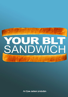
Your BLT sandwich
Here is my animation in its pretty much finished form. I think this will be how i submit it but i would like to try and get it completely finished.
Thursday 14 May 2015
Evaluation
This project has certainly been a challenge. I decided to work on my own as I wanted to try a hybrid of animation and a lot of people were doing stop motion and i didn't want to. This gave me a lot of work to do all by myself. The good thing about this was I didn't have to arrange with everyone when and how to do things. The bad thing was that I didn't have anyone to bounce ideas off of and delegate tasks to if someone was better at it. I could work when i like on what I like and not feel bad. I do think having a partner or group would've improved my animation in hindsight.
This project was also difficult in that I was learning new techniques and it was all a bit confusing for a while. I learnt how to make 2D images move through 3D space using maya. I had not thought of this technique before, I thought maya was just for 3D things. It was tough to get my head around what needed doing as i didn't do things in chronological order. I think i should have done that to make it easier but i couldn't because there were things i didn't know how to do.
I think the part i enjoyed the most on this project was actually creating the assets. I really enjoy animating the pig too.
The way i tackled the audience was by making things very clear both visually and verbally so it is easy to understand for both children and adults. This way it can be used as a teaching method or just something to explain for personal use at any age. I believe the tone of voice is clear yet not patronising.
I think if i were to do this module again I actually would've chosen something a bit more fun to work on like Cara, Rebecca and Annas one as i think it would have kept my attention more and made me want to work on it whereas i got quite bored with this one. I am happy with how it turned out in the end but i feel it is not my best work and I think its the idea that is holding it back.
I also would've worked in a team so i could concentrate on a specific skill and we could have made everything to a better standard.
Almost there
Today i fixed my most of my maya issues (last nights renders turned out to be useless as there were lots of black boxes everywhere) So i sorted that out and tonight i have added extra sound effects from freesfx.com and then i decided to see what a music track would sound like on it and i decided it made it more interesting. I chose one from http://www.purple-planet.com . It's nice background music that isn't too over powering. It's also not sad and a bit jolly which lightens the mood much the way the tone of voice is in the animation.
There is still a couple of bits in maya that need editing (the flash of a box and the tomato plant needs lifting) but i will do that if i have time tomorrow. If not-this will do fine for submission, at least it is finished.
Title sequence research
The incredibles is i brilliant title sequence, I like how it starts of with the normal family then the dad rips open his shirt to reveal the logo and then its all action from there.
Unfortunately our title sequences aren't going to be long like this as that would be like the same length as the actual animation.
Like this which is much shorter and cuter.It is still too long though
I think i might just have to have the title move across the page or something reeaaally simple.
A little more like this:
This one is really cool! Its an impressive use of motion and also the text is twisted and has a cool shine on it but i think what makes it is actually the music they use! its very powerful and dramatic.
This is really cool too but i think thats something to learn as a whole project not just for my title sequence as i dont have time!
Wednesday 13 May 2015
Maya
Tuesday 12 May 2015
product design
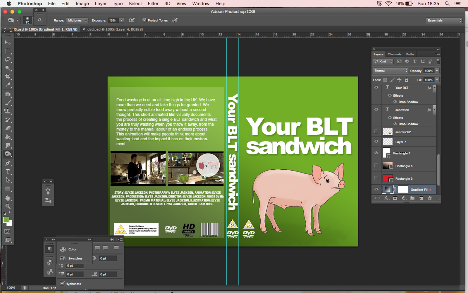
Today i redesigned my dvd cover and poster. I was not happy with my original designs as they just looked cheep and tacky and boring. Rosy gave me a great idea to make the type look like a sandwich in 2 slices of bread. I thought this looked better with a blue background. I think it looks much more professional now especially the poster.


PROBLEM SOVLED!!!
For the last couple of days I have been stuck with maya. although i exported my files as png's and clicked rgb and alpha so i had a transparency setting, it still wasnt working properly! It made me have ghost objects! but today with annabeths help, the problem is solved! for started i shouldnt have been creating mp4s then exporting them as png's afterward, i should have exported png's from photoshop, and clicked straight matted. This part was very important as that is what took away the background properly and also made the image the right transparency!!! definitely a successful day!
Here is a test of my pig in 3d space. its not quite right yet but at least he isn't a ghost anymore. I will edit everything tomorrow and hopefully put it all together.
Here is a test of my pig in 3d space. its not quite right yet but at least he isn't a ghost anymore. I will edit everything tomorrow and hopefully put it all together.
Monday 11 May 2015
A correlation i see between these posters is that they are all a bit dark, they feature a main character, 3 of which by a close up headshot. they all have the title on.some have more details like release date, some have actors names or "from the makers of" as this might sell the film.
Now i don't have a main character, or famous actor or anything like that so I actually don't know what to do to make my poster look awesome>?


poster
This is my initial poster design but I think i need to find out what else goes on a movie poster:


Sunday 10 May 2015
Decisionssss
So I have put the correct synopsis on the back now and added the pg etc. But i still can't decide what colour to use! so difficult!I like the brightness of the green but i like how the pink one makes it look more professional. But green makes me feel like its more about food! I think ill have to get another opinion before I decide.


Distribution
So for the distribution part of this submission we need:
-A2 poster
-Logline (breif summery of film 2 lines)
-Summary (synopsis of film and background up to 250 words)
-3x images from animation
-5x images from process( storyboards, concept art, behind the scenes photos)
-Crew and director bio
-DVD box art
So my logline i think will be:
In this documentary animation, find out about how much you actually waste when you throw food out.
or maybe
food wastage-what are you throwing out?
And my synopsis:
Food wastage is at an all time high in the UK. We have more than we need and take things for granted. We throw perfectly edible food away without a second thought. This short animated film visually documents the process of creating a single BLT sandwich and what you are truly wasting when you throw it away, from the money to the manual labour of an endless process. This animation will make people think more about wasting food and the impact it has on their environment.
crew and director are all just me so...
Elyse Jackson:
As her second year of studying animation comes to a close, she feels she has come a long way from where she started. Elyse knew nothing about animation, but now can confidently make her own short animations as proved in this documentary that was created solely by her. There are still many things Elyse would like to improve on, and many more things she would like to learn. She has not yet chosen a specific area she likes to work in as she cannot pick a favourite yet.
My 3 images from the animation:


+one maya one
5 images from process:


need 1 more...
DVD box
Im still not set on a design so I'm having a play!! with colours and different images. I also researched what needs to be on the box and realised i needed the age rating, I have decided on pg and in the second image, its says "suitable for general viewing but some scenes may be unsuitable for younger children. A pg film should not disturb a child age 8 or older" and i think the scene where it says the oil gets slaughtered to make bacon would be disturbing to a 4 year old which is the starting age for a U.


Here are a few of my colour choices for having the pig on the front. Red stands out well but I have never been a fan of red and pink together. Also it says to be blood and danger and thats not really what my animation is about.
I like the turquoise one but i think that is just because I like the colour. The green says healthy and food etc so i still like that. I feel it looks more like a children's book than a dvd cover though with plain backgrounds. I also need to put the rating description on the back.


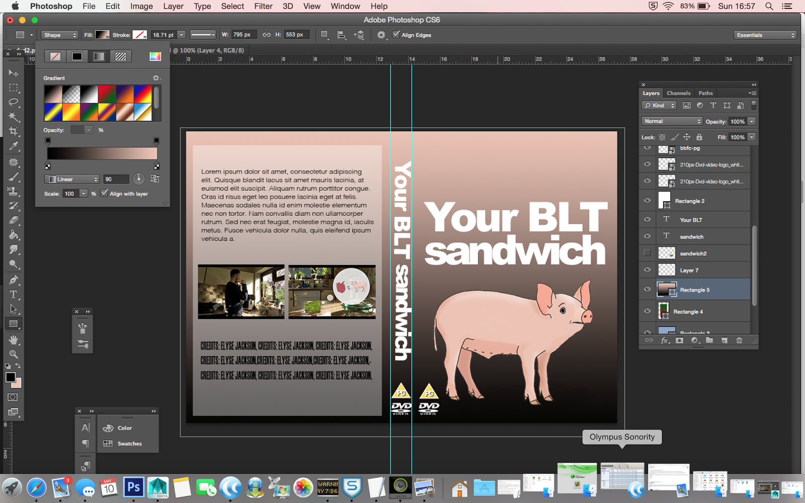

I also tried using a gradient preset and I think this looks quite good as it looks more like a DVD than a book. I also made the pig have a worried expression on his face. It makes him look less cute though so I may have to edit it.
DVD cover
So here is my DVD cover original design. I think it looks pretty cool! I'm not sure if maybe it looks a bit amateur though? Not very clean and nice either. But i do like the idea of it! ah such decisions!!!


I also did a second design that a lot simpler Maybe the text on the back should be white though? I think this one looks a bit cleaner and more professional. I think I am going to re do this on illustrator though so it prints nicer and also print it an uni where the quality it lots better because I printed these as testers to put in a case to see how they look and my quality is not very good.


DVD cover research

 I was thinking about using an image of the kitchen to spread across the whole thing but actually after seeing this I'm not so sure. This is a beautiful image so it works better but they have ruined it with the use of type I think. The two typefaces do not go together in my opinion and they just detract from the beautiful imagery. Type is definitely something I will have to take time to consider.


In hunger games, the main characters are on the front. The title on this isn't actually that clear but i think people just recognise it for the characters. I think it is important to have a clear title though. Again on the back there is some stills from the movie.
I also started looking at animated film covers. Wall E uses the more photographic scenes and has the main character on the front. It doesn't have the same image going through the whole thing but they do blend well together. On the back again we have extra images that show more about the story.


Overall from this research I have learnt that the general dvd boxes have the main character/s on the front (which could be a problem as I don't really have any) , a clear title both on the spine and the front, and stills from the movie on the back. I want my box to look clean and simple with nice type and looks appealing so people want to look at it.
Saturday 9 May 2015
progress
The crit gave me a lot of fuel to get cracking on more animation today as it gave me a few ideas and I've got lots of things fixed and extra bits in. Pretty much all thats left now is the stuff in maya which I started yesterday and will continue tomorrow, then the title and credits and then making sure it all runs smoothy together. I also need to gather the sound effects and possibly locate a music track but I'm still not decided on that.
here is my animation at this point.
here is my animation at this point.
Final crit
I found this final crit very useful as there was still a lot of things I wasn't sure about and as I am working on my own, I needed to bounce ideas of people.
Together we came up with these changes:
-Audio is fine
-when were talking about £2 for belt do close up on counter and show money piling up
-when talking about carbon footprint maybe close up on bin.
-add sound effects
-possibly music but only if it fits right
-get some close ups
-start title sequence after first scene.
-Make bread just open first then say about bread at the end
Thursday 7 May 2015
Getting there
All my voice over sound is now ready. I have decided to do it myself as i know how I want it to be said and i can just get on with it. I will ask in the crit if people think it is okay. If not ill get someone else to do it. I am also hoping to add small sound effects to make it seem a bit more real like tractor and pig noises and footsteps. I am also not sure whether to have a quite track playing in the background for a bit of interest but this may make things a bit confusing? again I will ask at my crit.
I was a bit worried that this animation would run long once I had created my script. I have put together what I have animated, with the rest of the animatic and audio for my crit and to see how long it would be. Turns out its only 1.35 so far! but obviously ill have proper title and credits. So thats good!
Theres one bit in the script "your blt may only have cost you £2 from the shop..." that I think might be a bit long winded and I think I might take it out. I can't decide if it adds to it or is just boring, because I also can't think of anything to animate for it so I may end up with just a kitchen and none wants that.
Drawing voices
In this article, Jacqueline Goss show us her findings from creating an animation called Stranger comes to town : 2007, in which she interviewed 6 people about their experiences coming across the border into The United States to either emigrate or visit.
From this we learn that there is a very thorough process of checking identification such as finger print recognition that is now digitally done and they couldn't see anything like a screen to know what was going on.
These peoples recorded interviews were used to create a documentary style animation a little bit like creature comforts in the fact that its real life peoples stories but instead of seeing the people they came from, we see a made up character that appears to tell the story like it's their own. In stranger comes to town She uses characters from World of Warcraft, partly because on the game, the appearance decides where you come from in the game. This is the same with nationality. It shows that all of these people are different and probably not what you would expect to see from their voices.
An interesting note was that all of the people that were interviewed chose a character that was the same gender as themselves. This made it easier for the animator as it would be more believable but I don't think that is what she was expecting.
Tuesday 5 May 2015
Applied animation
Today I feel like I have got a lot done and I feel like everything is starting to come together which is making me feel much better about the whole thing. This morning I put together all of my images to make my pixillation animation and I made png sequences of my pig and farmer animations so that they are ready to go into maya. This afternoon have animated my sandwich on top of the pixillation and have put that together with what I did before and I now have about 40 seconds done so far.
Im feeling like I am more on top of my work not but still not as much as I would like. I am hoping to have the animation pretty much finished by the end of this week with a lot of luck.
Im feeling like I am more on top of my work not but still not as much as I would like. I am hoping to have the animation pretty much finished by the end of this week with a lot of luck.
Monday 4 May 2015
Voice over script
http://england.lovefoodhatewaste.com/node/2472
We throw away 7 million tonnes of food and drink from our homes every year in the UK, and more than half of this is food and drink we could have eaten. Wasting this food costs the average household £470 a year, rising to £700 for a family with children, the equivalent of around £60 a month.
ENVIRONMENTAL IMPACT
If we all stop wasting food that could have been eaten, the benefit to the planet would be the equivalent of taking 1 in 4 cars off the road.
Man picks up sandwich- takes a bite
crunch noise
man throws sandwich in the bin
woosh noise
"The UK throws away around 7 million tonnes of food and drink from our homes every year. A lot of which could have been eaten. Wasting this food could cost the average house around £470 per year. But it is not just money we have wasted."
Sandwich jumps out of bin. flute kinda noise
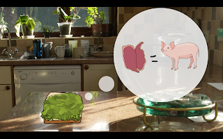
"To make one BLT sandwich we need bread, which is made from wheat that farmers have had to plant, nurture while it grows, Harvest, turn it into flour and then sell it on so that it can be made into bread.
The bacon would've started off as a young pig that would be raised by famers, who would have to feed it and make sure its healthy, then slaughter it and sell it for meat.
The tomato's came from a tomato plant that would have been carefully grown and kept healthy then harvested
The lettuce would also have been planted, nurtured and harvested. bubble pop
All of these things require farmers. Famers require a wage.
farmer walks on eyup
Farmers often need tractors to help them do their jobs. Tractor drives on.tractor noise. Tractors need fuel to keep them going Fuel comes on and almost everything needs water to survive Water starts flowing out of the tap.water flowing..the list of things that are needed to create one BLT sandwich is almost endless. things move around the table, wheat etc jumps into tractor and tractor drives off. pig oinking, footsteps, tractor, water,
Things start jumping into the bin.
Your BLT may only have cost you £2 from the shop but when you add up the cost of what has gone into making it, not to mention the manual labour and the lives lost for you just to throw away their efforts, it accounts for much more.
We are creating an unnecessarily larger carbon footprint Smoke comes out of bin by wasting food that could've been eaten. By stopping this wastage, we could benefit the planet as much as taking 1 in 4 cars of the road would.
Do your part to stop food wastage.
We throw away 7 million tonnes of food and drink from our homes every year in the UK, and more than half of this is food and drink we could have eaten. Wasting this food costs the average household £470 a year, rising to £700 for a family with children, the equivalent of around £60 a month.
ENVIRONMENTAL IMPACT
If we all stop wasting food that could have been eaten, the benefit to the planet would be the equivalent of taking 1 in 4 cars off the road.
Animation action
Sound effect
Words
Man picks up sandwich- takes a bite
crunch noise
man throws sandwich in the bin
woosh noise
"The UK throws away around 7 million tonnes of food and drink from our homes every year. A lot of which could have been eaten. Wasting this food could cost the average house around £470 per year. But it is not just money we have wasted."
Sandwich jumps out of bin. flute kinda noise
"To make one BLT sandwich we need bread, which is made from wheat that farmers have had to plant, nurture while it grows, Harvest, turn it into flour and then sell it on so that it can be made into bread.
The bacon would've started off as a young pig that would be raised by famers, who would have to feed it and make sure its healthy, then slaughter it and sell it for meat.
The tomato's came from a tomato plant that would have been carefully grown and kept healthy then harvested
The lettuce would also have been planted, nurtured and harvested. bubble pop
All of these things require farmers. Famers require a wage.
farmer walks on eyup
Farmers often need tractors to help them do their jobs. Tractor drives on.tractor noise. Tractors need fuel to keep them going Fuel comes on and almost everything needs water to survive Water starts flowing out of the tap.water flowing..the list of things that are needed to create one BLT sandwich is almost endless. things move around the table, wheat etc jumps into tractor and tractor drives off. pig oinking, footsteps, tractor, water,
Things start jumping into the bin.
Your BLT may only have cost you £2 from the shop but when you add up the cost of what has gone into making it, not to mention the manual labour and the lives lost for you just to throw away their efforts, it accounts for much more.
We are creating an unnecessarily larger carbon footprint Smoke comes out of bin by wasting food that could've been eaten. By stopping this wastage, we could benefit the planet as much as taking 1 in 4 cars of the road would.
Do your part to stop food wastage.
Farmer
I spoke to Mat on Friday to have a refresher of how to make my assets move around the kitchen using maya. This time he showed me how to animate it along a path and how I can make it go around a corner. He also showed me a way that I can use a locator tool and parent my tractor to it meaning I could just add in whichever asset I want in place of the tractor and they'll all move the same way without having to re do it every time. I am a bit nervous about getting round to doing this for real but I think it will definitely be worth it as it will cut my animating time down by a lot which I need as there is only 2 weeks left until the deadline. I also really hope I have enough time to add shadows and reflections but I feel like I won't unless they are really quick to do.
Today I did a walk cycle for the farmer so he can walk around the table tops too. I am quite pleased about how he walks but after I finished animating I realised i hadn't set the frame rate to 24fps now I am worried that this won't work with my animation but I'm hoping it will be okay. If not I think I will just copy all the frames over into the correct timeline frame rate. I will cross this bridge if it becomes a problem but at least I am aware that this problem could arise and I can look out for it.
Here is my little animation:
Friday 1 May 2015
Pixar
Chris - character designer at pixar
lots of research involved in getting final look of characters- to try and make things believable- when you find the authernticity it makes the audience relate.
research drawing help you find out things that are consistent that you need to put in the final
have to do turnarounds and work with character builders to tell them how they can build it and to keep it how its supposed to be.
try and bring your personal life into your animations and make it authentic
always has to be a reason why your doing something
clarity and strong silhouettes and strong gestures are very important
Wednesday 29 April 2015
piggyyyy
Yesterday I decided to start animating my piggy to walk around the tables. I used a video reference of a pig walking on youtube to see how the legs moved. I was pleased with how the legs turned out. But there was something missing. it just looked really jerky and not natural.
I decided to edit it first my making each frame double the length which made it look much smoother. Then I also realised that it needed some secondary action to make it look more real like on the ears and tail and humans and animals blink and a dead stare is just weird so i made it blink a bit. I really like how it looks now! much more fluid and real.
Wednesday 22 April 2015
Summative evaluation
There were 3 tasks in this module, individual practice, collaborative practice and creating a project report. I found the first two study tasks very useful. The individual practice brief got me to enter competitions that I might not have if I didn’t have this brief, get myself out into the world more and take on live briefs, expand my skills and try new things. Although at the beginning of this module I was really reluctant to start finding briefs to do, as I didn’t feel very confident in my abilities, now I have finished I feel like I am capable of much more and want to carry on doing live briefs and competitions over the summer.
Things I found difficult about this project was the amount of briefs we had to do which for a 20 credit module I thought was a bit too much. We also had lots of other briefs going on at the same time and it was very hard to manage my time. I started making daily schedules to make sure I kept on track with everything. This helped a lot but I still felt like I had way too much to do. Now it is over I am glad I did it.
I also thought that the collaborative practice brief was very useful and I am glad we did that too, as I might not have had the chance to collaborate otherwise. It really opened my eyes to how much better you can make a project with a little help. I chose to work with an illustrator because I felt that would improve the quality of my animation and I was right, I am really impressed with it. Aggie and I worked really well as a team, both being punctual and doing things when we say we will. We managed to complete our project one week early so we had time to make some minor changes at the end. I would definitely consider collaborating again in the future.
Things I found difficult in this module were also my confidence levels, which did improve after seeing our final animations. I thought I was going to let aggie down as I was still learning the software and she wouldn’t want to work with me again but it actually turned out to be the opposite and she was really impressed with our collaboration and wouldn’t mind doing it again. I also found it difficult that I did not have the software I needed to work on it whenever I wanted, I had to come into uni a lot more than I usually do. This also made me realize that if you’re in uni there is more help about.
The project report task I found a bit tedious and didn’t really see the point and I was struggling to understand how it worked and get my head around how to lay the pages out so it would look right as a book. I managed it in the end with a lot of stress. Now it is finished I absolutely love the look of it and think I might be able to use it as a version of a portfolio or at least this method.
Aside from the study tasks, I found the classes about pitching and understanding briefs very useful. I think we could possibly have covered a lot of ground in a shorter time though. I think it was good that we learnt to do pitch boards and got to see other people versions of the same brief because that is like the real world and I like giving and receiving criticism about the work because it really makes you think about what your doing and why.
Overall, this is by far the most stressful module yet and it has really pushed me to and over my limits. I think there was a little too much expected of us for a 20 credit module. However I do think that this module has benefited us all greatly and we have got a lot out of it.
I think if I were to restart this module, I would start doing or at least plan out my individual briefs in the first few weeks of having the brief. Or at the least start looking for things I could do. This way I would be much more prepared and wouldn’t have to spend so long further through the brief trawling the Internet for something to do.
Logo design
I also mocked up some business cards and I think they look really nice and clean and professional. I love the colours. I think it is important to be double sided as it a) give you opportunity to see the logo on its own, and B) everyone turns business cards over to see whats on the other side anyway. I believe i have all the relevant information for getting in contact with the studio and seeing their work.


I am quite happy with how the whole project turned out. I enjoyed hearing other peoples opinions and ideas and although this design isn't what I would have chosen for my own company, I do still like it. I am very happy that I managed to please my client in the end even though I was a bit doubtful in the middle. I particularly like my business card design I think that is my favourite thing I have designed for this project.
Logo design
Although my client liked this, i believe they were still hoping for something different. My client explained that they don't really like the perfectly aligned square designs and were hoping for something where the 7 is more prominent perhaps in a circle. Now from my graphic design background this was not something I wanted to do and its not something I like but it is not my logo. I did express my concerns that it wouldn't fit as neatly into corners etc but i wasn't going to stop them using something like that.
So i set about coming up with a few ideas that were more what they were hoping for.
I started off doing 2 variations of a design that the client had suggested. I did not like them from a graphic design point of view.


So i designed my own version along those lines which i think works much better and is much more clean and readable. I sent all 3 to the client and to my relief they really liked the last design. They asked some questions about how easy it would be to change some colours and backgrounds for different seasons and i explained it is fairly simple as you can just change the hue but if you wanted 2 very different colours like red and green I would have to redo it. They said it was good that it is easy to change.

I was still a bit concerned of how this would look on photographs. The client said try black and white. I did this but it came out a dirty grey colour which i didn't think would show up on anything, so i made it white which again didn't show up very well.
I suggested just using the bottom of the logo as it would look more professional and less like part of the image and you can read the company name better and it fits into the corner better and you can make it a lot smaller than the other one and still be able to read it.

The client didn't seem to like that. I then decided to cut the 7 out of the middle to make it more obvious and allow the photo to show through. I think this still works they will just have to be careful of the positioning so you can still see the logo which i have explained.
It even works on off white pictures. For pure white if it ever happened we agreed it would be a light grey. I think it does look quite nice in white being on the pictures.

Saturday 18 April 2015
Wall art
Yesterday I did more tree painting! And after many many hours i finally got it finished! It actually took a lot longer than i had first thought. The edging took forever! but it was definitely worth it to get such a lovely clean straight line around the edges. If i could've i would've spent an extra day on it but as i had to come back to leeds the next day i couldn't so i had to work really late, which meant i made mistakes like smudges and getting paint on my hand and printing it somewhere else which meant there were more touch ups to make. But the end result was worth it. The client is so happy with the result and so am i! It has certainly given me a lot of confidence in my abilities, knowing that i attempted something i was very nervous of and didn't think would go very well and it actually turned out to be exactly what the client wanted is a very confidence boosting experience. We also discussed the fact that with the tree i designed, there is still an option to put photos on it and it not look weird which the client is very happy about.
Here is the finished result!! From this I earned £50 which is a bonus as i enjoyed doing it so much!!


Here is the finished result!! From this I earned £50 which is a bonus as i enjoyed doing it so much!!
This is my "i did that!" face.

Wednesday 15 April 2015
Wall art
I have been asked to do some wall art. The client wants a tree painting in the kitchen, we have been looking online and have found various examples of things she likes. She has decided that she doesn't want it to look too much like a fantasy tree. She like the look of it being quite random and natural, she also likes the look of it being windy and we both agreed that that would work very well in the space she has available.
The original idea when we were talking was to make it a family tree, something she could put photos on like these examples:


 But when we started finding nicer trees she said she wasn't so sure anymore.
 She preferred trees like these, and so did i although i knew they would be more of a challenge to draw. I thought accepting this challenge would be a good idea because it will get me to do something i have not attempted before and get out of my comfort zone. I have always struggled to draw trees so that will be interesting, but also i have never drawn anything so large.
 So i started drawing and i came up with this design in my sketchbook so i could get a rough idea of what i was drawing first. I wasn't sure if i was finished but as soon as the client saw it she said she loved it and wanted me to get it on the wall so we could see what it looked like.
 So i started marking it out on the walls and it looked pretty good, the client was pleased and i was also pleased with myself because i struggle to draw trees and also i have never drawn anything so big.
Next we went out to buy the paint. The client couldn't decide between black and grey so i suggested a dark grey because i felt it was less harsh, more designer ish and also it would look good with the new kitchen counter tops that were going to be a mottled grey and black.

Subscribe to:
Posts (Atom)