Wednesday 29 April 2015
piggyyyy
Yesterday I decided to start animating my piggy to walk around the tables. I used a video reference of a pig walking on youtube to see how the legs moved. I was pleased with how the legs turned out. But there was something missing. it just looked really jerky and not natural.
I decided to edit it first my making each frame double the length which made it look much smoother. Then I also realised that it needed some secondary action to make it look more real like on the ears and tail and humans and animals blink and a dead stare is just weird so i made it blink a bit. I really like how it looks now! much more fluid and real.
Wednesday 22 April 2015
Summative evaluation
There were 3 tasks in this module, individual practice, collaborative practice and creating a project report. I found the first two study tasks very useful. The individual practice brief got me to enter competitions that I might not have if I didn’t have this brief, get myself out into the world more and take on live briefs, expand my skills and try new things. Although at the beginning of this module I was really reluctant to start finding briefs to do, as I didn’t feel very confident in my abilities, now I have finished I feel like I am capable of much more and want to carry on doing live briefs and competitions over the summer.
Things I found difficult about this project was the amount of briefs we had to do which for a 20 credit module I thought was a bit too much. We also had lots of other briefs going on at the same time and it was very hard to manage my time. I started making daily schedules to make sure I kept on track with everything. This helped a lot but I still felt like I had way too much to do. Now it is over I am glad I did it.
I also thought that the collaborative practice brief was very useful and I am glad we did that too, as I might not have had the chance to collaborate otherwise. It really opened my eyes to how much better you can make a project with a little help. I chose to work with an illustrator because I felt that would improve the quality of my animation and I was right, I am really impressed with it. Aggie and I worked really well as a team, both being punctual and doing things when we say we will. We managed to complete our project one week early so we had time to make some minor changes at the end. I would definitely consider collaborating again in the future.
Things I found difficult in this module were also my confidence levels, which did improve after seeing our final animations. I thought I was going to let aggie down as I was still learning the software and she wouldn’t want to work with me again but it actually turned out to be the opposite and she was really impressed with our collaboration and wouldn’t mind doing it again. I also found it difficult that I did not have the software I needed to work on it whenever I wanted, I had to come into uni a lot more than I usually do. This also made me realize that if you’re in uni there is more help about.
The project report task I found a bit tedious and didn’t really see the point and I was struggling to understand how it worked and get my head around how to lay the pages out so it would look right as a book. I managed it in the end with a lot of stress. Now it is finished I absolutely love the look of it and think I might be able to use it as a version of a portfolio or at least this method.
Aside from the study tasks, I found the classes about pitching and understanding briefs very useful. I think we could possibly have covered a lot of ground in a shorter time though. I think it was good that we learnt to do pitch boards and got to see other people versions of the same brief because that is like the real world and I like giving and receiving criticism about the work because it really makes you think about what your doing and why.
Overall, this is by far the most stressful module yet and it has really pushed me to and over my limits. I think there was a little too much expected of us for a 20 credit module. However I do think that this module has benefited us all greatly and we have got a lot out of it.
I think if I were to restart this module, I would start doing or at least plan out my individual briefs in the first few weeks of having the brief. Or at the least start looking for things I could do. This way I would be much more prepared and wouldn’t have to spend so long further through the brief trawling the Internet for something to do.
Logo design
I also mocked up some business cards and I think they look really nice and clean and professional. I love the colours. I think it is important to be double sided as it a) give you opportunity to see the logo on its own, and B) everyone turns business cards over to see whats on the other side anyway. I believe i have all the relevant information for getting in contact with the studio and seeing their work.


I am quite happy with how the whole project turned out. I enjoyed hearing other peoples opinions and ideas and although this design isn't what I would have chosen for my own company, I do still like it. I am very happy that I managed to please my client in the end even though I was a bit doubtful in the middle. I particularly like my business card design I think that is my favourite thing I have designed for this project.
Logo design
Although my client liked this, i believe they were still hoping for something different. My client explained that they don't really like the perfectly aligned square designs and were hoping for something where the 7 is more prominent perhaps in a circle. Now from my graphic design background this was not something I wanted to do and its not something I like but it is not my logo. I did express my concerns that it wouldn't fit as neatly into corners etc but i wasn't going to stop them using something like that.
So i set about coming up with a few ideas that were more what they were hoping for.
I started off doing 2 variations of a design that the client had suggested. I did not like them from a graphic design point of view.


So i designed my own version along those lines which i think works much better and is much more clean and readable. I sent all 3 to the client and to my relief they really liked the last design. They asked some questions about how easy it would be to change some colours and backgrounds for different seasons and i explained it is fairly simple as you can just change the hue but if you wanted 2 very different colours like red and green I would have to redo it. They said it was good that it is easy to change.

I was still a bit concerned of how this would look on photographs. The client said try black and white. I did this but it came out a dirty grey colour which i didn't think would show up on anything, so i made it white which again didn't show up very well.
I suggested just using the bottom of the logo as it would look more professional and less like part of the image and you can read the company name better and it fits into the corner better and you can make it a lot smaller than the other one and still be able to read it.

The client didn't seem to like that. I then decided to cut the 7 out of the middle to make it more obvious and allow the photo to show through. I think this still works they will just have to be careful of the positioning so you can still see the logo which i have explained.
It even works on off white pictures. For pure white if it ever happened we agreed it would be a light grey. I think it does look quite nice in white being on the pictures.

Saturday 18 April 2015
Wall art
Yesterday I did more tree painting! And after many many hours i finally got it finished! It actually took a lot longer than i had first thought. The edging took forever! but it was definitely worth it to get such a lovely clean straight line around the edges. If i could've i would've spent an extra day on it but as i had to come back to leeds the next day i couldn't so i had to work really late, which meant i made mistakes like smudges and getting paint on my hand and printing it somewhere else which meant there were more touch ups to make. But the end result was worth it. The client is so happy with the result and so am i! It has certainly given me a lot of confidence in my abilities, knowing that i attempted something i was very nervous of and didn't think would go very well and it actually turned out to be exactly what the client wanted is a very confidence boosting experience. We also discussed the fact that with the tree i designed, there is still an option to put photos on it and it not look weird which the client is very happy about.
Here is the finished result!! From this I earned £50 which is a bonus as i enjoyed doing it so much!!


Here is the finished result!! From this I earned £50 which is a bonus as i enjoyed doing it so much!!
This is my "i did that!" face.

Wednesday 15 April 2015
Wall art
I have been asked to do some wall art. The client wants a tree painting in the kitchen, we have been looking online and have found various examples of things she likes. She has decided that she doesn't want it to look too much like a fantasy tree. She like the look of it being quite random and natural, she also likes the look of it being windy and we both agreed that that would work very well in the space she has available.
The original idea when we were talking was to make it a family tree, something she could put photos on like these examples:


 But when we started finding nicer trees she said she wasn't so sure anymore.
 She preferred trees like these, and so did i although i knew they would be more of a challenge to draw. I thought accepting this challenge would be a good idea because it will get me to do something i have not attempted before and get out of my comfort zone. I have always struggled to draw trees so that will be interesting, but also i have never drawn anything so large.
 So i started drawing and i came up with this design in my sketchbook so i could get a rough idea of what i was drawing first. I wasn't sure if i was finished but as soon as the client saw it she said she loved it and wanted me to get it on the wall so we could see what it looked like.
 So i started marking it out on the walls and it looked pretty good, the client was pleased and i was also pleased with myself because i struggle to draw trees and also i have never drawn anything so big.
Next we went out to buy the paint. The client couldn't decide between black and grey so i suggested a dark grey because i felt it was less harsh, more designer ish and also it would look good with the new kitchen counter tops that were going to be a mottled grey and black.

Bingomation
I have now converted my animation into a GIF and submitted it!! can't wait to see it on the website that will be so cool! I have actually really enjoyed doing this and glad i did it!

Tuesday 14 April 2015
Bingomation
I have made an adjustment to the animation to make the blob look more like bread. All i did was put 4 lines on to give it more shape and be more like a bun. Here it is:
I also noticed that my number was a little too big compared to the original bingo board so i reduced that.
Someone actually said they weren't sure about the beginning so i tried a new beginning where the bun just slides on but i and other people i have asked prefer the original:
I also noticed that my number was a little too big compared to the original bingo board so i reduced that.
Overall i am quite happy with the results, I think it turned out pretty much how i wanted. I would be more happy if the beginning looked more like dough being dropped but i can't quite figure it out. I would spend more time on it if i hadn't got other things to be doing
Bingomation
I have just done my bingomation. I decided to use the yellows to be the bread dough because thats the closest colour to dough so your more likely to recognise what it is. Also there are 3 different yellows from light to dark which could look really good to show the dough cooking as bread goes darker when baking. I chose purple for the back ground because its yellows contrasting colour. I was originally going to use a blue but realised there wasn't enough contrast between that and yellow so it would be less readable as you can see here:


It was quite difficult figuring out how to make the dough explode and how to make it go in the right shape, and it took a few attempts but i think the end result works quite well, i especially like the way it slides down at the end i am quite proud of that.
I am just concerned whether it actually looks like bread baking and trying to come up with a way of making it more obvious...
Here is my animation that is finished for now but i want to try and make it more like bread.
Monday 13 April 2015
Bingomation- Idea
So I chose number 61-Bakers bun
My idea is to have some dough being slapped down, it rises as it bakes maybe changes colour slightly and then it explodes and goes all over the screen and makes the number 61 in gloop then fades into the right font (the splash i am planning to make in pretty much the right shape so it'll just be fading to perfect it) then it will slide off the screen then the baker starts again by putting the dough down!
This is my storyboard for my idea.
Bingomation
As i don't feel loop de loop is right for what i want this month i have decided to do a Bingomation which is almost the same thing but its not a competition. You have to claim a number and then you have to do a 5 second looped animation that shows the bingo call for the corresponding number. Im actually really excited!!
I think it will give me chance to do an animation that seems fun but has limitations that i need to work to i.e the short timeframe, the colour scheme, the size, the theme and deadline. Also its a collaborative project for anyone to get themselves involved with which means my work is going to get shown many places all across tumblr which will give me some publicity.
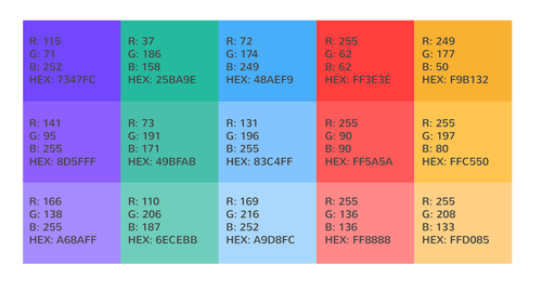
"Bingomation is an online collaborative project aimed at showcasing inspiring work from brilliant illustrators, animators and designers around the globe. The challenge is to create a 5 second, looping GIF that visually connects the bingo call to the number in question.
Your GIF must be 500 x 500 pixels wide.
It must be 5 seconds or under.
It must loop.
Your GIF must include your chosen number, in the Patagonia font.
The number must be approximately the same size as it is on the website
You can download the font here:
http://www.fontsquirrel.com/fonts/Patagonia
Finally, It must use the colour palette provided although you can use a many of the colours as you want."
I think it will give me chance to do an animation that seems fun but has limitations that i need to work to i.e the short timeframe, the colour scheme, the size, the theme and deadline. Also its a collaborative project for anyone to get themselves involved with which means my work is going to get shown many places all across tumblr which will give me some publicity.
"Bingomation is an online collaborative project aimed at showcasing inspiring work from brilliant illustrators, animators and designers around the globe. The challenge is to create a 5 second, looping GIF that visually connects the bingo call to the number in question.
Your GIF must be 500 x 500 pixels wide.
It must be 5 seconds or under.
It must loop.
Your GIF must include your chosen number, in the Patagonia font.
The number must be approximately the same size as it is on the website
You can download the font here:
http://www.fontsquirrel.com/fonts/Patagonia
Finally, It must use the colour palette provided although you can use a many of the colours as you want."
I have 1 month to do it from the time i ask for the number so mine is due on 13th may :) I plan to get it finished and submitted by the end of the week though.
Loop de loop
I was hoping to do a loop de loop for this project but unfortunately when i looked to see what the theme was for this month, it wasn't just a word like usual which is what i was looking forward to. Its amnesty international and refugee week instead. This would require far more research and planning and as its a sensitive subject i would have to think carefully about the content too. This is more work than i have time to do and also i have been having a brainstorm for about an hour and i have come up with nothing so i think i will have to pass on this one. Which is a shame as i was looking forward to it. I also really don't want to be doing an animation about a sad subject as i have done it before and the research just gets you down and i already have a serious animation on the go at the moment.
Friday 10 April 2015
PigPrints
Today i drew and submitted an image to Pig prints. It is an international competition for students. This image, if it is chosen shall be created with an etching technique which sounds really cool. Not only does it get printed but:
The winner will be awarded a prize of € 1000 and retain 50% of the edition, which will be printed in no less than 50 copies. All costs for the edition will be covered by PigPrints. That seems definitely a good reason to submit something. Not only the monetary gain but also the exposure you would get.
 I also had to submit an application form which is this:


The winner will be awarded a prize of € 1000 and retain 50% of the edition, which will be printed in no less than 50 copies. All costs for the edition will be covered by PigPrints. That seems definitely a good reason to submit something. Not only the monetary gain but also the exposure you would get.
It costs €10 to submit which seems fair its about £7.50. I originally tried to draw a wolf as i thought the hairs would look really cool as an etching but i didn't like the result so i decided to do something a bit more simple and would also help me practice drawing something that i struggle with-lips.
so here is what i submitted:
I also had to submit an application form which is this:
Here are screenshots of my email and my payment:
Monday 6 April 2015
Logo design
Today the client said they would like a bit more emphasis on the number so i started coming up with some different designs of the number 7, baring in mind I don't even have a colour scheme to work to at the moment.
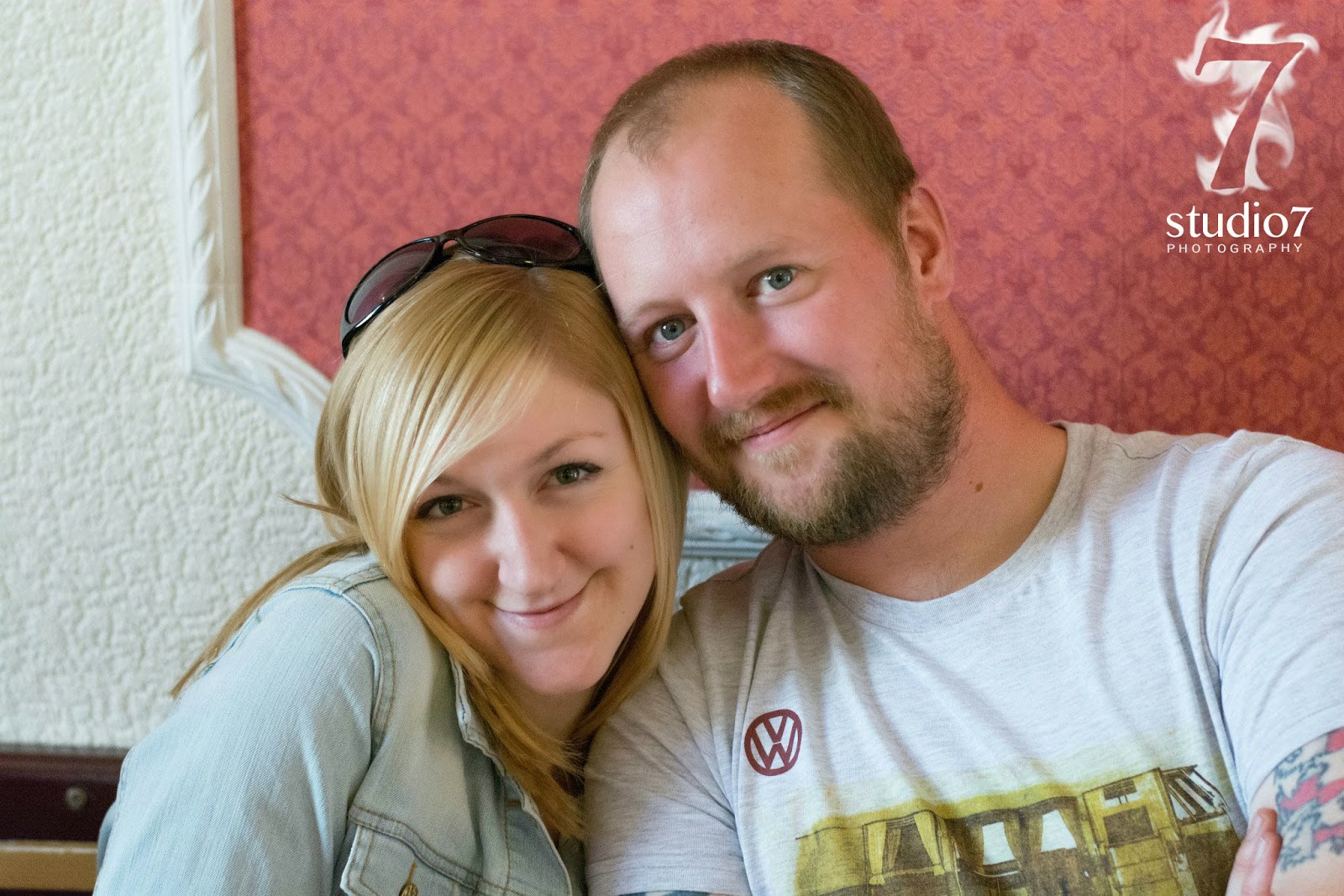
 I really liked the one that looked like flames so i quickly mocked up a logo as an example of how it would fit and it turned out like this:
 The client actually quite liked this and wanted to see what else i could do with it like can in be translated for holidays. So i mocked up a couple of valentines ideas.


The client liked these too! I think we are finally getting somewhere! I don't think they are 100% on it yet but we are definitely a lot closer!
Thursday 2 April 2015
Logo design
I have been asked to design a logo for a new compony called Studio 7 Photography. I will also be creating business cards and mock ups of where the logo will go. In return the client said i would get a free photoshoot.
So i set to work doodling and coming up with various ideas that did and didn't work.


So i set to work doodling and coming up with various ideas that did and didn't work.
Unfortunately the client has said that it needs to be the number 7 rather than the word because they have already bought the domain name with the number in it and they don't want people getting confused and not being able to find their website. It would have been nice to know that before I started but never mind. I much preferred the ones i doodled that had the word as i thought they worked much better and the word gave space to do much more with. so i had to have a rethink.
I came up with this which i think works quite well but when i showed it to the client they said it was much better but still not quite what they were looking for, unfortunately that is all i got, they have not been particularly forthcoming with constructive criticism saying what they do and don't like about it.
Subscribe to:
Posts (Atom)