Monday 24 March 2014

Childline facts


Every single day, thousands of children experience terrible abuse and suffer in silence. But with your help, we can put a stop to this. By making a donation today you can help us be there for more abused children

£4
Answers a child's call for help on ChildLine.

£25
Enables a trained practitioner to deliver one hour of support through the NSPCC helpline, to protect some of the most vulnerable children in society such as babies or toddlers who cannot call for themselves.

£42
Pays for a child who may have nowhere else to turn to receive confidential, one to one counselling through ChildLine, about an issue which is important to them.

£50
Pays for an hour of direct one to one support for a vulnerable child and their family. This includes the time it takes to prepare and write up the session.

"If a stranger was horrible to a child, the thing to do was run home and tell their mum or dad," says Rantzen. "But what if their parents were the ones hurting them, who did they tell then?

Bullying: 18%
Family tension: 13%
Physical abuse: 11%
Concern for others: 8%
Facts of life: 8%
Sexual abuse: 7%
Pregnancy: 5%
Health: 4%
the charity still relies on donations for 92% of its budget.

£2 a month could help answer even more calls to ChildLine. Last year we received 1.6 million contacts from vulnerable children.


"When children cannot get through, they feel even more alone and without hope," says Rantzen. "Our dream is to answer all the children the first time they ring."

Did you know that childline is so underfunded that 2000 calls every day go unanswered..that is totaly sh*t . Some of those calls are going to be the last call for help, plucking up courage, sneaking the call, and noone answers.


I like this last part, it's not a fact but I think it would be good to say that these calls could be someones last chance and they can't be answered. That is a really horrible thought and maybe people with think, gosh if I donate thats an extra call that can be answered.


I'm thinking of new facts to put onto my animation. The first one I said 'a report of child abuse is made every 10 seconds' this could stay the same but I might change it like ' last year childline received 1.6 million contacts from vulnerable children.

If someone hurts a child, they usually run home to their parents

But what if their parent is the one that is hurting them?

Childline can only answer so many calls

those calls could be a childs last cry for help.

Abused children live in fear.

Just £2 a month can help answer a childs last cry for help

Please help end their nightmares

Waltz of Bashir

Waltz of Bashir is an animated feature length movie that appears to be rotoscoped because it looks like this:
However, I googled the making of the film and I found this
'Most importantly, Folman is emphatic that the film was not rotoscoped. "I respect rotoscoping and I even like walking life, unlike my animators" he says. "But, for me, rotoscoping has a big problem in conveying emotions. You see the technique, you see the drawings, and that takes your focus. If the film had been rotoscoped, it would have been hard for the audience to get emotional with the characters."
However I disagree with this because I had to google it to see that it wasn't rotoscoped because it looks like it was. 
I don't think this will effect my animation because hopefully it will help me learn to draw emotions and I will just try to make a really good job of it. Hopefully it will work but if not then I will learn from my mistakes and never use it for emotion again. 
I think it will look better though because it is real people.


Take on me

In more popular culture is this video of take on me by Aha. This is rotoscoped but is a completely different style being hand drawn. This created a flickery effect where the line work changes. I like the changes between film and rotoscope though I think this gives a really nice effect. This would have taken a long tie to create I am very thankful for computers! I think it was a very talented artist that created this though I love the faces. I think they were right not to use colour A) because the comic she was looking at was black and white and B) because it created more of a contrast. This is one of most memorable times we see rotoscoping in common media. We don't actually see it very much anywhere else.

Schedule

So I have worked out that I have about 22 seconds worth of animation to do not including the words. On my test rotoscoping piece I did 5 seconds of animation that took around 5.5 hours. Lets say 5 for ease. Therefore i need at least 22 hours to work on my animation which I will round up to 30 hours for safety. I figured out if I work for 3 hours per day I can get it done in 10 days with 18 days left of the holiday to put everything together and maybe add shading, but if i have full days spare over the holidays then I will probably work for around 6 hours on those days. I will have to find out if and when I am working and plan my time around that and seeing friends. I think I have time to get this done though as long as I get the video reference from my friend. I have contacted him today making sure I can get it. If this fails though my backup plan is to use a girl of around the same age as I know a lot more girls of that age so will be easier to find and I will film it myself. I plan to do this half way through the first week if I haven't received the footage by then.

A scanner darkly

This is a feature length movie that was made as a movie to start with then rotoscoped afterward to create the effect that Richard Linklater wanted. At first glance I was thinking: what is the point of this? all that work to rotoscope a film thats already been made. I thought this wouldn't work especially if it was a serious film but it seems to have some comedy in it which would make it work better. This is all painted but it just looks like a transparent layer over the top. I guess that is a compliment to the artists, you can still tell who the actors are and the movement is nice and fluid, I'm just not sure it was necessary for the film. I may watch the full film and get back to you on that. It's very strange watching this style of film because it looks like a cartoon in places and in others it just looks like a film with outlines. I think you would get used to it once you started watching the film though.
http://www.imdb.com/title/tt0405296/?ref_=nm_flmg_dr_7

Statistics

I found this website with lots of shocking statistics and facts. I was looking for whether boys or girl are abused more and this is what I found:
Rate at which boys become victims vs. girls: Nearly the same (48.5% male vs. 51.2% female)

 So it doesn't really matter if I use a male or female character but maybe a boy is best because it shows that it does happen to boys too.

http://www.safehorizon.org/index/what-we-do-2/child-abuse--incest-55/child-abuse-statistics--facts-304.html

Monday 17 March 2014

Colour theory


In this lecture I learnt that everything I once knew about colour was now wrong and it was all about how we perceive colour. 
We started off the lecture going over some things that we had learnt in school and some we weren't familiar with for example:
-White light is made up of colour, each colour has a different wavelength.
-In the eyeball the rods let us see tone (light/dark) and the cones let us see colour.
-We have 3 cones-1 red, 1 green and 1 blue
-We see the colour when it hits the corresponding cone.
-Yellow is seen by a combination of the red+ green cones being hit.

If there's no light, is there no colour?

Then we looked at people that are colour blind and saw that they see things in different colours. Deuteranopia causes you to see everything in yellows and tritanopia makes you see everything in pinks and blues. 

-The primary colours are blue red and yellow.
-mixing primary's gives you secondaries  
-complimentary colours are opposites on the colour wheel
-complementaries are made up of the other 2 primaries.
-Complementaries remove colour from each other and become a neutral grey.
-neutral colour wheel= tertiaries- pure colour mixed in different ways
-spectral colour- perception of colour in different light

-yellow cannot be a spectral colour

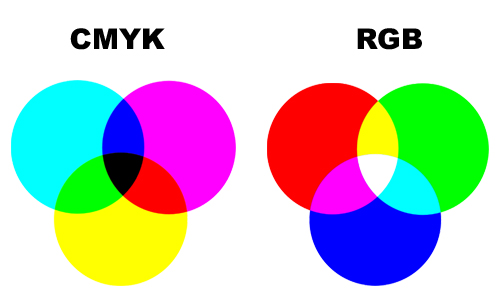
The two colour modes are made up of each other. Notice how the overlapping of the cmyk colours makes the rgb colours and visa versa.
-Subtractive colour is physical- mixing colours turns to black.
-Additive colour is on screen where mixing colours turns them white.

Dimensions of colour
-chromatic value= tone, saturation and hue
-shades= pure colour getting darker
-Tint= pushing toward white
-Tone= combination of shade and tint.
-Luminance- how bright+ pure the colour is
-Bright= reflecting light
-Dark= absorbing light
-desaturation= taking purity away, removing colour, making darker, turning into a different colour


We perceive colour by what's around it. We are fooled into seeing colours. The colour changes by comparing another colour to it. you may see something as red until you put something more red next to the original colour. Now the original looks more pink or orange. 


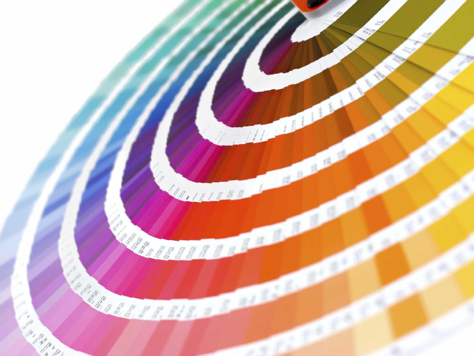
This is why we need a system so we get the exact right colour. The most common system is Pantone. These have numbers and letters with every colour under the sun. Colours are only the colour they are by concencous and even that cant be trusted.

Colour and contrast
-Contrast of tone. monochromatic, light value and dark value
-Contrast of hue- the greater the distance between hues on the colour wheel, the bigger the contrast
-Contrast of saturation
-contrast of proportion
-contrast of temperature- putting colours together and adding cold and hot changes the appearance of the colour.
-non existing gradients because of temperature contrast
-complimentary contrast
-simultaneous contrast- all contrasts working together

Subjective colour
The primary colour wants it's complimentary colour to be there so when we see blue on grey, the grey looks yellow orange or brown.
same as yellow on grey makes the grey look purple.

Rotoscoping practice

Today I tried rotoscoping for the first time. I used the tutorial I found on youtube to set it up in photoshop. I used a video of my friend doing some moves because I thought this would be interesting. I did it at 24 frames per second as specified in the brief. Things I have learnt from this are that its difficult to rotoscope someone in dark clothing especially with poor lighting as you cant see the definitions between the clothes. I also learnt how long this process takes. For 7 seconds of animation i have been working for about 6 hours. so lets say thats roughly an hour per second of animation. 
However I think the pros out way the cons. You don't have to think as much as you would if it was coming out of your head. I think it will be worth it when it's done as the final product looks great.
What I found difficult about this was that in some positions you couldn't see parts of his limbs or they looked like stumps but i had to force myself not to add extra bits because they're not visible. Also The motion blur blurred out some limbs that were actually there! I think higher resolution video might be a good idea.
Overall though I'd say I quite enjoy this process though I found i got engrossed in it so much that my eyes now hurt because I wasn't taking enough breaks.

Sunday 16 March 2014

Flow form and force

This 3D animation of the android robot with artificial intelligence really explores the human form. I think it is absolutely beautiful, it looks so realistic with real fluid movements. I love how this not only explores the physicality of the human form but the emotional side as well. this animation feels so real that you really connect with it and empathise with it even though you just watched it be created. They have really got the features and expressions almost spot on. Even down to the skin texture.    

Flow form and force

This video I found on Youtube was a project for someone life drawing class and I think it's really interesting. I think it's important to notice here that we get a great sense of movement and shape and humanity from very little detail. I admire this because I always think it needs to been drawn really accurately so it looks like what it should be but this has proven that it just need to be the right shape and people will instantly recognise it and fill in the blanks.

Flow form and force

This animation shows life drawing in the form of animation. Ryan Woodward has done a lot of life drawing and this is apparent in his work. Although the drawings are simple they are all in perfect proportion with excellent movement. I like the thin lines and the draft lines it makes it more interesting and I also like the block shading. 

Friday 14 March 2014

Flow form and force


These are the drawings for push and pull. It was hard getting used to drawing for longer than a few seconds, we had time to put in more details. I think this was actually quite a hard task because pretending to put a force on something doesn't actually show where the weight is because if they actually put force on they would probably fall over so to make sure they didn't fall, they moved their weight. I still felt a bit rushed on these though, but I was happier with the result because they actually looked more like what they're supposed to.


This was the first of the long poses task. I enjoyed this one more because we had more time to get the details and make corrections we needed to and actually try and get them accurate. This gives you chance to work on proportions and foreshortening. That's what I found difficult. I am happy with the result of this one I feel the proportions are right, I just can't draw feet as you'll see more of soon.
This is the second drawing, I found it harder to get the foreshortening right here and her head is too big for her body but I think the body is actually quite accurate apart from her feet. They are FAR too small and this makes her proportions look even worse.
I am quite pleased with this drawing, I feel the proportions are much better and even the feet are a little better! I didn't put much face in this one as I thought I might ruin it and I couldn't see it very well anyway. I like the way I shaped her legs and it actually looks like her weight is in the chair. 

I am also quite pleased with this drawing as it actually looks like Anna and the proportions look good I think this task has really helped my life drawing skills. 
I think I would like to do more but maybe have even more time on it and use a range of different pencils and get lots of darks and lights in there but I didn't really have time to go into great detail on these. I definitely think on this that practice makes perfect.


Monday 10 March 2014

Ceramics

We were asked to do a series of images for next time from one shape to the other so I did a ball into a splosh. It's supposed to gradually turn from one shape to the other I think it does that. Though one is a bit too small...

Experimenting

I loved this so much I decided to make a little model for home. I wanted to experiment with making a larger model this time to see if it was easier. It really was. This model is more simple though because I wanted to re position him lots and if he had lots of complicated clothes it would be hard to keep the same. Meet Eric! I like putting him in yoga poses that's fun but he looks more girly doing that. Maybe he's gender neutral? He can stand on his own though!


Ceramics

Our next lesson our models were dry and it was time to do the fun part- make our character come to life! Firstly we had to stick plaster tape to the Milliput because it makes the paster-cine stick bette

Then we chose a colour of plaster-cine and just started making our models! It was fun to see everyone's characters come to life. I started off by just putting a base of plaster-cine on mine to get it going

Then I started adding features like clothes and hair


This was going well until I added the face. I decided I really didn't like it and
that it really wasn't in keeping with the cute childlikeness of this character. She was supposed to be 2 but she looks about 5 here which when your young is a big difference. She looks far too grown up.
So I decided to make her a bit chubbier, change the hair, get rid of the face to start again, altogether simplify her really. I like the effect this gave and I really didn't want to add more detail though I feel I should really give her a face. I started playing with her making her do cute poses and things which shows she works as a character now.


 Here she is from the other angles.


 I made her some eyes for next time out of milliput and painted them white. i poked holes in the side for pupils, this means that you will be able to move the eyes around once they are in the head. Quite clever eh?! Really looking forward to next time!

Ceramics

Our first modeling session was really fun! We started off with a basic induction to the area learning about where things are and the safety rules etc. Next it was time to get making! It is so nice to be hands on with stuff after staring at a computer for most of the week. We started off by designing us a character in a 6 inch high box...apparently your supposed to draw your character this high in the first place not draw it in the middle which I and a few others found out later on because our characters ended up being really small. We then got a piece of metal rod, sawed off how much we needed then bent it high enough so that it would go into a piece of wood, curve, and into the back of our character. Next we drilled a hole into some wood for this to go into. Then we got a loop of wire and attached it to a drill to weave them together to make stronger wire. 


After this, we used the wire to start creating our models, starting with the head, back and first leg. It became apparent that for those with smaller models we would need to use a single thickness of wire for the limbs so they would be easier to move. After using the same principle for the rest of the limbs, this is what I had:


Once we had got our skeleton we then made him stronger with Miliput which is two squishy things that put together turn into a rock like substance once dry. Using this meant that we can control where he bends. so we leave the joints free like this:
I think I made this models head too big. It became apparent here that the model was too small to work on easily. So we left this to dry for the rest of the day.
Then we started to have fun with some plaster-cine and get a feel for it. This was fun I haven't played with plaster-cine in years. Here's what I made:


Thursday 6 March 2014

Flow form and force


 The first 4 images are for the rhythm is a dancer task in which we recorded someone moving through a space. The first one we failed a little bit, I ended up drawing a stick person I felt very rushed by the time limit and I drew over the top of each other cause I ran out of space and I just feel it was rubbish. The second 2 images are part of one sequence, I ran out of space so used another peice of paper this time. I think this style worked much better I used the edge of a peice of black chalk and used sort of triangular shapes to make the image more filled out. I think the walk on this one was more interesting and natural too. The first one was very robotic and every move was similar.


 The next one was Mike moving through a space like a gorilla. Again this ended up looking stick like maybe due to my choice of media but I think I was basically drawing the lines of the limbs. I don't like hoe my style changes on this one because sometimes he's more filled out than others. The next one was Anna and she was wearing a skirt at the time and I wanted to capture that but I think I ended up making the drawing more confusing. Again they are too much like stick men/women in their limbs but the body is becoming more filled out. The next this person is walking and gradually falls to the floor. I like how I kept this one going round the page instead of starting a new line I think this gives it a bit more fluidity. Not keen on the drawing style though.

These next drawings are the puppet on a string part. The first I decided to try and draw the movements happening over the top of each other. This worked for the first couple of drawings but after a while it began to get messy and you couldn't see what was happening anymore. I like the idea though but maybe more movement is required meaning having larger gaps between each movement. The next drawing I really like how i started off by drawing the outline of the person but I think I got rushed and forgot where to start and the angle changed and I ended up going back to a stick man for a couple of drawings and then back to how I started. I do find drawing fast really difficult.
The blue one is someone kneeling down then getting back up. I thought I'd try a colour pastel to see if that looked nice. It just made it look messy really. The rest of the drawings I can tell what's happening cause I drew them but not so much on this one.

This is one of my favourite drawings from today. Bex did some sort of yoga poses and I did more of the shape of her rather than all the limbs individually. I am really pleased with how this one turned out and I like the nice thick smooth non scratchy texture I got from using the charcoal in a much smoother way. The last picture is of someone starting off on the ground and getting up and stretching. I feel if I had used the previous technique I could have accentuated the stretch more and made it more human. 


I had fun doing these sketches but I felt under a lot of pressure with the time limit and because I was not happy with a lot of my drawings because they didn't look like much.


Tuesday 4 March 2014

Live footage

So I finally got my head on straight and remembered that I have a photographer friend that has a 9 and a half year old son and I was looking for a 10 year old...couldn't ask for a better set up really! So I spoke to him today and he said he will see what he can do! As he has cameras and is obviously a better camera man than me I have asked if he will do the footage and send it up to me. I would do it myself but I think this would be easier for them as they can do it whenever they get time and I won't have to travel down there. 
Really excited now! I can't believe I didn't think of it sooner!

Animatic

Here is my stylised animatic. Meaning I re-did it in the drawing style I would like to use which is rotoscoping. During this process I have practised my rotoscoping an tracing skills. Next I would like to try a short video to learn how to do the moving image. 
I tried a new backing track on this one as Mat said he didn't like the previous one.

Monday 3 March 2014

New styalised story boards

These are my story boards re-done in the style I would like to use. This gives a better idea of the story as it's clearer and gives an idea of what it will look like. I am actually really happy with this it looks nice and neat and realistic but cartoony which is what I wanted.