Thursday 26 December 2013
style
Monday 2 December 2013
Research
This was research for 'earth'. It's basically how man arrived on a perfectly good planet and starting killing things and using them for personal gain. Like in the Pocahontas song ' you think you own whatever land you land on. The earth is just some dead thing you can claim.' It is animated in a comedic way but it puts forward a message about the way we treat this planet in which we live in. I'm not so keen on the drawing style but I like the story.
Research
I love this!!! it's so cute and engaging and the way they have a rock song sung by a squeaky kid is cool. I just love the idea of this person made out of water walking around reacting with everything he comes in contact with. And the idea that when he goes over something he would fall through, he splits into lots of tiny people! I think that is so clever!! Absolutely love the idea and may use this as my inspiration.
Research
I really like this style of animation, how the hands are effecting what is going on in the drawing, I would love to do this someday but I seems quite complicated. I love the fluidity and the clever ideas. This animation made me smile. Also it has a simple way to do rain...just lines coming down from the sky and people reacting to it. I think the reaction is key because it makes it believable.
Flash
Next we had to make a bouncing ball. We weren't shown how to do this- we had to figure it out on our own. I found this one more difficult. You have to think more about timing and spacing. When I first did it, it kind of worked but it seemed too slow and not how a real ball would drop. So I moved the key frames closer together. I also love on this software that you can click a button and it gives you in betweens! There's also a cool onion skin button! I am happy with how this turned out and I think I would like to try more things on flash!


Flash
Today we had our flash induction. I like how its a vector image software not bitmap so its not pixelated. I quite like the interface and how you create the animation. There's options for easing in and out rather than having to do more frames which is quite handy. Our first task was to create a pendulum. Mat showed us this then we had to go and do it. I think I actually did it quite well! although it does seem little fast. I think to alter that I might have to move the key frames further apart from each other on the timeline.


Wednesday 27 November 2013
Visual language
Dog project
So this is the story I came up with. Because I designed the poodle all stuck up I thought she probably knows how pretty she is and thinks everyone is looking at her so in this she is walking through the park when she passes two dogs who she thinks are staring at her, she winks and they come running toward her, but then they run past her and she is confused. It turns out there was a ball being thrown near her and that's what they were looking at. So she ends up walking off in a huff! I thought it was pretty funny. I really like it! If I animated it I would do it in slow motion so you would see what is going on and it doesn't all happen too fast.


This is my original thinking and first draft of my story board.

Visual language
Dog project
The word I was given for this project was 'Dog'. This was my first set of 12 drawings out of 32. At this point all I could think about was a fluffy dog! and a couple of other things like 'dog house' 'dog bowl' 'dog bone' 'balloon dog' 'hot dog' 'dog poo' 'dog pile', but they didn't really seem like things I could do a story with.

This is the rest of the 32 images. I started getting more ideas like 'scurvy dog' 'doggy paddle' 'dog collar' 'dog and bone' 'dogma' 'dog rose' 'dog leg' 'dog fish'. But again it was very difficult to think of a story to do with any of these I wasn't particularly inspired. The only one I thought of a story for was the posh poodle because it actually had character. So I chose that. I was originally going to do how dogs and owners look alike but mike said just concentrate on the dog.

We then had to do 8 images on our chosen image in different angles and using different mediums. I quite like this series of images. I like the shadows on the black and white pen one and I also quite like the newspaper one.

Friday 8 November 2013
Fear
So here it is- my final animation! Turns out the gradient made it difficult to edit and perhaps I should have put it on as a new layer afterward but...I only thought about that now. Silly me!
I have never done a walk cycle before as we've not been taught...I didn't think this through when I was planning! so I had to research it. a couple of things I found are these. I found that I kept missing out the passing part of drawing C on the second image, but I soon fixed that. I think it turned out okay! definitely room for improvement though and I cant wait to learn how to do it. I also found it difficult being a shadow moving because you didn't have the definition of both legs.


I have never done a walk cycle before as we've not been taught...I didn't think this through when I was planning! so I had to research it. a couple of things I found are these. I found that I kept missing out the passing part of drawing C on the second image, but I soon fixed that. I think it turned out okay! definitely room for improvement though and I cant wait to learn how to do it. I also found it difficult being a shadow moving because you didn't have the definition of both legs.


Anyway...My animation!!
I'm glad I've got this finished. I set my self a target to be finished by the weekend and... I am! all I have to do now is convert my blogs to PDF and put everything on a CD!
Fear
So I started doing my animation on Photoshop and the first thing I did was do my storyboard images. So I guess this would be classed as pose to pose animation? Here are my images. I am quite pleased with them actually! I used a gradient layer to make everything look darker which worked well. I used these images as reference:


Fear
I was looking at a youtube video not long ago and I posted it on here about character design and he used a blue pencil (which we now have) so I gave it a go and I really like the technique! I like getting the shape with the light blue then putting in detail with the dark blue. I want to practice more at this as my first attempt. I also want to try more styles as this was just the one I read in a book I believe it was called character mentor? I also need to work on how to do a 3/4 view...cause that ain't right.


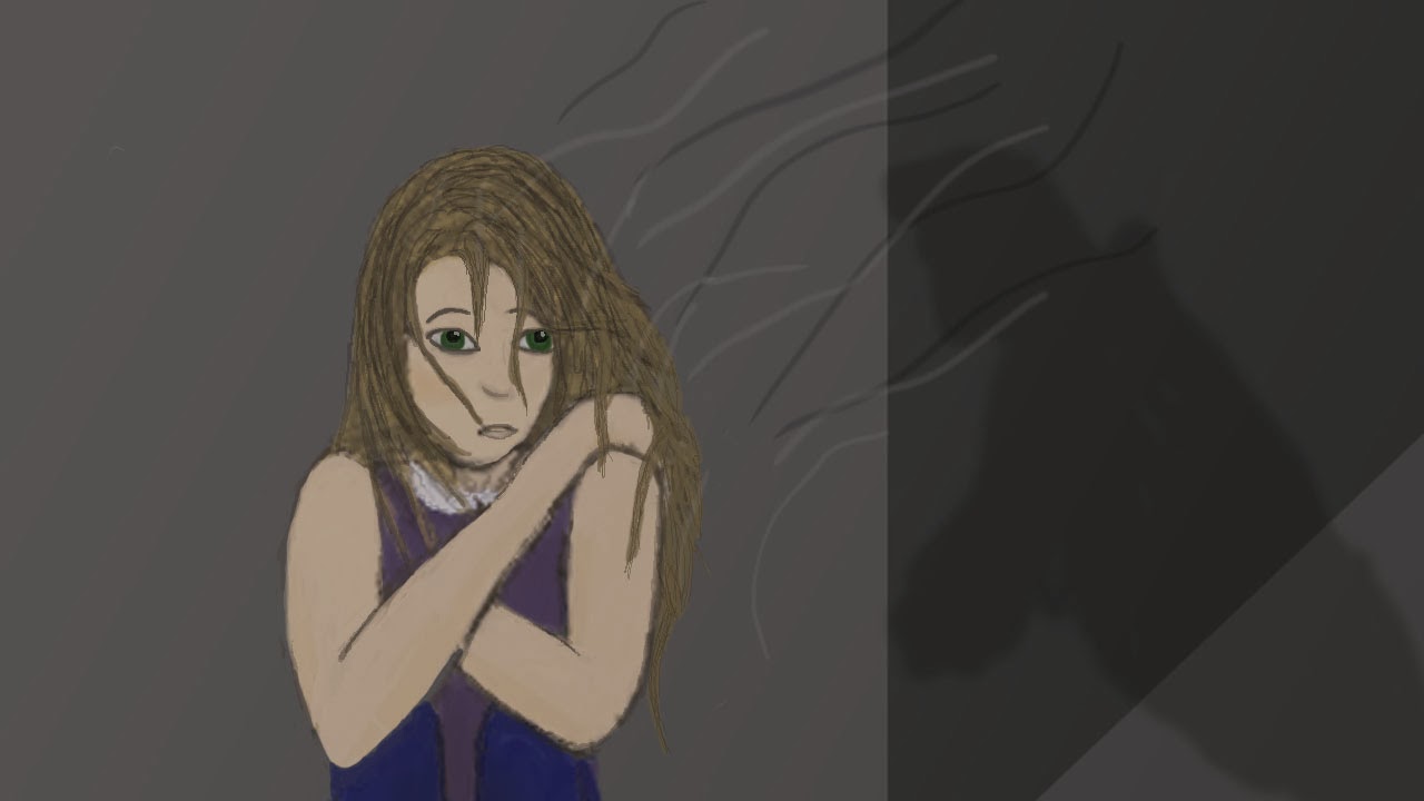
Fear
I decided to do choose the word 'fear' to do my animation on as I got the most on my mind map for it. The idea I had was about a girl who is sitting in an alleyway hiding from someone, a shadow is creeping closer and then she notices but the person puts their hand over her mouth before se can move. This is my storyboard for it.
 I want it too look all dark and spooky. I'd love to be able to make it rain and have a sound track of rain, footsteps and heavy breathing but I don't know how. This would make it so much better!! I was thinking of drawing this out on animation paper but in the timescale I had I decided this was not appropriate and decided to draw it on Photoshop instead.

Thursday 7 November 2013
Stuxnet
Wow this is quite thrilling and interesting. The actual content is interesting but I love to way its portrayed through type and image. I always find that if things are written down for me to read while someones talking its easier to take in the information. As proven here. The key information was written down in an interested animated way that made you read it and take it in and the little geometric drawings just helped recap what they were talking about. It made the context more interesting. As someone with a background i graphic design i feel this was typographically very good too I like a lot of the layouts Patrick Clair used. I'd not really looks at type animation yet but this reminded me of it and I believe it has more of a purpose.
http://vimeo.com/25118844
http://vimeo.com/25118844
Twerk it girl
HAHAAHA this is hilarious xD It's a short claymation video also by Kirsten Lepore of a girl twerking and dancing. I admire the fluidity of this piece and the way she got the ponytail to move after she's stopped moving is pretty clever. This just made me smile so I had to post it- hope it makes you smile too. Reading the comments- I just learnt that she is standing up well even on one leg by using tie downs on the feet so they have ties going through the block of wood she's standing on. Pretty clever.
http://vimeo.com/11649385
http://vimeo.com/11649385
Bottle
This is such a lovely pixilation animation by Kirsten Lepore. Very clever how the waves move in the right timing to the sand. Must have taken ages. Well at least a year to get the snow too! It's like a human pen pal relationship and I admire the fluidity of her work. Then they decide to meet underwater but of course neither sand nor snow will last underwater. They're so close and you think they might just make it...but they dissolve just before they get to each other. It's so sad. A lovely way to show the idea of love though. I'm impressed that one person did this by herself.
http://vimeo.com/12155835
http://vimeo.com/12155835
Meet Buck
I like this style, I believe its done in photoshop judging by the lines and the textures. This is how I expected it to be when my boyfriend met the parents!! haha! I think its quite comical how Buck has a dear head and the girls dad is a hunter and has animal heads on the wall...perhaps ex boyfriends?! The fathers hunting skills kick in and he wants to protect his daughter so he goes after Buck. It all ends in a catastrophe but bucks friends (also animal headed) save him and turns out most people have animal heads... maybe this is like saying that the Dad sees all boys as meat that he wants to hunt and not let near his daughter? Maybe I'm reading too much into this but I think that would be a pretty cool idea. I like the colours and how its just painted but it looks like its 3D.
http://vimeo.com/17535548
http://vimeo.com/17535548
Shave it
Erm... okay... not really sure what I just watched if I'm honest. A monkey finds a handbag that happens to have a razor in it so he shaves his whole body so he looks like a human, then goes into the human world, is awesome at his job and gets promoted and ends up really rich and then it all gets a little weird from there. He destroys the city cause he has a mental break down? Okay the colours are nice and the smoothness of the animation but... seriously this guy must be all kind of messed up. Just not my kind of thing i guess.
http://vimeo.com/63528500
http://vimeo.com/63528500
In a forest
This 3D animation is very exciting,Directed by Fons Schiedon (fonsschiedon.com) and produced by Submarine.nl. I like how they pan the camera to show that theres no-one around and then this wolf appears and all hell breaks loose so the rabbit runs away and falls down and it's all very dramatic. While watching this I was thinking 'wow i love the set design, it's so realistic, is it a photo or is that cgi? That's pretty impressive.' I did think though that the background is more realistic than the characters so wondered if they really fitted together. Then the background disappeared and i was a bit confused and the characters simplified and like turned into rigs. Then the rabbit was cornered so just jumped off this ledge and landed on a cushion It's so surreal but it's showing that its just a character and if you take them out of the scene they're in, they're perfectly safe. It's really strange. Interesting to see the rigs though. Reading the description, I don't think it should have turned out like this but something went wrong in the run up to the deadline.
http://vimeo.com/77579558
http://vimeo.com/77579558
Light painting with pixelsticks
This is pretty awesome! It's like pixillation but using light painting, what a neat concept!! I never would have thought of that! So basically they capture scenes of a city with cars and lights whizzing past and they do light painting and the light is taking a journey through the city! So clever! The idea of this video was to show off what the pixel sticks they made can do and it certainly does just that! I like all the different patterns they have. They can do so many different things!
http://vimeo.com/78163959
http://vimeo.com/78163959
Upstairs
This has such a good story line that i can relate to. When you get to sleep and suddenly you hear strange noises, you start thinking of random scenarios that would fit with those noises. I'm not sure bout the style of drawing, it's extremely simple and that's not really my thing but it's still good. I like the way they used boxes as the rooms and used other little boxes for the different scenarios. When it went to the shot of what it actually was it made me giggle that it was something completely legit and not what he thought at all. But they had the same thoughts like 'oh no what if its someone come to kill me' kind of thing and the guy asleep would rather not be able to sleep than to get shot so he doesn't end up finding out that its actually just some old lady doing some sewing!! I relate to this like when it's all dark and you see a shape and you think its a person but when you turn your light on its just a coat.
The maker of this mentions that this is what happens when your brain is stimulated before you go to sleep. Definitely love the way the story is told.
http://vimeo.com/68226169
The maker of this mentions that this is what happens when your brain is stimulated before you go to sleep. Definitely love the way the story is told.
http://vimeo.com/68226169
Le Gouffre
This is fabulously drawn by David Forest, Carl Beauchemin and Thomas Chrétien. I love the realism, I think i would like to try this because it just inspires me and makes me want to do it. I love this style. Obviously i like other styles too but i just think this is like a level above! If you scroll down on this link theres also a bit to do with the bridge. I found it quite interesting seeing how they made it move, i'd not really thought about it before. Id like to see more of this not just the trailer.
http://www.cartoonbrew.com/crowdfund-fridays/le-gouffre-looks-beautiful-and-was-made-by-just-3-artists-89045.html
http://www.cartoonbrew.com/crowdfund-fridays/le-gouffre-looks-beautiful-and-was-made-by-just-3-artists-89045.html
Making the distance
This is a 2D animation about a lady who loses her short term memory. I like the way this is like a voice over documentary kinda thing, you don't really see many of them unless you look at the animation world. I remember seeing one about a lady who lost her arm that was pretty good too. It makes it seem more real because its like the person it happened to is recapping it but someones painted the picture for you so its right in front of your face. There was some funny parts in this one like where she thought someone she worked with was her mum! I think this does its job well, it portrays what life is really like after an accident from a first hand perspective.
http://www.cartoonbrew.com/cartoon-brew-pick/marking-the-distance-by-the-rauch-brothers-90623.html
http://www.cartoonbrew.com/cartoon-brew-pick/marking-the-distance-by-the-rauch-brothers-90623.html
Pixillation animation
Here is my Pixillation animation. The theme I used was predator-Prey. This was a nice quick way of animating I found. The difficult part was keeping the frame the same and not letting things move of get added to the shot because this makes it look less like an animation. I also found making things float and things was difficult, i ended up using string and blue-tack to hold up a spoon and photoshopped it out. I should have figured out how i was going to do this before I started though as it slowed up the process and resulting in me having extra bits in my shot that i didn't know about until i put it all together.
Overall I think it turned out okay and followed my plan but i dont think the quality was as good as it could have been. Part of this is the lighting. I probably should have done it in the day time to help this.
Happily ever after
This is by Yonni Aroussi and Ben Genislaw from Bezalel Academy or art and design Jerusalem in Israel. I cant believe how good it is for a student! I find it a little strange how their mouths don't move much but that was their design, it looks like a puppet. I love the story line, you really feel for the characters and what they go through because you know that that really does happen. When you get to the end your so relieved. I like how they portrayed the ageing of the characters, that was pretty clever. I also really like the lighting techniques and the textures they used.
http://www.skwigly.co.uk/showcase/happily-ever-after/
http://www.skwigly.co.uk/showcase/happily-ever-after/
Mute
I found this on Skwigly, its such a strange concept but it kinda makes you think, what would we do if we didn't have mouths?! It's kind of grousome and a bit cringeworthy but actually a really good concept! Its a 3D computer animation by Job, Joris & Marieke in the Netherlands. So the reasoning behind this is odd "Joris cut himself in his toe once, while he was swimming. He thought the cut looked a bit like a mouth, so we thought: this calls for a film! We love to tell short, weird stories." The style of it looks like its intended for kids but when you get into the story...its really not. But i don't think thats such a bad thing because it kind of surprises you because it looks so innocent so I think it still works.
http://www.skwigly.co.uk/showcase/mute/
http://www.skwigly.co.uk/showcase/mute/
Honda 'Hands'
So i was absolutely wowed by this, it's so clever! I wasn't sure how they managed this so I googled it and this is what I found: http://www.fxguide.com/featured/the-making-of-honda-hands/
Seriously, check it out its actually quite interesting!! Theres even a video of how its made. Basically they filmed the hands and used models in place of where the cars etc go. Then they created the cars and bikes and things using CGI then merged the two things together. Its really cool how it looks so realistic, at first i thought it was extremely smooth pixilation, the motors look so real! Apparently the ideas came from someones love of transformer toys. They started off this idea by using story boards, then boardomatics to get timing. The idea of this was to advertise honda and it certainly does just that! I think it's intended for young adults, maybe that remember playing with transformer toys, that are wanting to buy a car or a motorbike. It also advertises what else they make which s a good idea! So cool!!
http://www.youtube.com/user/HondaVideo?v=Dxy4n0UT82o
Pixillation
Lost things pixilation animaiton
I found this lovely animation today. Firstly, the photography is beautiful. The use of lighting, depth of field and the quality is great. I particularly like the part where she gets a letter and she opens it up and it's black paper, then i turns into fabric then she puts it on the floor and somehow falls into it like those cartoon holes. I cant get my head around how they would do that!! I also like how her hair transforms into a tree and blossoms with flowers made out of tea cups, they work really well!!Theres just something really beautiful about it! I admire the fluidity too. I definitely need to learn how to do that and keep the camera in the same place every time.
Monday 4 November 2013
Pendulm
This is my pose to pose animation. This is where you draw the main poses that you want in your animation and then fill in the gaps. I think this is a very good idea. We did this on special animation paper using special animation pencils and light boxes. This was quite fun but quite long and tedious. I liked how the paper was thin so you could see through it. Also the pencils were cool because they blend well, can be rubbed out and also the light blue one used to disappear when they made photocopies but we don't do that anymore. The aim of this process was to get the slow in and slow out action. I believe I got this but not as well as I perhaps could have. I think I needed an extra one or two frames either side or maybe one or two less close to the middle? I also should have made the pencil darker before I scanned it.
Flip Books
I scanned in my flip books page by page and then imported them to quicktime 7 which is proving to be a very fast way of creating a film... one you've scanned it all in. These are the bouncing ball animations we were asked to do plus an extra cute one! The balls are done in 12 frames per second because there are 24 pages and it takes 2 seconds to play the movie. I have been trying to get my head around that today!
I think this was a pretty neat way of animating and I've never done it before. Once you get the hang of it, it's pretty easy. I found starting at the back of the book good because then you can see where your previous drawing was. I also find it easier to flip the book this way. I enjoyed this and was able to get quite engrossed in it however I think it would be difficult to do a long or detailed animation like this. for a start you can't use half the page because you cant see it when flipping, and also if you go wrong you practically have to start all over again you cant just pull out a page!!
Friday 25 October 2013
Photography
Here are my 6 images from our photography lessons. I had already done photography at college but this helped me remember it all. I liked playing with the settings and seeing what happened. I also liked learning about the lighting because we weren't allowed to do much of that at college. I think the curved table is very clever cause you can take photos of things without there being a line on where the floor meets the wall.

I liked using different depths of field for example this one above, the background is quite blurred which brings more attention to the foreground. I did this using the aperture settings.


This was quite fun, we set our cameras to a really slow shutter-speeds and put them on tripods to avoid camera shake, then had someone walk across the canvas and our cameras captured the person at different stages giving a ghost like effect.


Wednesday 23 October 2013
TARZAN 2
Aw just been watching Tarzan 2! such a good movie I've not seen it before. I love the character design of Tarzan, he looks so cute like he's got the baby features because he's a kid, but they've also thought of the ape in him not just by the way he walks but they've even changed the muscles to how they would be if he really walked like that. I like the way they drew his nose, I have difficulty drawing noses. The facial expressions are often exaggerated but still look realistic and when he jumps and things they use the squash and stretch technique. I also like the way his hair moves in the wind so you get a sense of atmosphere. Speaking of atmosphere, the scenery is beautifully designed with such lovely colours and textures. I like the way the lighting alters to a sort of blue colour when they're under canopies in the shadow. I believe this is aimed at children because it uses such bright colours and simple lines and the storyline is quite simple. This definitely does its job in that it draws kids in. Its just beautiful! Disney, you've got this. Teach me!!!
Tuesday 22 October 2013
OUAN403-Animation Skills-Telling stories
My finished storyboard
So I finally finished my storyboard on the computer using Photoshop. I think it was definitely a good idea to do it on the computer because it has made it look far bolder and more professional. It's also more consistent because you can copy certain aspects or trace them. It took quite a while to do but I actually enjoyed just sitting there for hours working on it, experimenting with my bamboo tablet. I hope to draw with this more often now I have seen what I can do with it. The only problem is -and I think it might just be my printer- when it gets printed out its a lot darker and not as much detail. When I print it on A3 at uni I hope it turns out a bit better.
This is the finished product!!
Overall I am very happy with my work and I look forward to making more things like this and then hopefully making them come to life!!


Monday 21 October 2013
OUAN403-Animation skills-Identify
Gertie the dinosaur
OUAN 403- Animation skills- Pose to pose
Today we had a go at pose to pose animation, which is where you draw out the poses you are definitely going to have, then draw out the in betweens after. To get it even we were told to draw the first pose, last pose and middle pose, then do in between each, then do in betweens again but not to the middle one. (to get the slow in slow out effect of the pendulum). We used light boxes and special animation paper then scanned the drawings onto the computer. We opened it in Quick time player 7 and clicked open image sequence and set it to 12 frames per second, so our 24 frames would make a 2 second animation. This is what i ended up with.
Looking back at it i think i should have gone over the drawings in a darker pencil so it shows up better. Also i think it would have looked better if it was slower. I quite like this form of animation however it does take quite a while to get it right in the drawing then scan it all in. If it was a long animation this would take FOREVER. I like how all the paper is separate though so if you go wrong on one, you can either rub it out or just get a new sheet of paper. Also you can change the order easier or trace different things.
Friday 11 October 2013
OUAN403-Animation Skills-Telling Stories
I'm a baller...Holla!
I couldn't think what to so Steve said do a walk but I have never done anything like that before so I didn't feel comfortable yet. So he said I could mix the ball bouncing with a person putting action on the ball like a basket baller! Ta-daaaa!
I think if I did this again I would possibly make the persons whole body move slightly so it looks more realistic. As it is, she looks very static.
OUAN403-Animation Skills- Telling stories
Jumping toddler
I decided to get a little more adventurous...I animated a kid! I tried to use the squash and stretch technique with him jumping but when I played it back it wasn't very emphasised. I think it looks alright though!

Pendulum
Pendulum
Our next task was to create a pendulum. I'm actually quite impressed with how this turned out. In this animation, the aim was to use the slow in and slow out technique. To do this you basically add more frames in which created the effect of it slowing down! If I did this again I would make the background more detailed and also there is one part where the animation doesn't quite add up, it jitters a little so I would correct this.

OUAN403-Animation Skills- Telling stories
My second animation
Our next task for the day was to make a bouncier, squishier ball applying the squash and stretch technique. I think it turned out pretty well considering this is the first day I have ever done any animation in my life! I added a little block for the ball to bounce of to create a bit of interest.

OUAN403-Animation Skills-Telling stories
My first animation
So today in our Photoshop class I created my very first animation. I thought this was pretty cool! we used a technique that I think was called frame by frame animation. So we basically drew out each phase of the animation in different layers.

OUAN403-Animation skills-Telling stories
Photoshop Induction
Last week was our first Photoshop induction. We learnt lots of things like how to use the paintbrush tool, how to add in images, making masks and things like that. We used Wall-E as an example in our work which I think it made it a lot more interesting. A lot of the things I already knew but I learnt new things such as how RGB and CMYK are different for printing which may come in very useful!

Wednesday 9 October 2013
Music
This is the music from the post below called 'Caged bird-D.N.Angel' I would love to learn this on piano! I think it would make a good background for a lot of animations. What do you think?!
OUAN403-Animation skills-Explore
OUAN403-Animation Skills-Explore
Flip Books
I had never made a flip book before Mondays lesson. It. Was. AWESOME :D woooh go flip books! I really enjoyed it and could have sat there for ages doing them! I really want to improve my flippin' skills and do really good drawings that work with it! Can't wait to explore. When Mike first looked at my first attempt at the bouncing ball, he told me it need to be faster- so less frames- this worked really well and gave it more energy! I think it was cool how it looked so life like with the squashing and stretching effect we learnt. It's really clever how you wouldn't think to make the ball the wrong shape but actually this gives it movement and it does actually change while its bouncing your eyes just cant catch it cause its so fast.This was included in the 12 principles of animation that Frank Thompson and Ollie Johnston from Disney created in the 1930's. You can see this Here.
Or for something a little more visual I found this which is pretty fun.
I found these principles very interesting and useful and I can definitely see how using these in my work will help to give it life.
OUAN403-Animation Skills- Identify
Bradford Media Museum
So on Thursday we went to the media museum in Bradford. I've been a few times before and thought it was alright. This time I went I actually got to see the animation stuff (my course last year weren't bothered about it) and everyone joined in and was really fun and I think there were some new things there! So yeah I really enjoyed it this time round and found it a very worthwhile trip! I liked seeing where gaming started and how far it has come, I liked seeing the story boards and how they put the cell with colour on it over the top, I had no idea that's how it was done and I really like it! There was lots of models from the actual animations which was pretty cool to see! I also saw this one part called 'The astronomers sun'. I'd never heard of it before but I fell in love with the model, it was so intriguing, I cant quite put my finger on what it was about it. Possibly the expression on the little mans face, mixed with the moody lighting. Anyway, it inspired me and I watched it when I got home. It's such a nice stop frame animation, and very emotional. I think this animation was supposed to make you feel for the guy left at the end which it does!! If you haven't watched it, here it is.OUAN403-Animation Skills-Telling Stories
Progress
I have begun to draw and colour my frames in neat. I like the style but I feel they are a bit messy and not very bright in colour. I may try them out on the computer although I have never done that before. It would get me some nice colours though so perhaps its worth a shot!Here is an example of what I have at the moment:

Do you see what I mean about it being a bit... wishy washy? Watch this space for my first attempt at doing it on the computer :S
OUAN403-Animation Skills- Telling Stories
Character Design
So this is Little Miss Muffet after her cosmetic surgery. I redesigned her so that she looks more modern and appealing like her hair, it looks neater, but still with the old style clothes so its a sort of contemporary look. I don't know if you'll be able to read the notes so i'll write them down here too.I've given her a maids style dress because this is how I think of Miss Muffet, I think of her as a maid who is on her lunch break eating her curds and whey. Ive given her a purple dress, it was going to be blue but I thought that won't stand out against the blue and green background. It's sort of Victorian because I like this style. The boots are also Victorian because I love them and they match the dress. I gave her a bonnet to match her dress. The apron shows she is of working class. I think she is possibly quite young, maybe a teenager. She is a friend to most but likes to be alone.
I used watercolour pencils to colour this image and I think it gave a nice effect.

OUAN403-Animation Skills- Identify
Storyboarding tips
We watched this video in class and I really enjoyed it and I think learned a lot from it. It's basically what we were doing in class. This guy is a bit crazy but that just makes the video more interesting. He teaches us that these sticky notes need to be quick and rough. The good thing about sticky notes is that you can just mix up the order if you don't like it, or just screw it up and start again without having to redraw your whole storyboard. He also says that the frames shouldn't look the same or it become less interesting. There's some great tips on there so if there's anyone who hasn't watched it...watch it!!
OUAN403-Animation skills- Telling stories-Story boarding
My first story board
So last Monday we started our first project. We had to think of a nursery rhyme and break it down into roughly 12 images. We did this on post it notes. I chose 'Little Miss Muffet'. I really enjoyed doing this, it got me excited for what's to come on the course. Here is my first draft of my story board.
Subscribe to:
Posts (Atom)