ENTRY SUBMITTED!!
I am quite excited that I have entered a competition and look forward to seeing the winning result! I am proud of myself for actually entering and especially entering before the deadline!
Wednesday, 28 January 2015
Tuesday, 27 January 2015
11 second club
Wednesday, 21 January 2015
Responsive
re look at the brief
presentation-looking at putting together proposals
Feedback i want
1)is it a good idea? or would something more like a film based promo work better?
2)does it relate to my target audience?
3)does it relate to the channel?
4)which one is better and more engaging?
5)voice over or text on screen?
go through you ideas- tell them the questions first
Feedback:
-50's style one is a better idea
-keep it characters talking then maybe at the end have a voice over to clarify
-could make it more the target audience by making the teenager more obviously teenager and the older one a more specific age.
-use colours like on the itv logo maybe
Finished!
CGI in films

 You can see the stages a bit better in this image from Pirates of the Caribbean. From the human with the motion capture on his face to the simplified version of the character to the final version with all the details, but as you can see from the original image, they didn't use a camera on this one, maybe that is how James Cameron got his movements some great!!
This is a massive potential because if you think this was created in 2009 that was 6 years ago now, I wonder what other amazing things they can do in the next 10 years! The 3D on this was fabulous too! When I watched it in the cinema I was amazed at how far technology has come since spy kids 3D.There was no fuzziness and blue and red lines, just really clear 3D images that literally felt like they were coming out at you!!
11 second club

Monday, 19 January 2015
Potentials for 3D animation as an animator
3D software has a lot of potential as an animator, for example, a lot of software can do the inbetween frames for you. This cuts down on the amount of work you have to do/the amount of time you have to spend doing it. This links with the facts that you can do an intense frame rate like 40fps and just leave the computer to render it and it will do it fairly quickly in comparison to if you drew each frame by hand. This is a great potential as it gives you room to be really creative and do quite adventurous things and (hopefully) not get too stressed out by it as the computer does a lot of the work for you.
Having a help like this means you can spend more time on other things like the smaller details and movements and the environment.
Having a help like this means you can spend more time on other things like the smaller details and movements and the environment.
Jessica Rabbit

Jessica Rabbit is designed to be extremely attractive and sexy and to be the centre of attention, everyone looking at her. She knows this and can use it to her advantage, this helps drive the narrative because we can clearly see that this is the case. Her being drawn to have her attractive assets enhanced (large breasts, tiny waist, really wiggly walk)helps us believe that she can cause distractions and make people do things by flirting. She is also dating the most unlikely of candidates- Roger Rabbit.
We also know that she is a fictional character though because of her being drawn, but we still believe the story line because of how she acts so intimately with the other characters.
Mr.&Mrs Potato Head

I think Mr and Mrs Potato head are really cool characters designed really cleverly and comedically. Mr potato head is a doll that you can put limbs and facial features on wherever you want. This really works in Toy story because they are supposed to be toys in a kids room so they will be played with, so its really funny when Mrs Potato head loses her eye and it turns out its under Andy's bed and she can still see through it so can see what's happening. Which obviously helps a lot with the narrative as if she didn't have a detachable eye she couldn't see what was happening at home. There are a lot of comedic scenes revolving around these like when Mrs Potato head is looking inside Mr Potato heads storage saying she sure she packed something. And When they get all mixed up like the image above. It really adds comic value to the movie.
Wall.E

Like lady and the tramp, Wall E and Eva are opposite characters. Wall E is old and worn and compacts junk and likes to collect things he finds, he's cute, worries a lot, is lonely, he's all rusty and falling apart, he's not particularly attractive looking.
Then theres Eva, She is very modern, sleek design, she has LED lights for eyes and on her chest, she is there to detect new life, she is also cute and loveable and worries.
Yet aside from all these differences, Wall E tries and gets the girl and is really romantic and as the viewer you almost feel sorry for him because he's never going to get the girl. But he does!!! But it is important for the narrative to see that they come from two different worlds, Eva lives in space and is checking if earth is inhabitable yet and Wall E lives on earth and can't believe how things have changed since they have been in space.
Morph
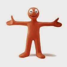
Morph, although a very simple character, has still been designed. He is a very simple plasterscine figure. He has a cute loveable face and just a very simple body that doesn't do much describing. But this in itself can drive the narrative. This is because this means that morph can 'morph' into anything and is really easily animated and tell any story and change into any characteristics that are required to tell the story! I think this is very clever as morph doesn't have a specific continuous story, he just does different things each time. He is just a loveable character whatever he is in. He doesn't even have a proper voice so that younger children, people with learning difficulties, deaf people can all understand what is going on without having to hear what is said.
11 second club
This is my storyboard for the 11 second club animation. I think she looks drunk enough, I think adding movement will help. What happens is she gets excited then tries to pick up the can and nearly falls over.


Lady and the tramp

Lady is rich and posh and to show this she is designed to be well groomed, she has an expensive collar, long eyelashes, and the way she holds herself with her nose in the air and trots around like she owns the place at the beginning.
Then theres Tramp who is not groomed so has hair sticking out all over, then his ears are quite often crooked and open mouthed with no manners and very playful, always getting dirty.
They need to exaggerate the differences so that the narrative works better and you understand why they have such different thoughts and how they change each other for the better at the end.
Hercules


As for hercules himself he is wearing an armour looking costume which shows that he fights i.e is a hero/god. Also in this film the gods have a glow to them like in stain glass window portrayal of jesus. So this shows people watching it that they are special and gods. This helps drive the narrative because you don't need to work out why this person is glowing because previous experience has suggested that its a god.

11 second club
Here is my animatic to show you how the video will look with the sound they have given us to use. I think its quite funny!! as you can see, I am using the Moom rig on Maya as I haven't learnt how to make or rig my own characters yet. I think this animation could work quite well. It has a bit of comedic value and I think I can have fun with making Moom look drunk.
Friday, 16 January 2015
colour change
I decided to change the colours of mooms joints and eyes because some people had done that in theirs and while I was animating, these are some things I didnt like so I decided to change them. I personally think it looks better and more realistic.

Final Crit
My final crit went pretty well, the overall animation seemed to be well received. The comments i got on what i need to improve on was:
-the feet slide around so need to make them step more
-the run at the end(which i asked for feedback on) needs some up and down movement in it
-I need some more fluid motion if its a human
-try and exaggerate the movements a bit
I think this is good feedback and I am definitely going to change the run and the feet right away. I will try and do a bit of the movement too, put in a bit of secondary motion. I don't know if ill have time to change anything else but i will try.
Wednesday, 14 January 2015
11 second club
I have decided to make things easier on myself and use the scenery from my last project with Moom as it is just a room which is what I wanted her to be in. I am going to change the clothes on the character though. I am also going to make a can of beer for her to pick up. I'm not sure how yet but I will figure it out.
11 second club
I have decided to do this months 11 second club competition as I said i would do the last one but didn't get a chance. This will still help me practice lip syncing and also practice using the Moom rig. It looks like a more exciting one this time too which is good and I have a good idea for it. I think I want it to be a drunk girl going out. I want it to be fun and lots of movement. I don't believe I will win with a Moom rig as you don't see it very often, the winners usually use their own characters or a better rig but we will see. I might try a 2D one next.
Tuesday, 13 January 2015
Tadaaa
After a lot of working out and help from people I finally managed to get my project into a video! I am really happy with it! I used Aftereffects to put my image sequence in and then audio and then I added a title sequence.
I rendered my frames at HD540 for the crit because I didnt want to spend hours rendering this pretty animation to at the crit be told i need to change things and have to render everything all over again, so I just rendered it at low res for now.
Sunday, 11 January 2015
Heroes


Heroes and good guys, just like the villains in the previous post, have their own colour scheme. This consists of reds, blues, whites, golds. Maybe as this is patriotic to america as that is where most of the animations come from. Having this colour scheme helps us depict the heroes from the bad guys. For example in spiderman 3 where there is a bad version of spiderman, he has a black costume, this easily shows who's bad and who's good.
Not only do we see this in the colour ways but we also see it in how the person stands. Heroes are shown to puff up their chests and stand tall and be strong and are handsome but villains hunch over and look unattractive. As I mentioned in the previous post, all of this helps to drive the narrative as it is clear to us what is going on.
Uncanny valley
In medal of honour-warfighter, the cutscenes are actually visually and technically extremely impressive. This shows the potential for 3D animation, and how far its coming in very recent years shows that it is getting better all the time. I have to say this is one of the most realistic animations I have every seen. But they still enter into the realm of the uncanny valley- when they look so real but theres something that makes you feel uncomfortable. I think this is in the dead eyes. As when drawing a picture, the eyes are the most important part, they make it believable. If the eyes are wrong the drawing doesn't look right and it loses realism. It is the same with animation but probably even more so as its moving. The eyes show emotion as well which can really add to the empathy of the audience.
I also find the mouth a little unnerving. It looks like how a human mouth would move, as it actually doesn't move that much when we talk, but theres something about it being portrayed in animation that is just wrong. it doesn't look right even though it technically probably is. I think maybe if they exaggerate the movement it would be more believable but that defeats the object of it being realistic.
A clip that shows the uncanny a bit more obviously is from the polar bear express.
Although this animation isn't designed with a realistic look, the movements are done using motion campture as demonstreted by Tom Hanks below.

This means that they were obviously trying to get the movements right but unfortunately it just looks very strange. It's still a nice film with its story line and the scenery is nice but as adults watching the film there is definitely something off about it.
This is a big limitation for 3D animation as believability helps tell the story and if you feel uncomfortable, thats all your going to think bout through the movie. Im not sure its a technical issue or an artistic issue or maybe a bit of both. Maybe the motion capture needs even more points and the animators need to put even more detail into the movements.
Saturday, 10 January 2015
Potentials and limitations
A potential for 3D modelling and animation technologies and techniques are like if an actor dies half way through filming a movie, they can use CG to finish the movie. For example-Paul walker in fast and furious 7.
"the filmmakers will use body doubles, CGI, and Walker's own voice to keep his character in the film to complete his storyline. The late actor's face will be digitally added to the body doubles and his voice will be used for the dialogue."
"the filmmakers will use body doubles, CGI, and Walker's own voice to keep his character in the film to complete his storyline. The late actor's face will be digitally added to the body doubles and his voice will be used for the dialogue."
This is a really clever idea as it means the film can go ahead, even though the actor died. Some people may disagree with this or find it disrespectful, but what are you going to do? just cancel a movie that everyone has been looking forward to or working on and spent a lot of time and money on? If technology has the potential to help us out in this situation we should use it.
Potentials and limitations

Although this was an enormous task to get the characters looking the way they do, I believe it was totally worth it! If it was done in 2D it would look something like this:

And although yes this is very cute, it wouldn't of had the same effect. There wouldn't be as much movement in the hair etc, which in turn would detract from the fact that these monsters are supposed to be scary and here they look just cute.
Villans


Colour ways play a big part in character design. For example a lot of villains are designed with the same sort of colour ways as you can see in the pictures above. They are designed in blues, purples, blacks, greens, reds, a lot of dark colouring. Because of the consistency in the design of villains, it makes it easier to see who is a villain.
Not only do colours help but they are also quite often designed with really sharp lines and harsh angles and very pointy. They are designed to be attractive in some ways but with an uneasy feel or in some cases, not attractive at all.
This is what we as a society associate with villains/bad guys. Dark colours, unattractiveness, harshness and these evil facial expressions.
This all really helps back up a narrative as you need to know who is who and you know a villain has bad intentions.
Woody

I think the movement they create is great. Like when andy plays with woody, he is very floppy and lifeless because he is made of floppy materials. But when he comes to life, although he has some rigidity so he can stand up, his movements still reflect the floppiness like a puppet. This is very important so we still keep in our heads that Woody is a toy and not a human in this movie which is key to the film or it won't work.
Tarzan

I have chosen to talk about Tarzan as my first demonstration of my understanding of character and narrative because I think he is just the perfect demonstration of how character design can drive narrative.
Tarzan has been raised by apes so he would move like one, be suspicious of humans, be very animalistic. I like the way they have really thought about Tarzans' muscles and how muscular he would be with all the climbing he would do in the jungle. Obviously this is a kids film so they had to coverup his...manhood...but they did it really well by using a loin cloth which is very jungle like.
I think the ape like design of Tarzan really helps drive the narrative as we see just how not human tarzan is. He has never seen a human before, and doesn't know what one is. I like his facial expressions as shown in the image above. It's very nervous about new things and the way he sniffs things like he's actually an animal. He's just very explorative and animalistic in everything he does and this really helps show where he is from and why his story is so different and exciting but also believable.
Also his hair looks like its almost dreadlocks, this is because he doesn't know what a brush is and its so long because they don't know it can be cut, they don't have scissors and they're used to apes who's hair doesn't grow that long. Also his skin is a pretty dark colour as he lives outside in the wild so he would be exposed to the sun a lot.
I like how his fingers and toes seem to work differently to a normal human as he has adapted to swinging on vines and climbing trees meaning he needs to grip more. This just backs up the narrative more.
Almost there
So this is a playblast of my final animation. Im pretty happy with it. I finally figured out how to make the dress disappear. instead of clicking 's' to set a key frame for its visibility you have to right click on visibility and set key frame. Seems silly but it works!
Mat helped me fix my lighting. I was thinking it was really dark and too many shadows etc, then Mat asked if its supposed to be daytime and it was so he said well we don't need lights on in the day....that was my problem. Then he showed me this awesome natural lighting idea. its called physical sun and sky. It looks awesome!!! then i had to try and figure out where to put my sun!


Monday, 5 January 2015
scene
I then tried to play about with lighting which i am actually quite struggling with. This is what i have so far.

Animating
Subscribe to:
Posts (Atom)