Showing posts with label OUAN 404- Visual language. Show all posts
Showing posts with label OUAN 404- Visual language. Show all posts
Sunday, 16 March 2014
Flow form and force
Friday, 14 February 2014
Sketch book

In my sketch book that we were asked to keep, I have been drawing things like this. This particular one is Elena Gilbert from Vampire diaries. I thought it had been a long time since I had drawn anything like this as there is not much call for it in animation. Imagine animating something detailed like this! Not fun. I am really pleased with how the hair turned out and I am pleased I can still draw like this as this is my first attempt in ages. I definitely need to figure out how to draw lips though. Took me many attempts and its still not right!
I have also been drawing from photographs that I have from my holidays and such:

I am quite pleased with how my figurative drawing has improved recently as before they would just look out of proportion like with giant heads and skinny legs etc.
I want to turn my sketch book into something filled with memories and things I like and inspiration.
You spin my right round
For this project I tried to find an interesting object. Everything that looked interesting was either round
or square. That would be boring, unchallenging and wouldn't help me get better at foreshortening.
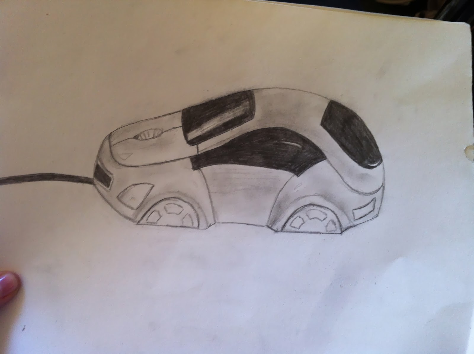
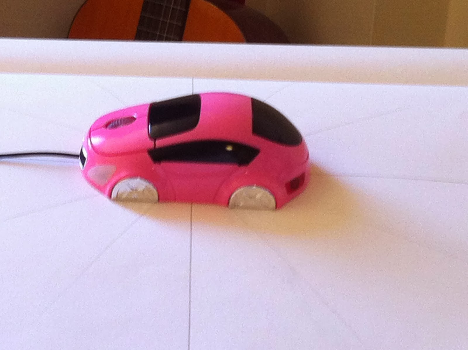
So I thought it would be fun to draw my mouse that looks like a car...wrong. I can't draw cars. And this one isn't even the right shape so it just went wrong.

My next most interesting object was my quivering bloke. I thought this would help me get better at the human proportions, drawing from different angles and foreshortening which will definitely help me in later animations.
To start off with I drew out some lines on the correct angles of what I needed to draw, drew a little line on the base of the figure to line it up with then placed the figure in the centre.
Next, I started drawing my figure onto animation paper. This would help make sure that the bits that stay central actually stay in the same position so that when I scanned it in it wouldn't move about across the page and it was the correct size. I could also get a sense of how this would move and if it looks like it's spinning by flipping the pages.
This is my finished animation. What I have learnt from this is that the first thing I do before I start drawing, is to draw a 16:9 box so that when I put it into an animation it will be the correct size. Over all I am pleased with my work. I am happy with the quality of drawing and I think I did pretty well at foreshortening. I quite enjoyed this task and love my end result.
or square. That would be boring, unchallenging and wouldn't help me get better at foreshortening.
So I thought it would be fun to draw my mouse that looks like a car...wrong. I can't draw cars. And this one isn't even the right shape so it just went wrong.
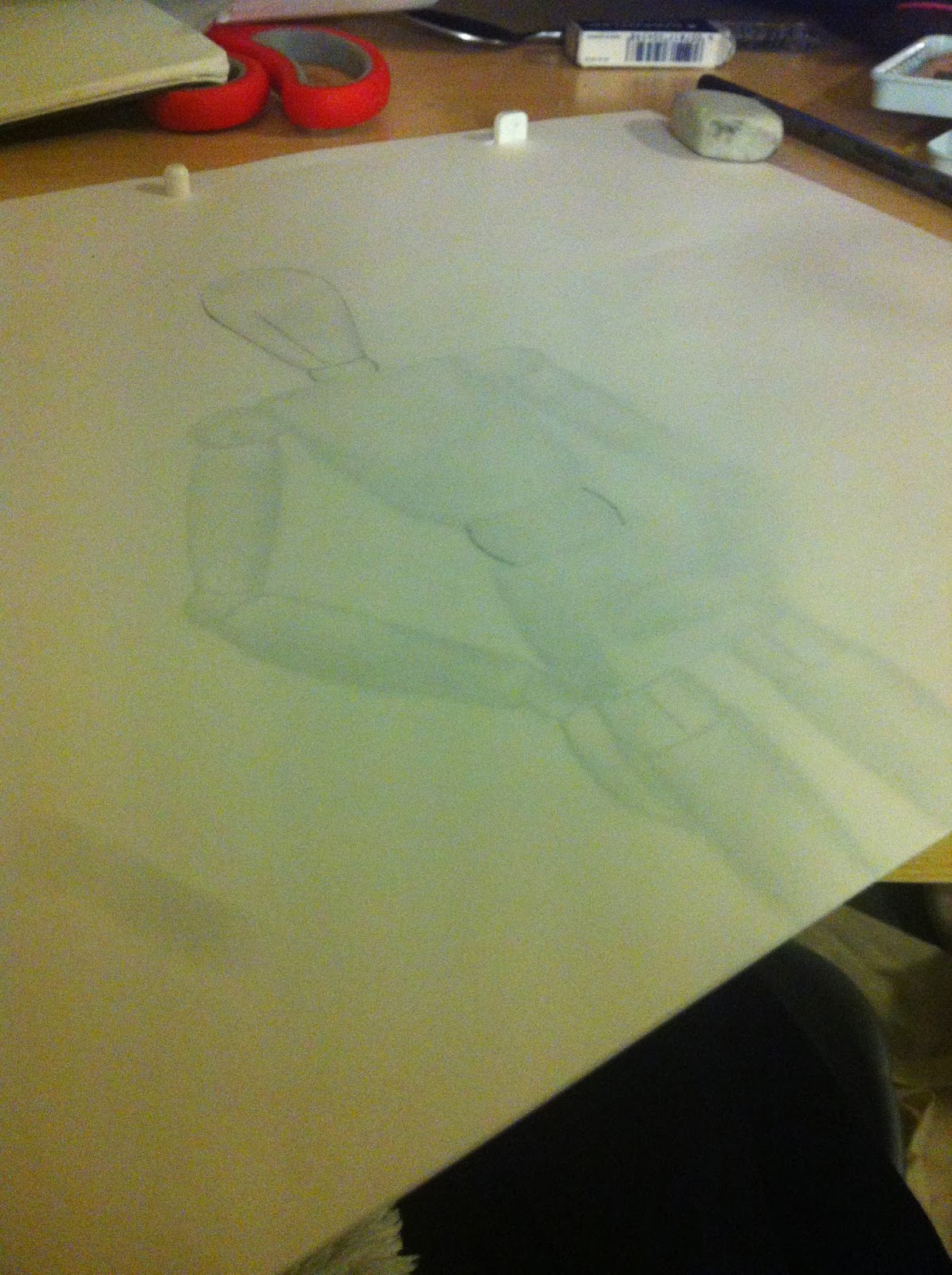
My next most interesting object was my quivering bloke. I thought this would help me get better at the human proportions, drawing from different angles and foreshortening which will definitely help me in later animations.
To start off with I drew out some lines on the correct angles of what I needed to draw, drew a little line on the base of the figure to line it up with then placed the figure in the centre.
Next, I started drawing my figure onto animation paper. This would help make sure that the bits that stay central actually stay in the same position so that when I scanned it in it wouldn't move about across the page and it was the correct size. I could also get a sense of how this would move and if it looks like it's spinning by flipping the pages.
Thursday, 13 February 2014
Rango
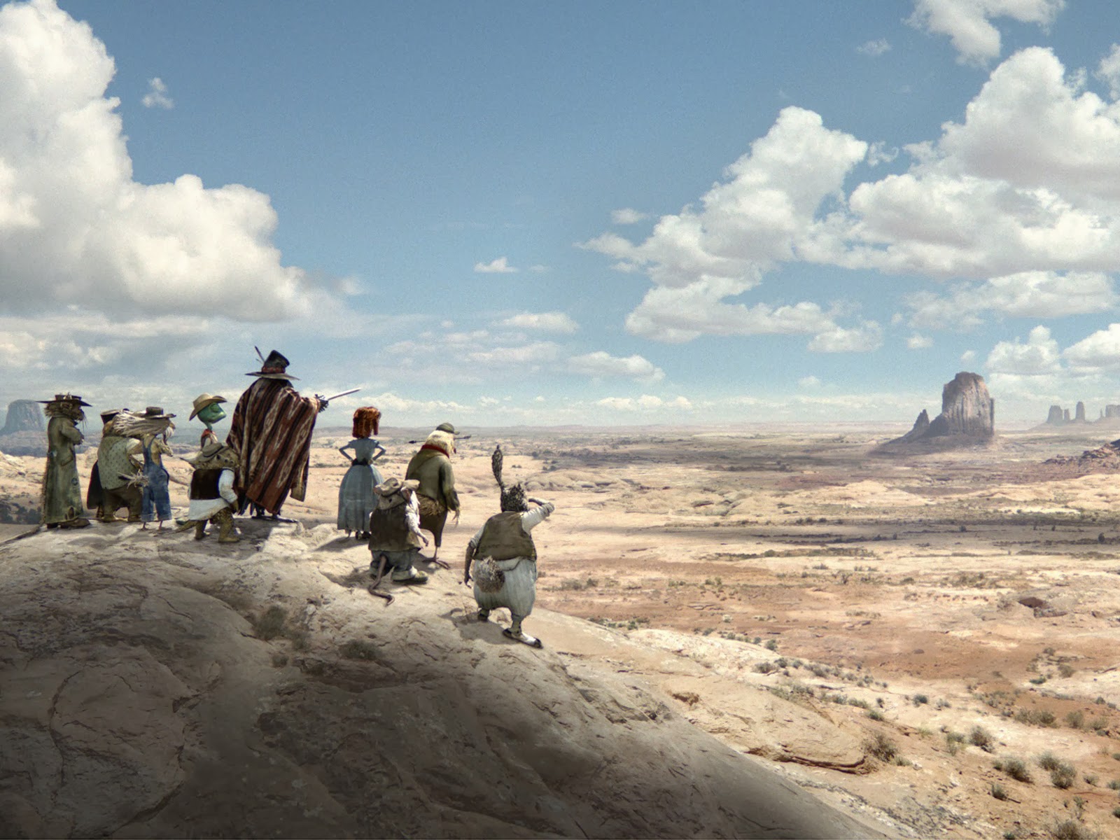 Rango uses imagery to set the scene well. From this image along we can see that they are in the desert far away from anything with a giant expanse of land that feels even bigger for these small animals. They use shadow and colour to show time and heat and the land just seems to go on forever.
They show through their backgrounds what kind of town this is. It's all old and rusty and breaking. Everything looks like its about to fall apart. It's dry and hot and people are busying about getting on with their lives while you can tell the two characters are above all this on a balcony. This kind of shows the turtles status because he is their leader so he is higher than the rest.
Avatar
I think Avatar really uses backgrounds and scenes to help tell a story. Take this image for example.
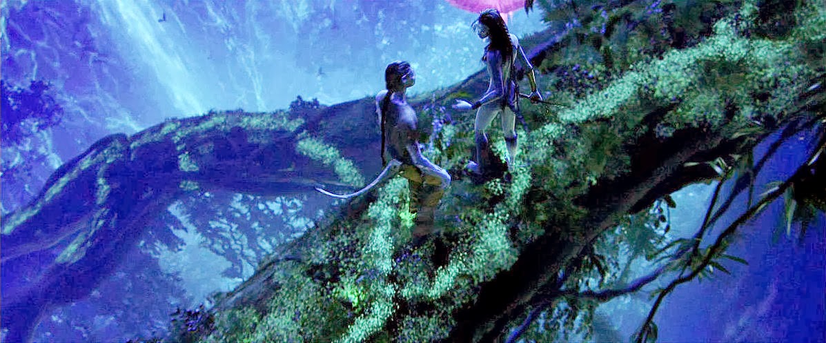 From this we can see that it is in the evening because it's dark with a moonlight kind of blue hue and there is a lot of contrast and shadow. Also from the angle they chose to shoot this scene we can see exactly where they are. They are high up in a tree on a single branch above and huge drop into a waterfall. This gives a sense of danger and also how Nala is used to this where as the guy isn't.

 It shows just how big this place is and that it's magical...theres just rocks hovering everywhere. It is a giant expanse that it absolutely beautiful and fills the audience with a sense of awe. This makes them feel bad that they want to knock this place down.
I like how they use lighting in this to show the light coming through the tree tops. This gives you a sense of where you are (under trees) and what kind of time of day it is. It's around the middle of the day because the sun is shining through the top and its bright. They use the foreground, middle and background in this with the rule of thirds. I like the colours too they're nice and bright.
I definitely think that they do a good job in setting the scene. Like when they first fly in and see like this...
Saturday, 8 February 2014
videos
Here are my finished animations. I really like this first one, I think it expresses the sound really well and I am proud of how it flows and looks like it fades which is what the sound does.
I am not as pleased with how this one turned out. I now know that I shouldn't have used the leaf brush as that has nothing to do with frying eggs. I just liked the way it scattered colour. I guess I could have done that myself though. I do like the tapping part at the beginning.
I quite like this one how it looks gloopy and splashy however Mike said it was a bit too literal. I agree now but I still like it. It's not exactly an object and it does work.
I really like how this turned out. The electric blue on the black looks ace and I timed the sharp spark perfectly! I can see from this that I need to start working at a higher frame rate soon because it is a little bit jittery.
I didn't like this one at first but actually I think it really does represent the sound. If i had time i would try and make the red spikes a bit sharper.
Friday, 7 February 2014
Drawing sound 2

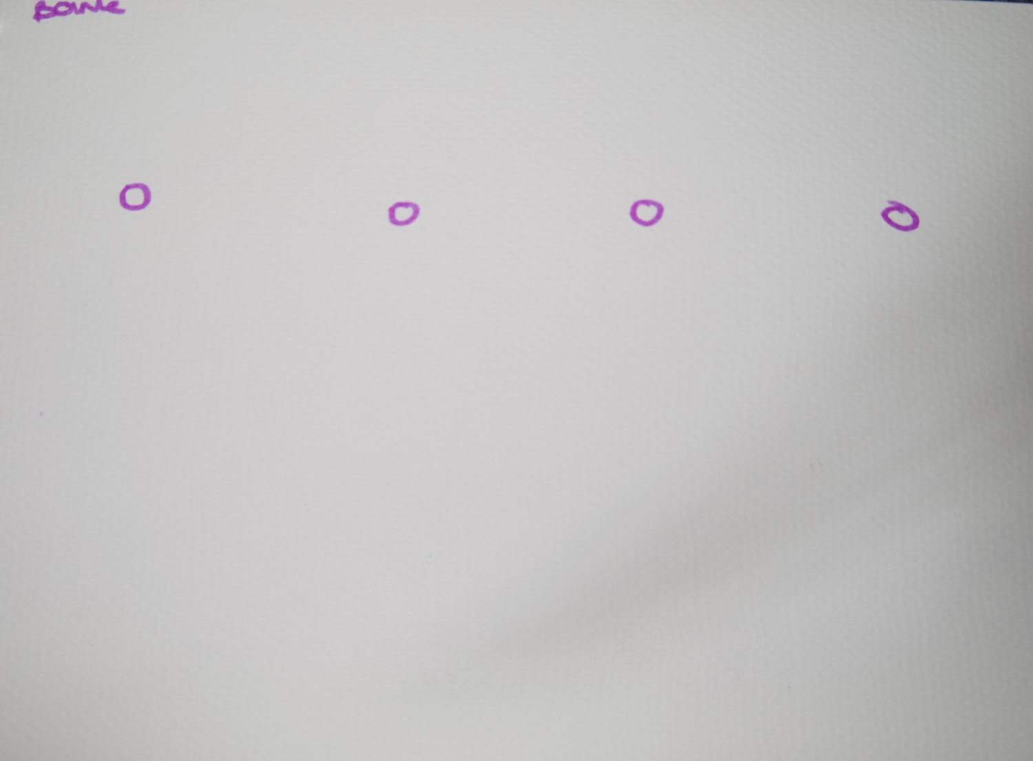
This is the electrical sound again using a few different types of pens and colours. The red one i put a little star on the peek to show like a spark but I don't think that works. And the blue still is the best representation.
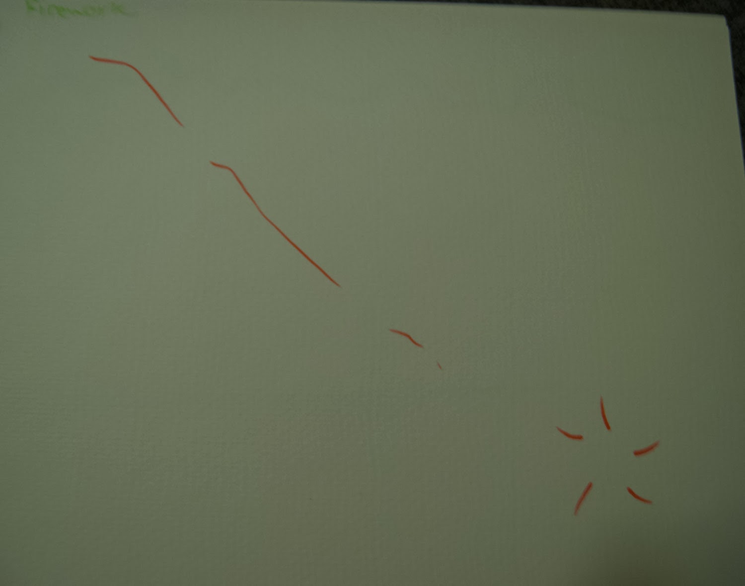
This one is the sound of a firework like a screamer. The pitch goes down so I made the line go down. Then there is a pop at the end. I think this definitely needs a black background to show it's a firework...although the point isn't really to show what it is! Just the sound! I like the single lines as apposed to the blue one i tried with scribbles. It describes the clean weeee sound better.
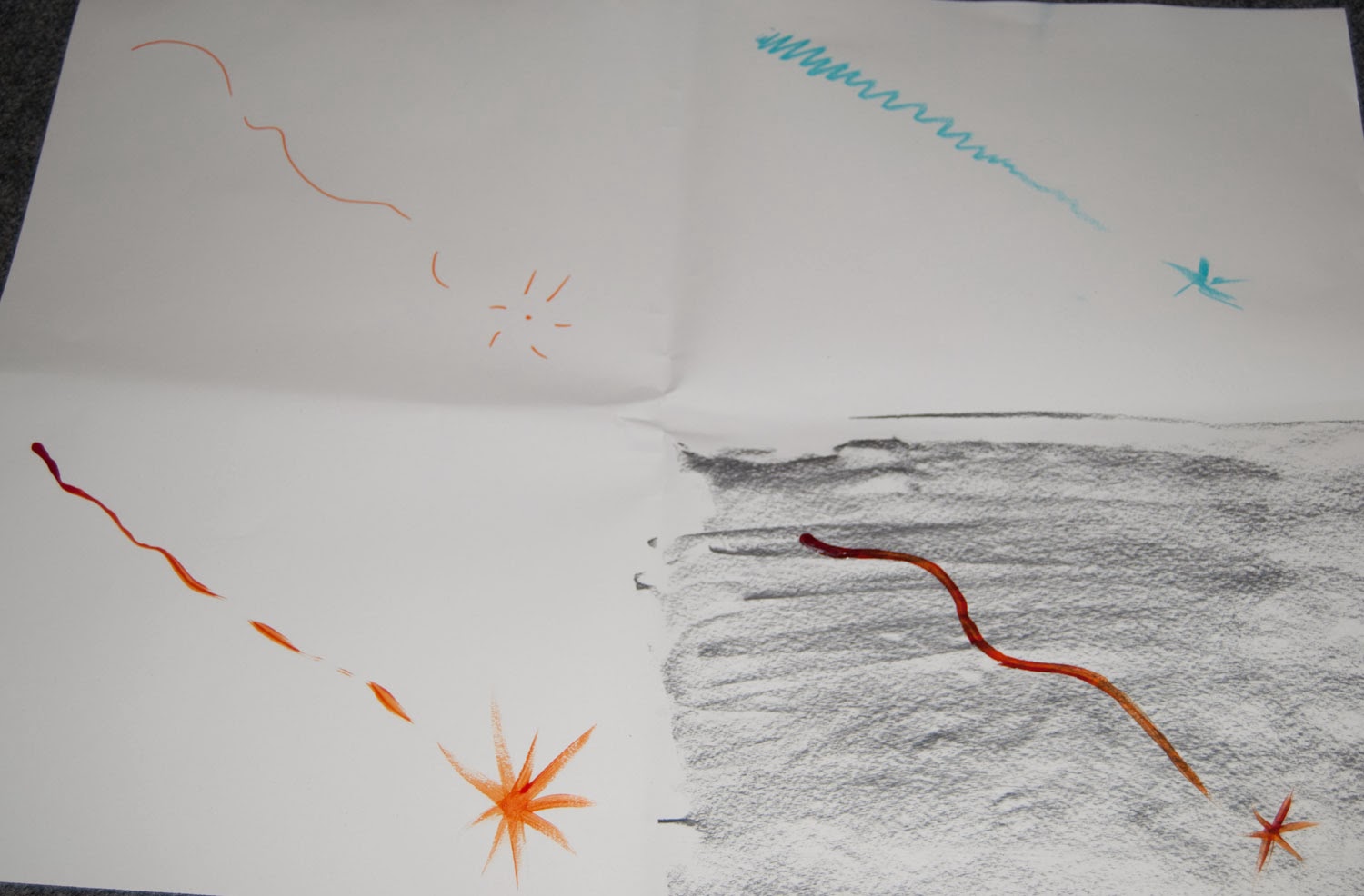


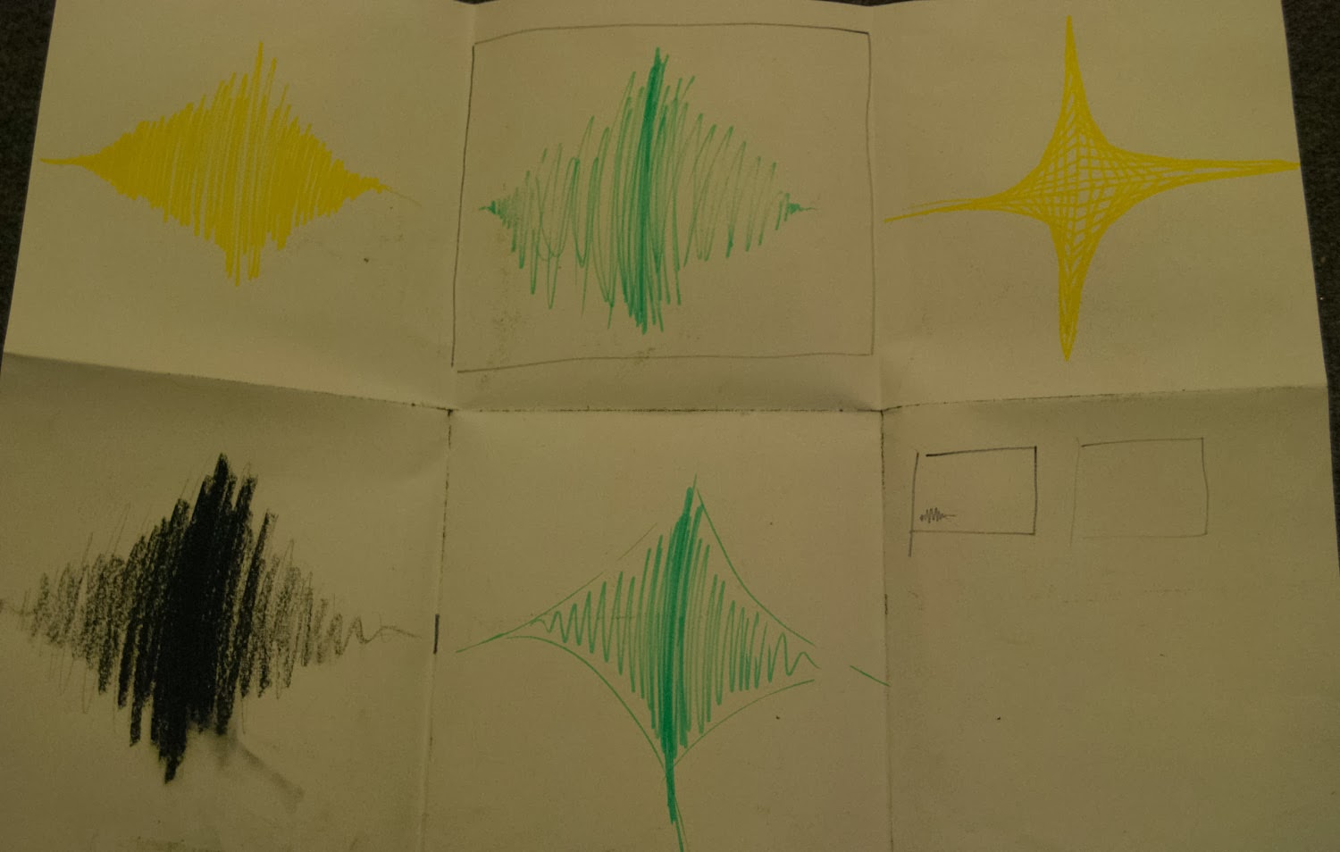
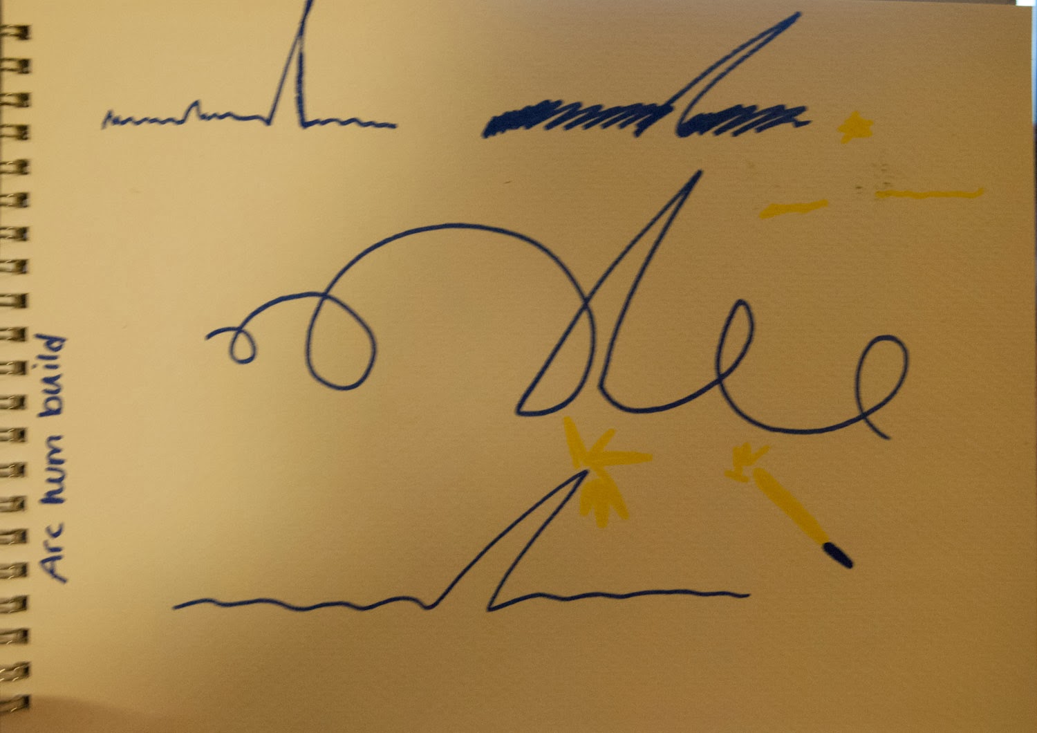
I also thought about pitch and how the constant was higher pitched to i tried that at the top instead of bottom. Then I tried the sounds over the top of each other. I think that works best. I also tried lots of different media such as pen, Pro-marker pastels, charcoal and acrylic paint.
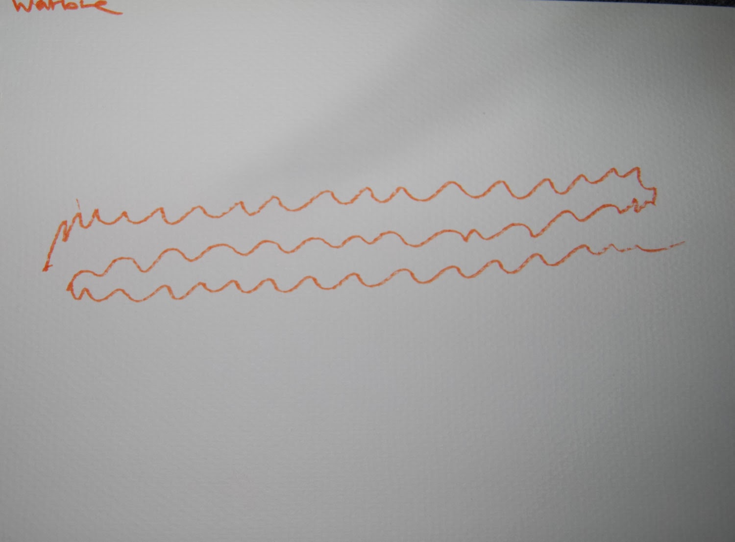
This sound went on for ages and was just wiggly and warbly so that's exactly what I drew. A wiggly sound. I played around with colour and size and decided smaller was better for this sound because it wasn't really loud. I'm not sure about colour but I don't think it needs to be red, for the same reason. It's not loud.


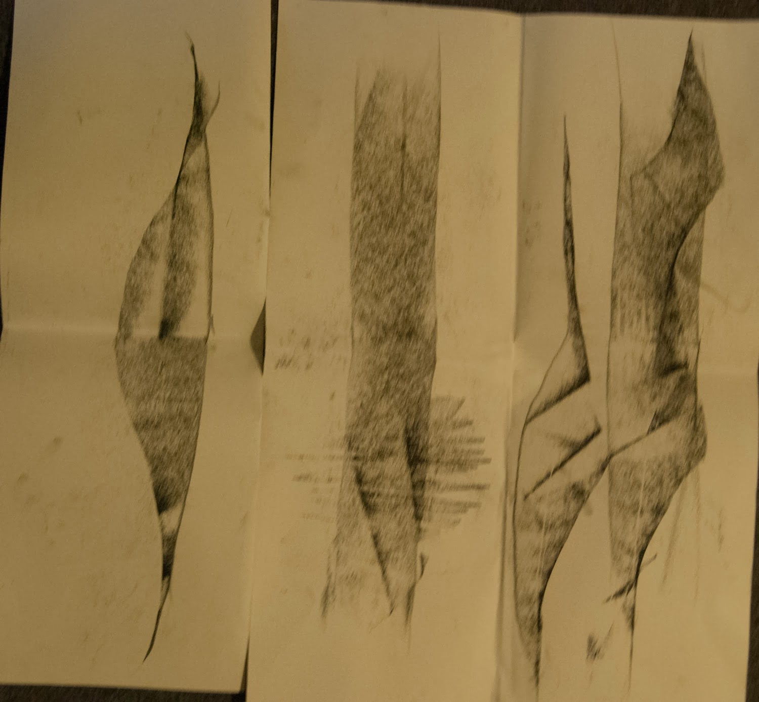
This one was a dentist and when I was listening I could hear one sound coming from the left that was soft and one sound coming from the right that was loud, sharp and annoying. So I used soft colours and shapes on the left and spiky blacks and reds on the right that have different peaks because the pitch is different each time.
Thursday, 6 February 2014
Drawing sound

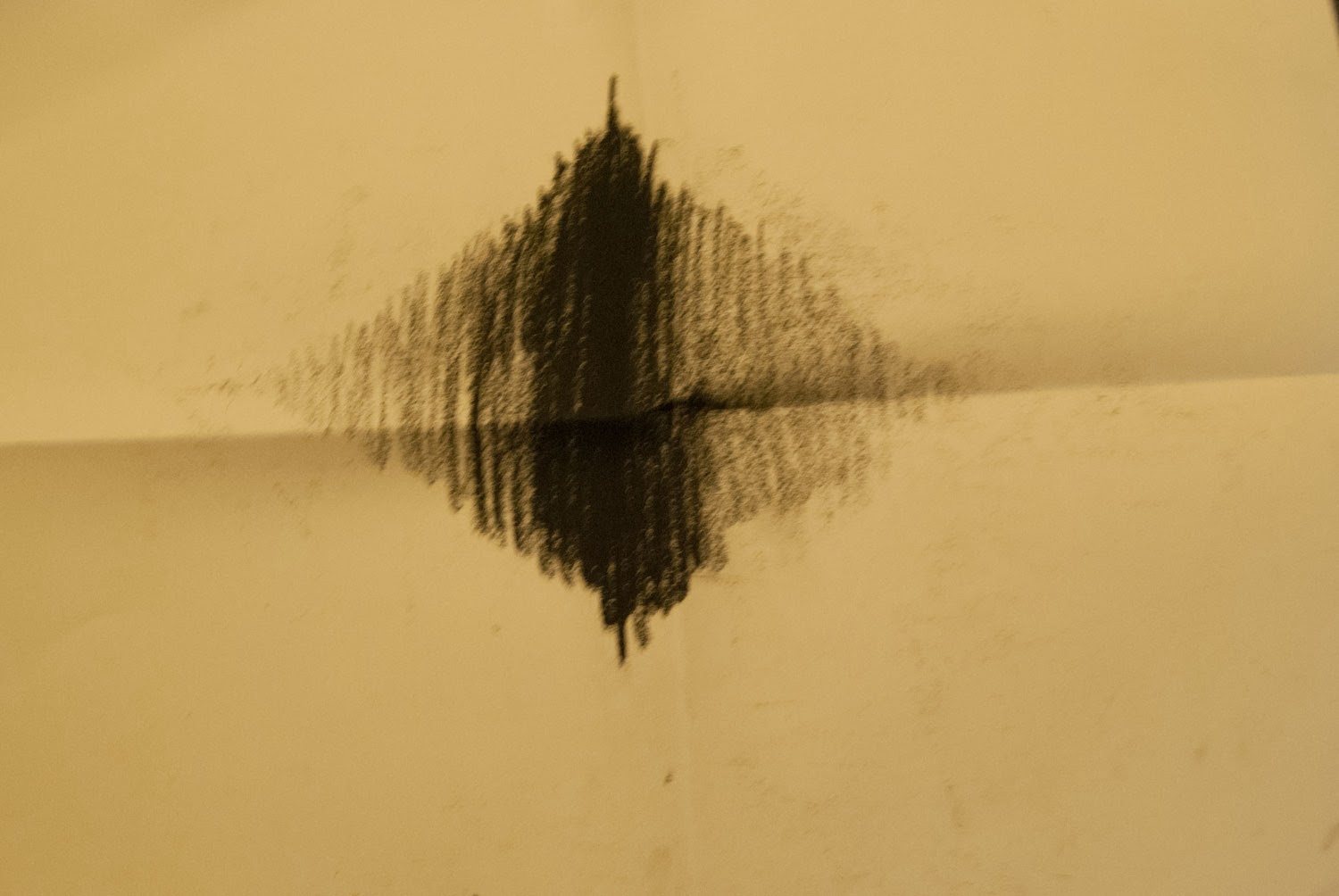
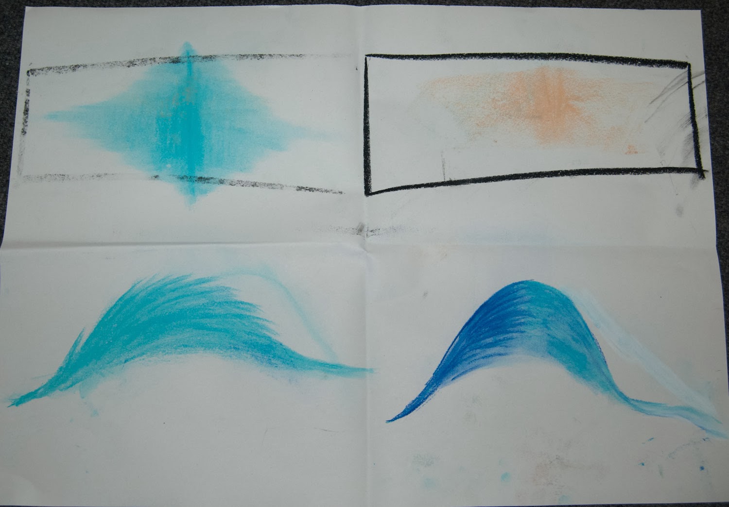
In this project we had to draw sound...sounds crazy. It's so difficult to draw something you can't see! We were given a list of sounds to choose from. This is the first one I did. It sort of came in quiet and built up then faded out again so i drew it getting bigger filling the page but also the colour gets more intense. Mike said that it shouldn't touch the top of the page because that means it's scratching where it makes a horrible noise and you don't hear that in this sound so he said to just be careful about my placement.
I tried a few variations on this using different colour and different media. This included felt tip, charcoal, pastels. I liked the pastels best because it faded much better.
I think I still prefer the shape I originally used.
This next one was a gloopy squishy grosse sound so I used greeny boggy colours to represent this. I used felt tip but also a type of ink. When it dried it still looked wet which looks really cool. I placed the blobs like the pitch when it went up and down.


This sound was electrical and buzzy then there was a snap and it went back to normal. I used blue because to me that is electricity. I came up with a few different lines to start with.

This was the sound of someone frying an egg. I did it like it started in the middle and then came out and as the sound got quieter the little shapes got further apart.
Another idea I had for this is below. I put in the tapping on the side of the pan like 2 solid dots because it was a solid sound. Then there is a swoosh where the egg pours into the pan.Then lots of crackling. I think this works quite well.

Thursday, 9 January 2014
Fantasia
I personally think this part of the film is better than all the others. I like that it has a story. I like the dinosaur part because I like dinosaurs but there wasn't much of a storyline it was almost just like they were trying to fill up the music and it got a bit boring. They are all very imaginative though which I love.
There is also a part in there about visualising sound which we were talking about today in visual language, I actually really enjoyed this piece it was like the sound as a visual form had it's own personality.
I also looked at how the water was done in this animation as I have water in mine, they use blue too but only the light blue for the highlights and dark transparent blue for the rest of the water. I think this works well and I may have to try it but I don't think dark transparent blue would be visible off the background and the water guy is supposed to be the centre of attention.
Wednesday, 8 January 2014
SSX on tour
Environmental Story
I think SSX on tour has great backgrounds. They use Lighting very well in this by giving a blue hue to the picture which shows the whiteness of the snow and also how cold it is because blue is a cold colour. The light also reflects off things making them appear shiny or smooth etc. Also, when you go off a jump quite high the sun appears and cause your looking right at it you get the solar flare/ sun spots which makes you feel like your really there because obviously you have to be straight on to the sun to do that. The shadows work well too, when you go into a valley or under a tunnel, everything gets darker but it doesn't just look gray.I like how the board leaves a mark in the snow, this gives it texture and depth and believability. Another thing that's good about this environment is the props and composition of them, although its just in the snow, there are trees, fallen trees that you can grind, big metal arches that show that your going the right way / show your nearly there, the buildings you pass. It uses great perspective like when you jump off a cliffe and you actually feel like your falling. I love the dust that comes off the board, makes it more real. I also like how you get day and night scenes, at night its a lot darker and more blue but you can still see and I think its a good balance. I also like how there's rocks under the snow.
Game play starts at about 4minutes.
Wednesday, 1 January 2014
Spaces and Places


 The first place I drew was the town hall. I chose this because it is an interesting building in a nice location with lots of space around it. I used a variation of media including charcoal, graphite stick,pencil and fine-liner. I like the graphite and charcoal ones best. Mike said the lines are very sketchy (that's my drawing style he didn't say we had to draw it a specific way) and that I need to use a

I chose to draw my bedroom next because this would give me chance
to relax while I draw and


I used media such as pro-

 marker, pencil, watercolour, graphite stick and fine liner. I enjoyed trying to get perspectives right from different angles.
 I also chose to draw the Merrion centre because although I've been in there before it's usually just to Morrisons and I've never really paid any attention to it, just walked through. There are some interesting angles in the architecture but apart from that it's a pretty boring building with hardly any colour (hence the lack
 of colour used and not a very

 inspirational place to draw. Not to mention the off putting people walking past you. I have to say I didn't like this project. I don't enjoy drawing in public.
Subscribe to:
Posts (Atom)