Showing posts with label Visual languange. Show all posts

Monday, 17 March 2014

Colour theory


In this lecture I learnt that everything I once knew about colour was now wrong and it was all about how we perceive colour. 
We started off the lecture going over some things that we had learnt in school and some we weren't familiar with for example:
-White light is made up of colour, each colour has a different wavelength.
-In the eyeball the rods let us see tone (light/dark) and the cones let us see colour.
-We have 3 cones-1 red, 1 green and 1 blue
-We see the colour when it hits the corresponding cone.
-Yellow is seen by a combination of the red+ green cones being hit.

If there's no light, is there no colour?

Then we looked at people that are colour blind and saw that they see things in different colours. Deuteranopia causes you to see everything in yellows and tritanopia makes you see everything in pinks and blues. 

-The primary colours are blue red and yellow.
-mixing primary's gives you secondaries  
-complimentary colours are opposites on the colour wheel
-complementaries are made up of the other 2 primaries.
-Complementaries remove colour from each other and become a neutral grey.
-neutral colour wheel= tertiaries- pure colour mixed in different ways
-spectral colour- perception of colour in different light

-yellow cannot be a spectral colour

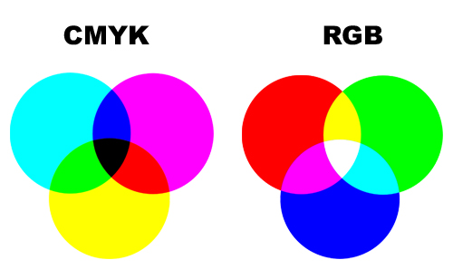
The two colour modes are made up of each other. Notice how the overlapping of the cmyk colours makes the rgb colours and visa versa.
-Subtractive colour is physical- mixing colours turns to black.
-Additive colour is on screen where mixing colours turns them white.

Dimensions of colour
-chromatic value= tone, saturation and hue
-shades= pure colour getting darker
-Tint= pushing toward white
-Tone= combination of shade and tint.
-Luminance- how bright+ pure the colour is
-Bright= reflecting light
-Dark= absorbing light
-desaturation= taking purity away, removing colour, making darker, turning into a different colour


We perceive colour by what's around it. We are fooled into seeing colours. The colour changes by comparing another colour to it. you may see something as red until you put something more red next to the original colour. Now the original looks more pink or orange. 


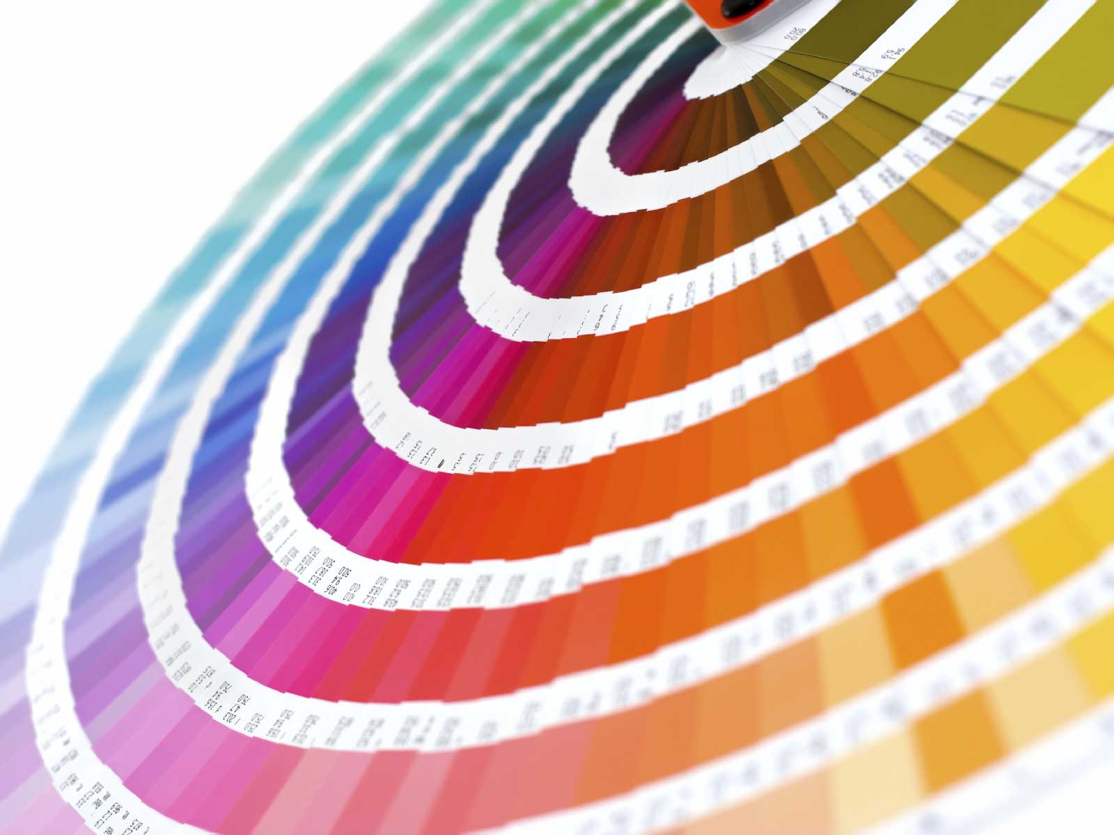
This is why we need a system so we get the exact right colour. The most common system is Pantone. These have numbers and letters with every colour under the sun. Colours are only the colour they are by concencous and even that cant be trusted.

Colour and contrast
-Contrast of tone. monochromatic, light value and dark value
-Contrast of hue- the greater the distance between hues on the colour wheel, the bigger the contrast
-Contrast of saturation
-contrast of proportion
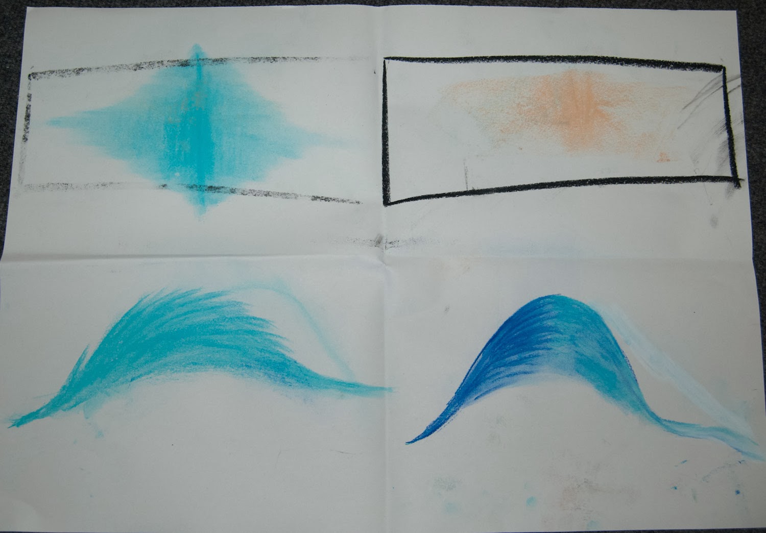
-contrast of temperature- putting colours together and adding cold and hot changes the appearance of the colour.
-non existing gradients because of temperature contrast
-complimentary contrast
-simultaneous contrast- all contrasts working together

Subjective colour
The primary colour wants it's complimentary colour to be there so when we see blue on grey, the grey looks yellow orange or brown.
same as yellow on grey makes the grey look purple.

Sunday, 16 March 2014

Flow form and force

This 3D animation of the android robot with artificial intelligence really explores the human form. I think it is absolutely beautiful, it looks so realistic with real fluid movements. I love how this not only explores the physicality of the human form but the emotional side as well. this animation feels so real that you really connect with it and empathise with it even though you just watched it be created. They have really got the features and expressions almost spot on. Even down to the skin texture.    

Flow form and force

This video I found on Youtube was a project for someone life drawing class and I think it's really interesting. I think it's important to notice here that we get a great sense of movement and shape and humanity from very little detail. I admire this because I always think it needs to been drawn really accurately so it looks like what it should be but this has proven that it just need to be the right shape and people will instantly recognise it and fill in the blanks.

Flow form and force

This animation shows life drawing in the form of animation. Ryan Woodward has done a lot of life drawing and this is apparent in his work. Although the drawings are simple they are all in perfect proportion with excellent movement. I like the thin lines and the draft lines it makes it more interesting and I also like the block shading. 

Friday, 14 March 2014

Flow form and force


These are the drawings for push and pull. It was hard getting used to drawing for longer than a few seconds, we had time to put in more details. I think this was actually quite a hard task because pretending to put a force on something doesn't actually show where the weight is because if they actually put force on they would probably fall over so to make sure they didn't fall, they moved their weight. I still felt a bit rushed on these though, but I was happier with the result because they actually looked more like what they're supposed to.


This was the first of the long poses task. I enjoyed this one more because we had more time to get the details and make corrections we needed to and actually try and get them accurate. This gives you chance to work on proportions and foreshortening. That's what I found difficult. I am happy with the result of this one I feel the proportions are right, I just can't draw feet as you'll see more of soon.
This is the second drawing, I found it harder to get the foreshortening right here and her head is too big for her body but I think the body is actually quite accurate apart from her feet. They are FAR too small and this makes her proportions look even worse.
I am quite pleased with this drawing, I feel the proportions are much better and even the feet are a little better! I didn't put much face in this one as I thought I might ruin it and I couldn't see it very well anyway. I like the way I shaped her legs and it actually looks like her weight is in the chair. 

I am also quite pleased with this drawing as it actually looks like Anna and the proportions look good I think this task has really helped my life drawing skills. 
I think I would like to do more but maybe have even more time on it and use a range of different pencils and get lots of darks and lights in there but I didn't really have time to go into great detail on these. I definitely think on this that practice makes perfect.


Thursday, 6 March 2014

Flow form and force


 The first 4 images are for the rhythm is a dancer task in which we recorded someone moving through a space. The first one we failed a little bit, I ended up drawing a stick person I felt very rushed by the time limit and I drew over the top of each other cause I ran out of space and I just feel it was rubbish. The second 2 images are part of one sequence, I ran out of space so used another peice of paper this time. I think this style worked much better I used the edge of a peice of black chalk and used sort of triangular shapes to make the image more filled out. I think the walk on this one was more interesting and natural too. The first one was very robotic and every move was similar.


 The next one was Mike moving through a space like a gorilla. Again this ended up looking stick like maybe due to my choice of media but I think I was basically drawing the lines of the limbs. I don't like hoe my style changes on this one because sometimes he's more filled out than others. The next one was Anna and she was wearing a skirt at the time and I wanted to capture that but I think I ended up making the drawing more confusing. Again they are too much like stick men/women in their limbs but the body is becoming more filled out. The next this person is walking and gradually falls to the floor. I like how I kept this one going round the page instead of starting a new line I think this gives it a bit more fluidity. Not keen on the drawing style though.

These next drawings are the puppet on a string part. The first I decided to try and draw the movements happening over the top of each other. This worked for the first couple of drawings but after a while it began to get messy and you couldn't see what was happening anymore. I like the idea though but maybe more movement is required meaning having larger gaps between each movement. The next drawing I really like how i started off by drawing the outline of the person but I think I got rushed and forgot where to start and the angle changed and I ended up going back to a stick man for a couple of drawings and then back to how I started. I do find drawing fast really difficult.
The blue one is someone kneeling down then getting back up. I thought I'd try a colour pastel to see if that looked nice. It just made it look messy really. The rest of the drawings I can tell what's happening cause I drew them but not so much on this one.

This is one of my favourite drawings from today. Bex did some sort of yoga poses and I did more of the shape of her rather than all the limbs individually. I am really pleased with how this one turned out and I like the nice thick smooth non scratchy texture I got from using the charcoal in a much smoother way. The last picture is of someone starting off on the ground and getting up and stretching. I feel if I had used the previous technique I could have accentuated the stretch more and made it more human. 


I had fun doing these sketches but I felt under a lot of pressure with the time limit and because I was not happy with a lot of my drawings because they didn't look like much.


Friday, 14 February 2014

Sketch book

In my sketch book that we were asked to keep, I have been drawing things like this. This particular one is Elena Gilbert from Vampire diaries. I thought it had been a long time since I had drawn anything like this as there is not much call for it in animation. Imagine animating something detailed like this! Not fun. I am really pleased with how the hair turned out and I am pleased I can still draw like this as this is my first attempt in ages. I definitely need to figure out how to draw lips though. Took me many attempts and its still not right!

I have also been drawing from photographs that I have from my holidays and such:
I am quite pleased with how my figurative drawing has improved recently as before they would just look out of proportion like with giant heads and skinny legs etc. 
I want to turn my sketch book into something filled with memories and things I like and inspiration. 

Seeing sound

This video shows basically the kind of thing we had to do. It responds to the music using abstract imagery and colours. This song is quite techno so I see why the bright colours and I like the way that at the beginning there is like each instrument visualised. So you have the drum beat with the pulsing circle and the whizzy lines down the left hand side perfectly describe the sound you hear, then you get the cluster of small spots for the smaller drum/symbol or whatever is used. When this is all put together you can just see that it IS the music, which was the general idea.  

You spin my right round

 For this project I tried to find an interesting object. Everything that looked interesting was either round 
or square. That would be boring, unchallenging and wouldn't help me get better at foreshortening. 


So I thought it would be fun to draw my mouse that looks like a car...wrong. I can't draw cars. And this one isn't even the right shape so it just went wrong.


My next most interesting object was my quivering bloke. I thought this would help me get better at the human proportions, drawing from different angles and foreshortening which will definitely help me in later animations. 
 To start off with I drew out some lines on the correct angles of what I needed to draw, drew a little line on the base of the figure to line it up with then placed the figure in the centre. 
Next, I started drawing my figure onto animation paper. This would help make sure that the bits that stay central actually stay in the same position so that when I scanned it in it wouldn't move about across the page and it was the correct size. I could also get a sense of how this would move and if it looks like it's spinning by flipping the pages.
 This is my finished animation. What I have learnt from this is that the first thing I do before I start drawing, is to draw a 16:9 box so that when I put it into an animation it will be the correct size. Over all I am pleased with my work. I am happy with the quality of drawing and I think I did pretty well at foreshortening. I quite enjoyed this task and love my end result.


Thursday, 13 February 2014

WALL E

Wall E is a good example of how sound is used. Wall E doesn't really talk so more sound is needed to tell the story. When he does speak though he has a robot voice. It's like auto tuned and electronic and not human. They also use sound effects but in this, unlike Tom and Jerry, the sounds are more realistic. They are not done to make it funny, they are done to make it believable. When he is rummaging through the trash if there was no noise it would be really strange. Or when he squishes his bug friend, if you didn't hear that, it wouldn't draw attention to it. I like how you can hear both of their foot steps and they difference in them. Wall E rolls but the ramp has ridges on it so it makes a noise and the cricket takes tiny tappy steps. It shows that the sound designer has really thought about how this would sound and every detail of it to make it seem real. 

Tom and Jerry

Tom and Jerry has a good use of sound. They use a musical score with sound effects over the top. The sound effects they used help to portray what is happening in the animation. Like when Tom hits something, it makes a bang. This makes it more believable. And when Jerry is running there is a high pitch tinkly sound which shows that Jerry is small and dainty. They use sound like stretching which accentuates the movement and makes it sound like the thing being stretched is about to snap. Without the sound you wouldn't know how much stretch this thing has left in it. These sound effects also add comedic value.
They also use the musical score to say what is going on. If there is a chase then the music would be fast and interesting and high pitched. If someone is sneaking up the music would start low and move up in pitch slowly. Things like that help tell a story. This is what the majority of the sound consists of because it is predominantly non dialogue so they have to tell the story another way.

Rango


Rango uses imagery to set the scene well. From this image along we can see that they are in the desert far away from anything with a giant expanse of land that feels even bigger for these small animals. They use shadow and colour to show time and heat and the land just seems to go on forever.

They show through their backgrounds what kind of town this is. It's all old and rusty and breaking. Everything looks like its about to fall apart. It's dry and hot and people are busying about getting on with their lives while you can tell the two characters are above all this on a balcony. This kind of shows the turtles status because he is their leader so he is higher than the rest.

Avatar

I think Avatar really uses backgrounds and scenes to help tell a story. Take this image for example.
From this we can see that it is in the evening because it's dark with a moonlight kind of blue hue and there is a lot of contrast and shadow. Also from the angle they chose to shoot this scene we can see exactly where they are. They are high up in a tree on a single branch above and huge drop into a waterfall. This gives a sense of danger and also how Nala is used to this where as the guy isn't. 
I like how they use lighting in this to show the light coming through the tree tops. This gives you a sense of where you are (under trees) and what kind of time of day it is. It's around the middle of the day because the sun is shining through the top and its bright. They use the foreground, middle and background in this with the rule of thirds. I like the colours too they're nice and bright.
I definitely think that they do a good job in setting the scene. Like when they first fly in and see like this...
  It shows just how big this place is and that it's magical...theres just rocks hovering everywhere. It is a giant expanse that it absolutely beautiful and fills the audience with a sense of awe. This makes them feel bad that they want to knock this place down.

Saturday, 8 February 2014

videos

Here are my finished animations. I really like this first one, I think it expresses the sound really well and I am proud of how it flows and looks like it fades which is what the sound does.

I am not as pleased with how this one turned out. I now know that I shouldn't have used the leaf brush as that has nothing to do with frying eggs. I just liked the way it scattered colour. I guess I could have done that myself though. I do like the tapping part at the beginning.


I quite like this one how it looks gloopy and splashy however Mike said it was a bit too literal. I agree now but I still like it. It's not exactly an object and it does work.


I really like how this turned out. The electric blue on the black looks ace and I timed the sharp spark perfectly! I can see from this that I need to start working at a higher frame rate soon because it is a little bit jittery.


I didn't like this one at first but actually I think it really does represent the sound. If i had time i would try and make the red spikes a bit sharper.

Friday, 7 February 2014

Drawing sound 2


This is the electrical sound again using a few different types of pens and colours. The red one i put a little star on the peek to show like a spark but I don't think that works. And the blue still is the best representation.


This one is the sound of a firework like a screamer. The pitch goes down so I made the line go down. Then there is a pop at the end. I think this definitely needs a black background to show it's a firework...although the point isn't really to show what it is! Just the sound! I like the single lines as apposed to the blue one i tried with scribbles. It describes the clean weeee sound better.


This one had two sounds on one track. There was an annoying sound and also a constant sound like someone flat lining. Though my first attempt shows them far away from each other but they aren't when you hear them.

I also thought about pitch and how the constant was higher pitched to i tried that at the top instead of bottom. Then I tried the sounds over the top of each other. I think that works best. I also tried lots of different media such as pen, Pro-marker pastels, charcoal and acrylic paint.


This sound went on for ages and was just wiggly and warbly so that's exactly what I drew. A wiggly sound. I played around with colour and size and decided smaller was better for this sound because it wasn't really loud. I'm not sure about colour but I don't think it needs to be red, for the same reason. It's not loud.


This sound was like short sharp plonks almost like drips. They had pauses in between so I put gaps in between each dot. I tried different kinds of dots in different shapes to see if they expressed the sound anymore. I think They all work so its difficult to choose!

This one was a dentist and when I was listening I could hear one sound coming from the left that was soft and one sound coming from the right that was loud, sharp and annoying. So I used soft colours and shapes on the left and spiky blacks and reds on the right that have different peaks because the pitch is different each time.

Thursday, 6 February 2014

Drawing sound


In this project we had to draw sound...sounds crazy. It's so difficult to draw something you can't see! We were given a list of sounds to choose from. This is the first one I did. It sort of came in quiet and built up then faded out again so i drew it getting bigger filling the page but also the colour gets more intense. Mike said that it shouldn't touch the top of the page because that means it's scratching where it makes a horrible noise and you don't hear that in this sound so he said to just be careful about my placement.
I tried a few variations on this using different colour and different media. This included felt tip, charcoal, pastels. I liked the pastels best because it faded much better.
I think I still prefer the shape I originally used.


This next one was a gloopy squishy grosse sound so I used greeny boggy colours to represent this. I used felt tip but also a type of ink. When it dried it still looked wet which looks really cool. I placed the blobs like the pitch when it went up and down.


This sound was electrical and buzzy then there was a snap and it went back to normal. I used blue because to me that is electricity. I came up with a few different lines to start with.


This was the sound of someone frying an egg. I did it like it started in the middle and then came out and as the sound got quieter the little shapes got further apart.
Another idea I had for this is below. I put in the tapping on the side of the pan like 2 solid dots because it was a solid sound. Then there is a swoosh where the egg pours into the pan.Then lots of crackling. I think this works quite well.